Examples
Common patterns, pages, tasks, component configurations, flows, and more to use as a starting point when creating government digital services.


74 examples

Add a filter chip
Allow users to apply filters using selectable chips, which visually represent active filters and can be removed to updat...
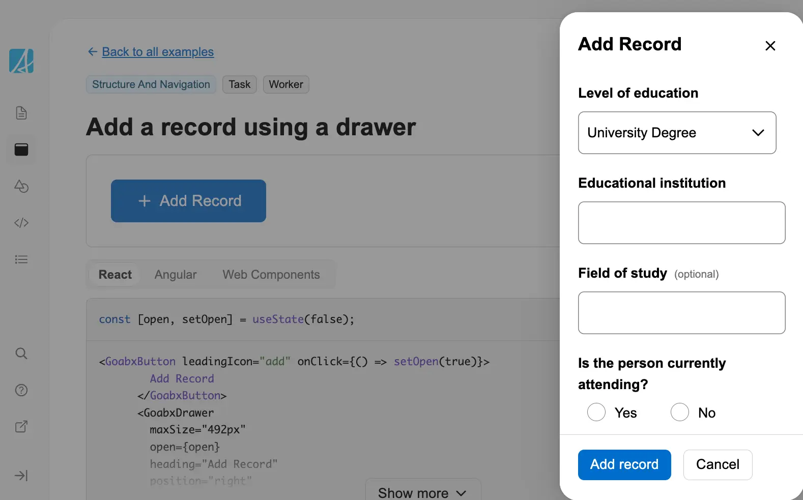
Add a record using a drawer
Add a record using a drawer. The drawer slides in from the side to allow data entry without navigating away from the cur...
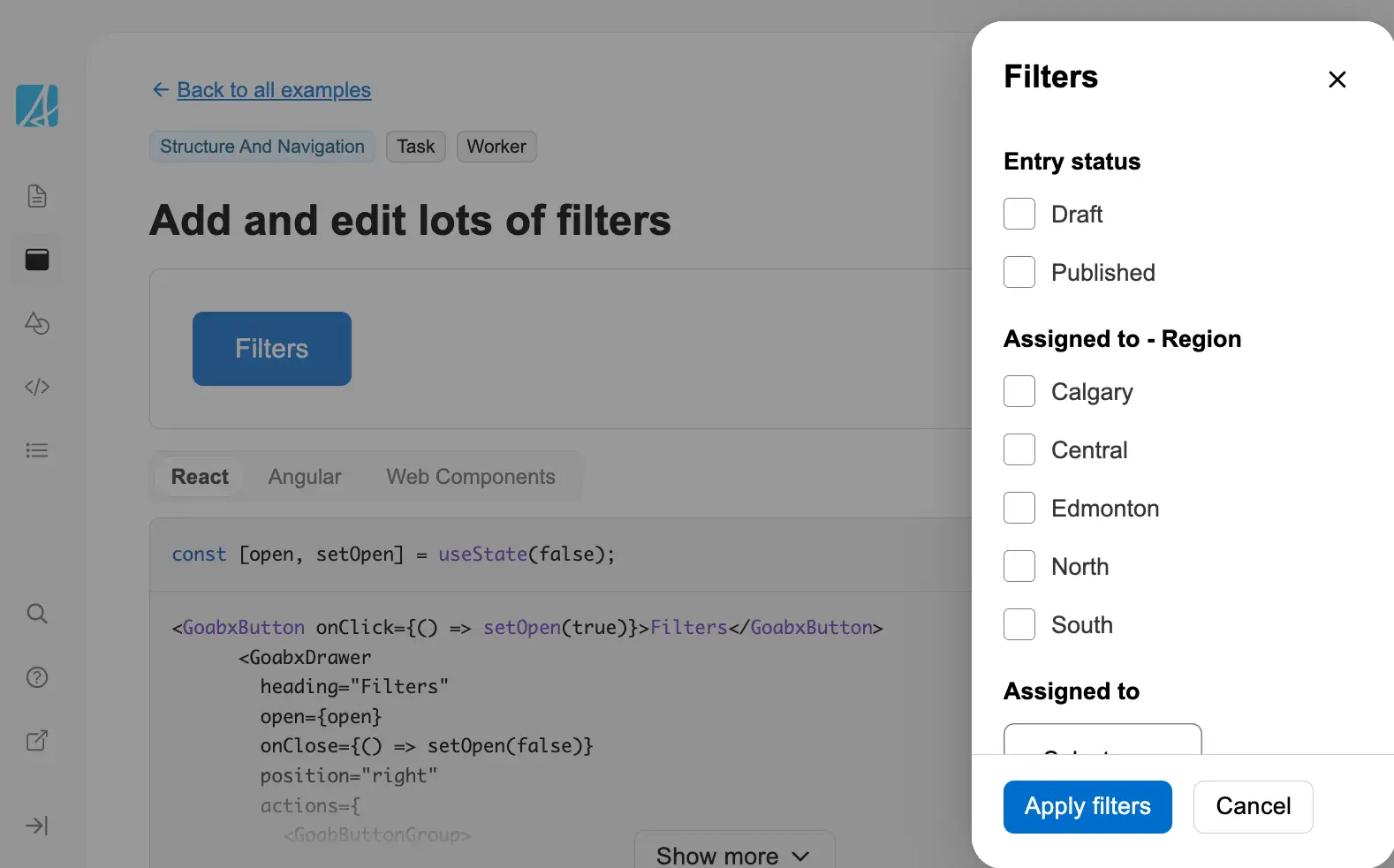
Add and edit lots of filters
Add and edit filters using a drawer. This pattern is useful when you have many filter options that would clutter the mai...
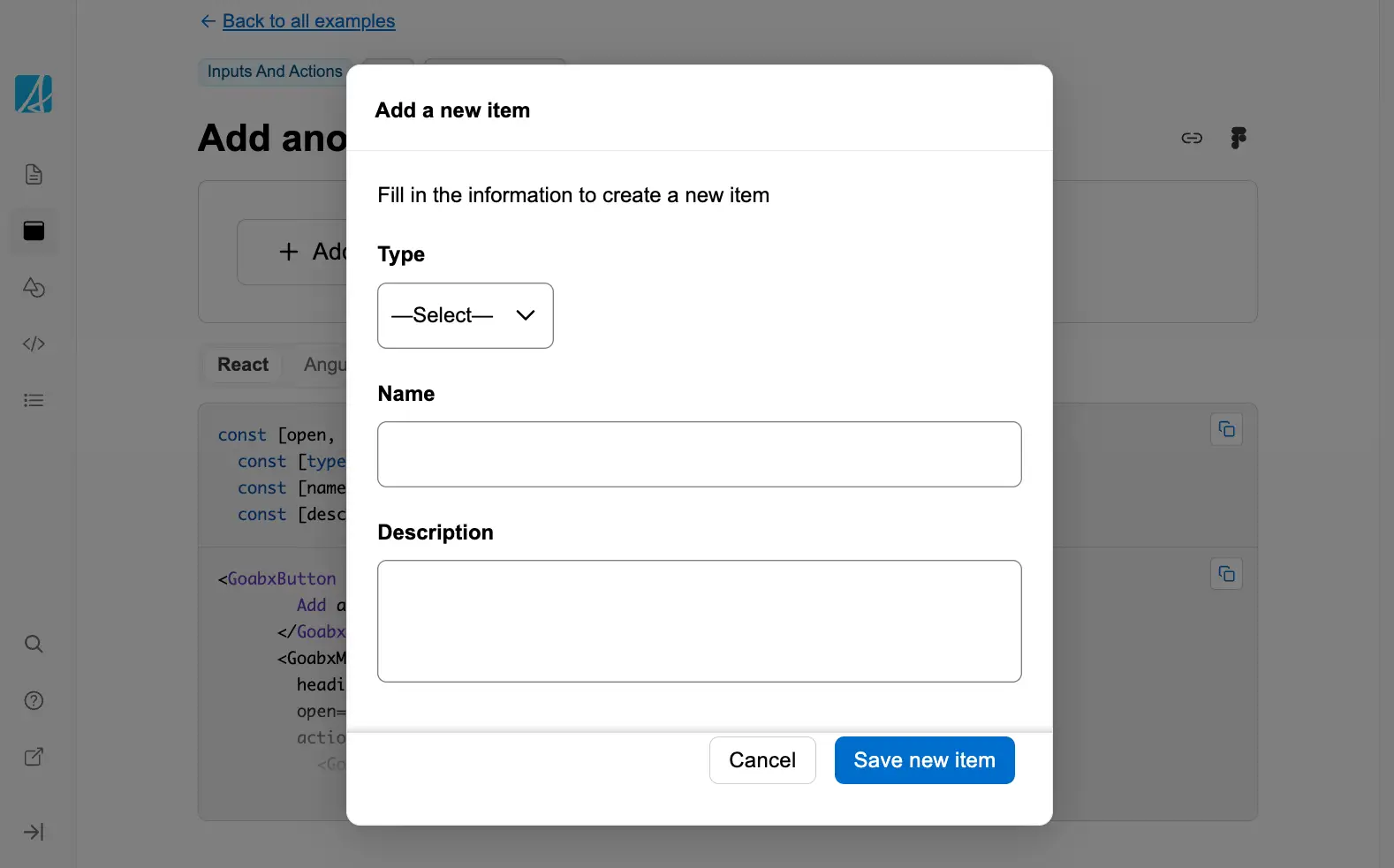
Add another item in a modal
Add a new item within a modal window without navigating away from the current context.
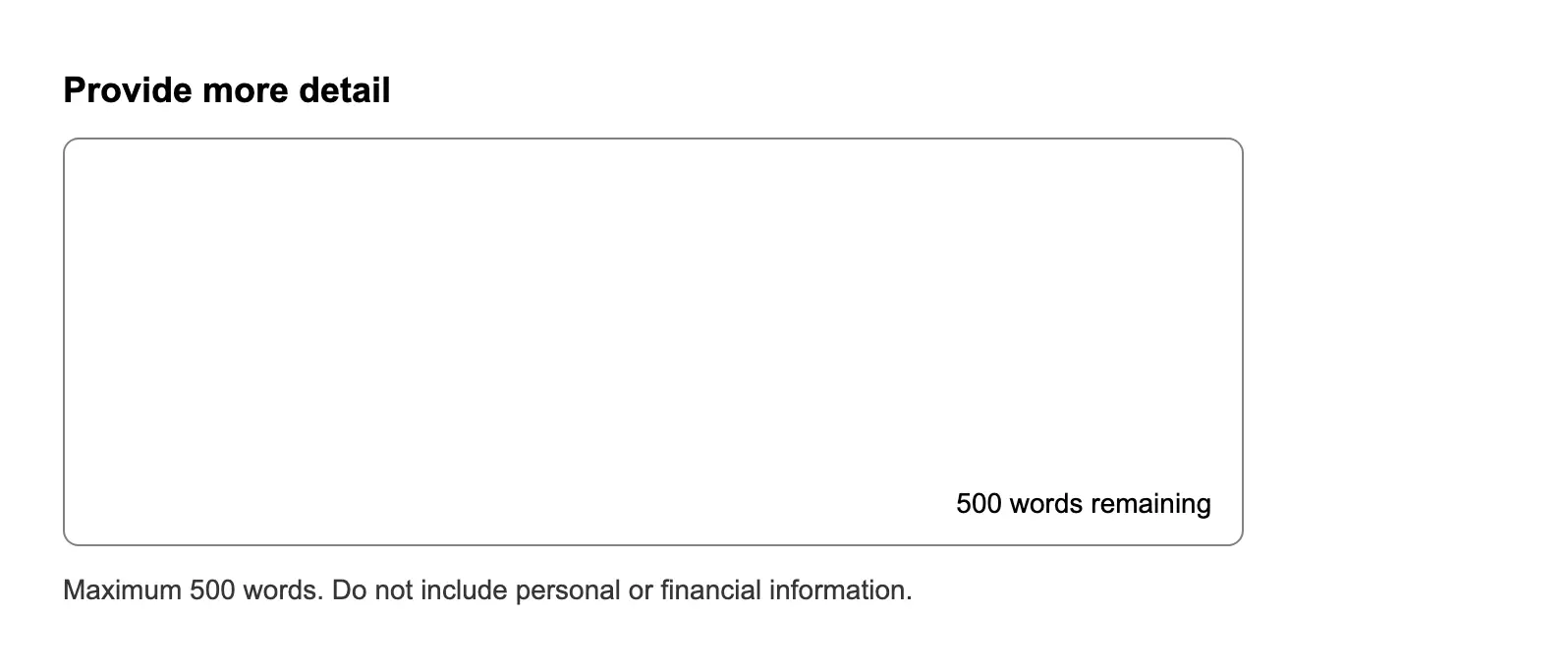
Ask a long answer question with a maximum word count
Restrict a long answer input to a maximum number of words or characters.

Ask a user for a birthday
Asks for a user's birthday using the date picker component.
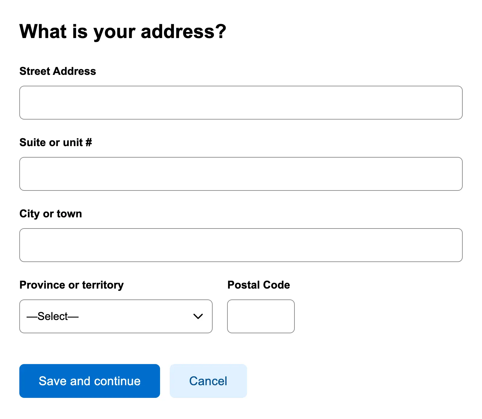
Ask a user for an address
Collect a complete mailing address from the user, including fields like street, city, and postal code.
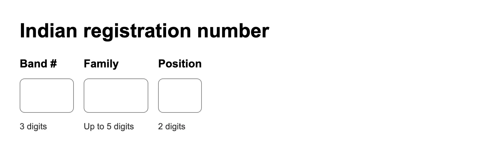
Ask a user for an Indian registration number
Request a user's Indian registration number with appropriate validation and context.
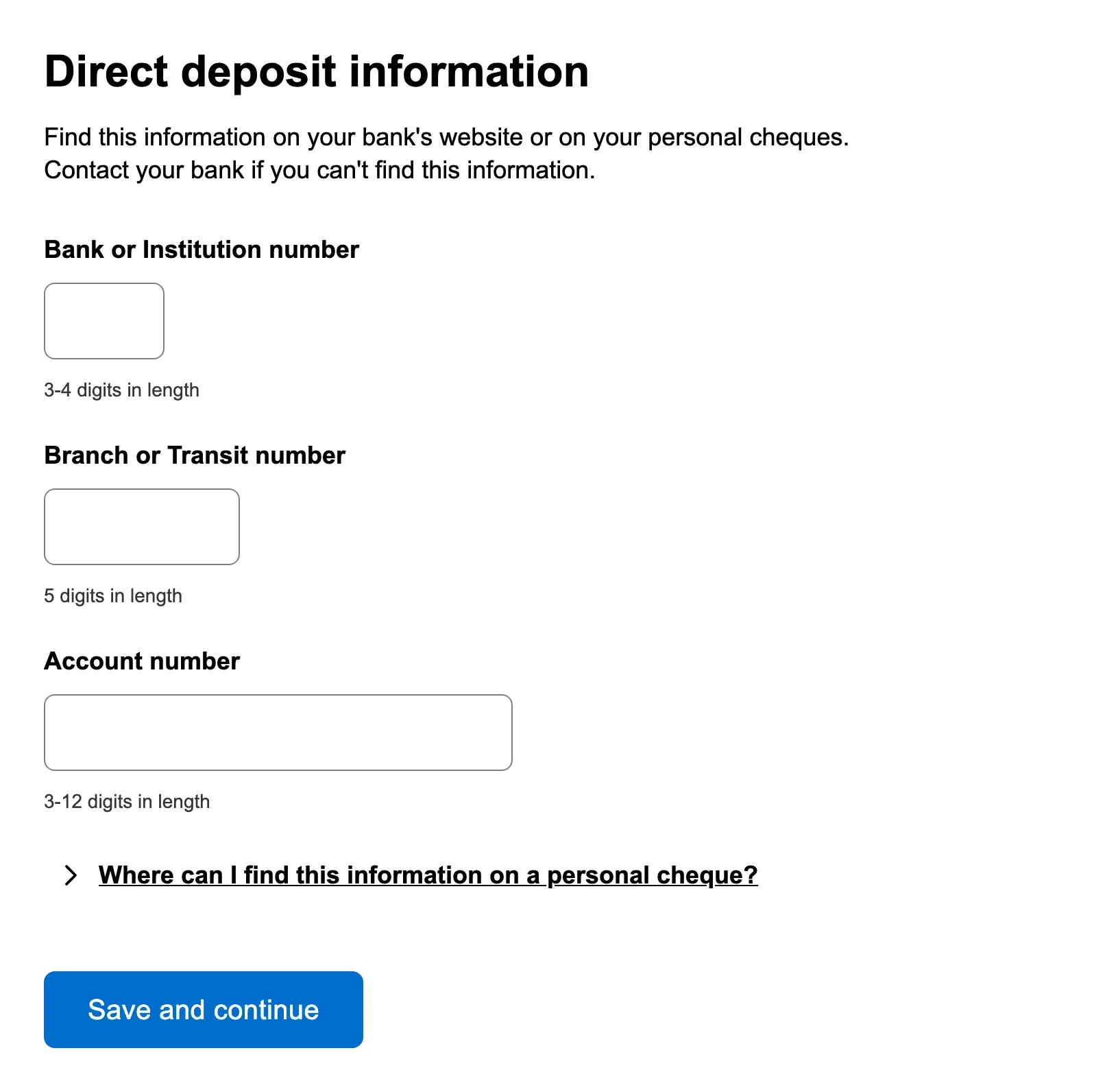
Ask a user for direct deposit information
Gather banking details from users to enable direct deposit, including account number and financial institution informati...
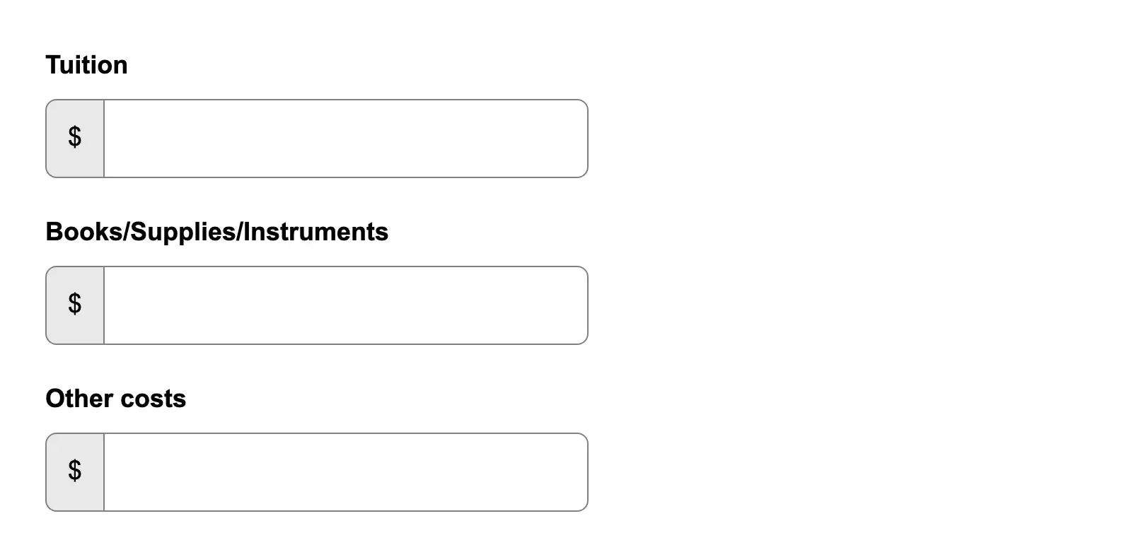
Ask a user for dollar amounts
Prompt users to enter monetary values using a consistent input format that supports validation and currency symbols.
Basic page layout
A basic page template to use as a starting point.
Button with Icon
Shows how to add leading or trailing icons to buttons for enhanced visual communication.
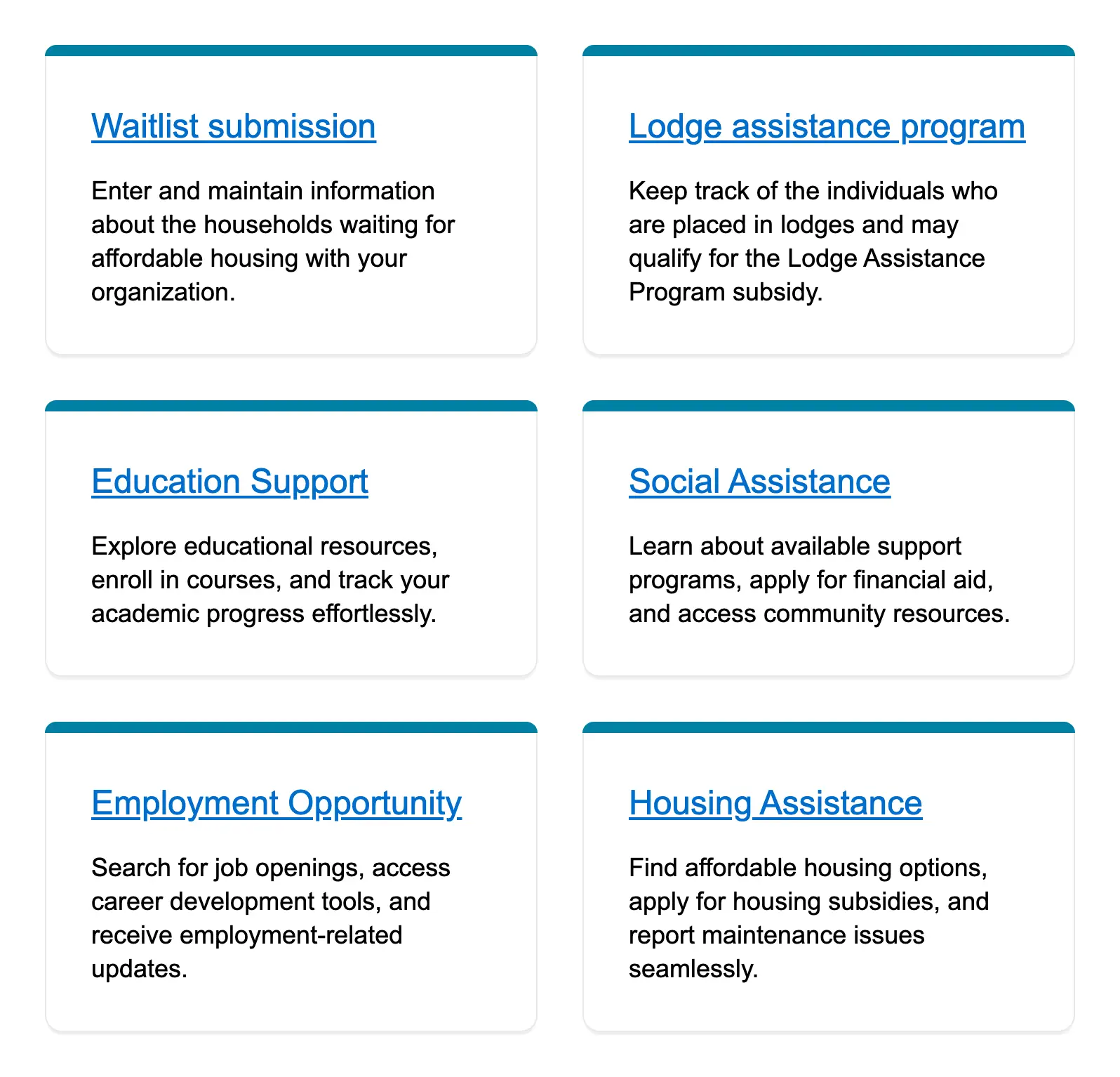
Card grid
Display multiple cards in a grid layout, each containing related content or actions.
Card view of case files
Present a visual overview of individual case files in a card format for scanning and access.
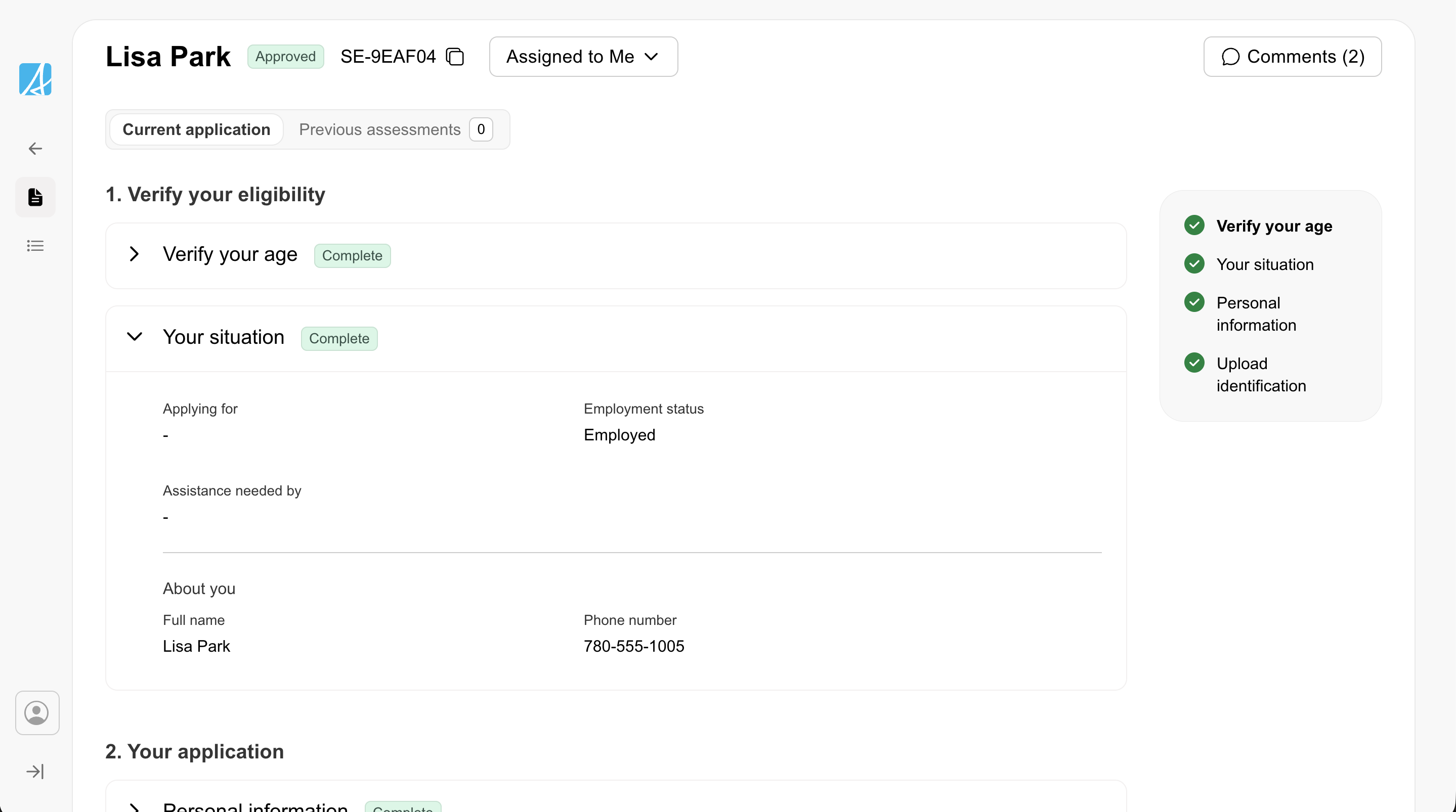
Case detail
A single-record view for reviewing and acting on one case. Uses accordion sections, a table-of-contents sidebar, badges ...
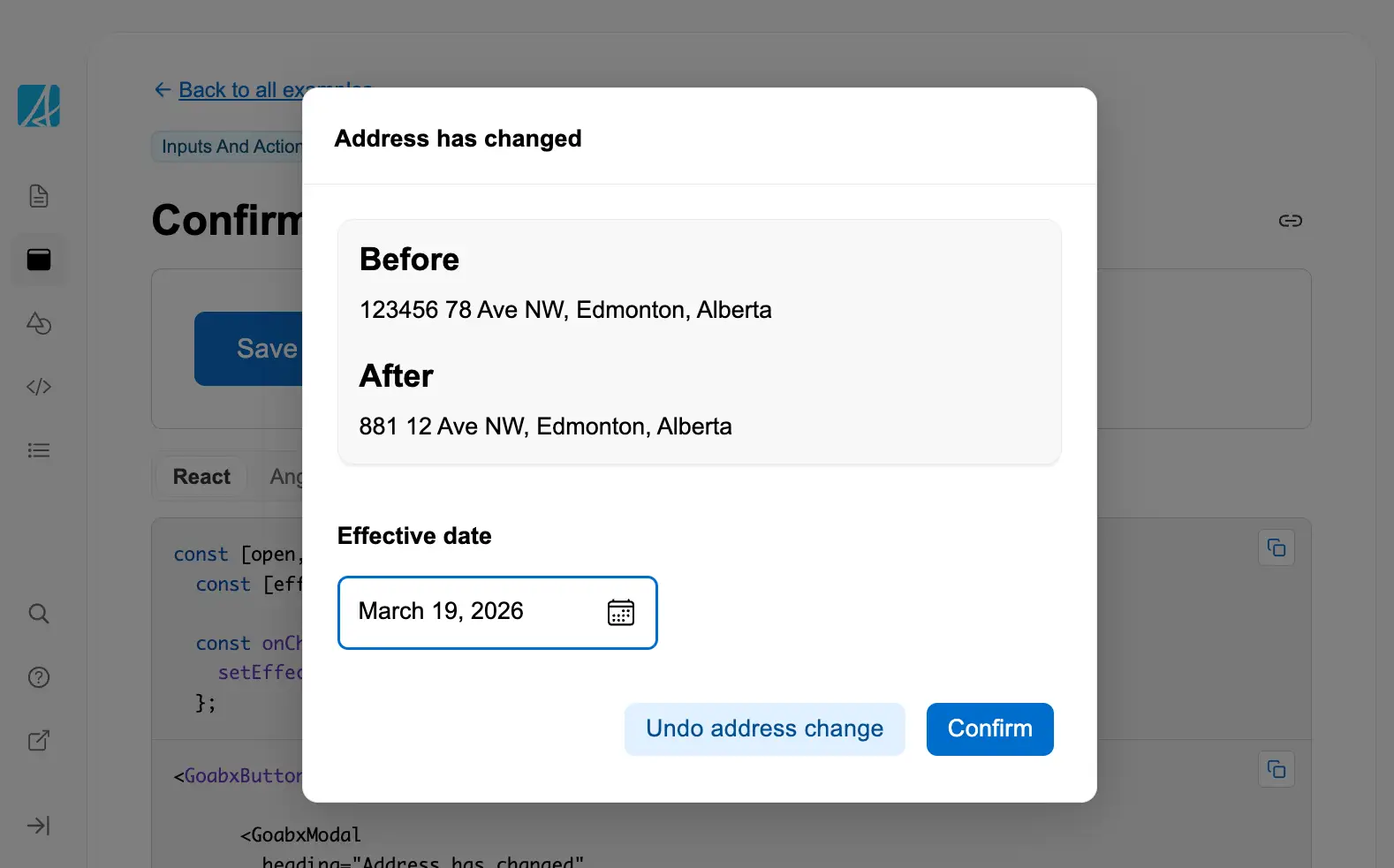
Confirm a change
Ask the user to confirm a proposed change before it is applied.
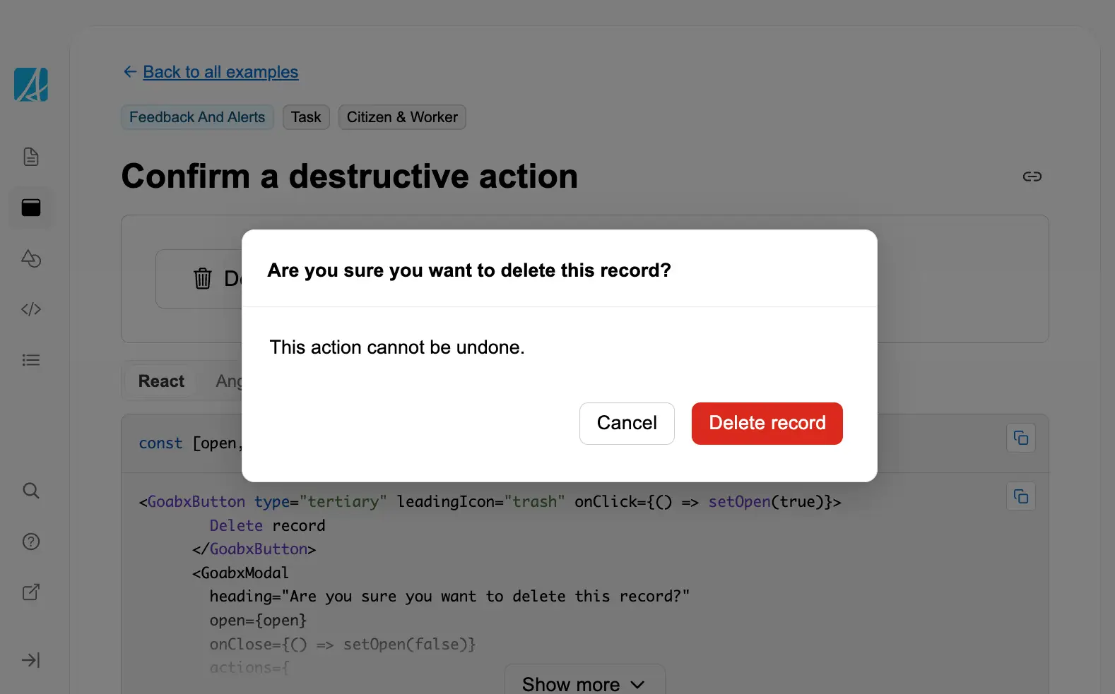
Confirm a destructive action
Confirm a destructive action like deletion to prevent accidental data loss.
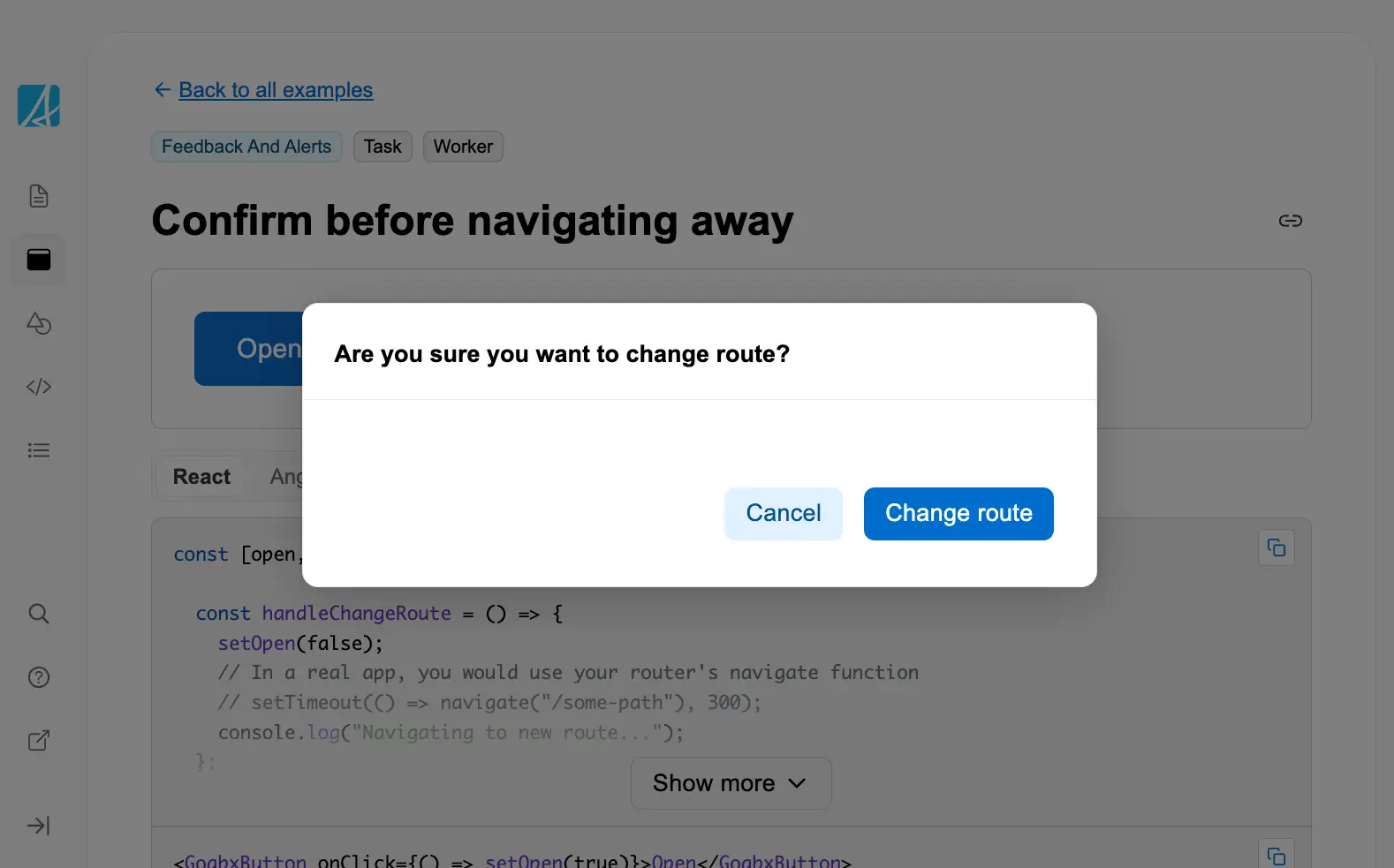
Confirm before navigating away
Prompt the user in a modal before navigating to a new route to preserve context.

Copy to clipboard
Allow users to quickly copy text or data to their clipboard with a single click.

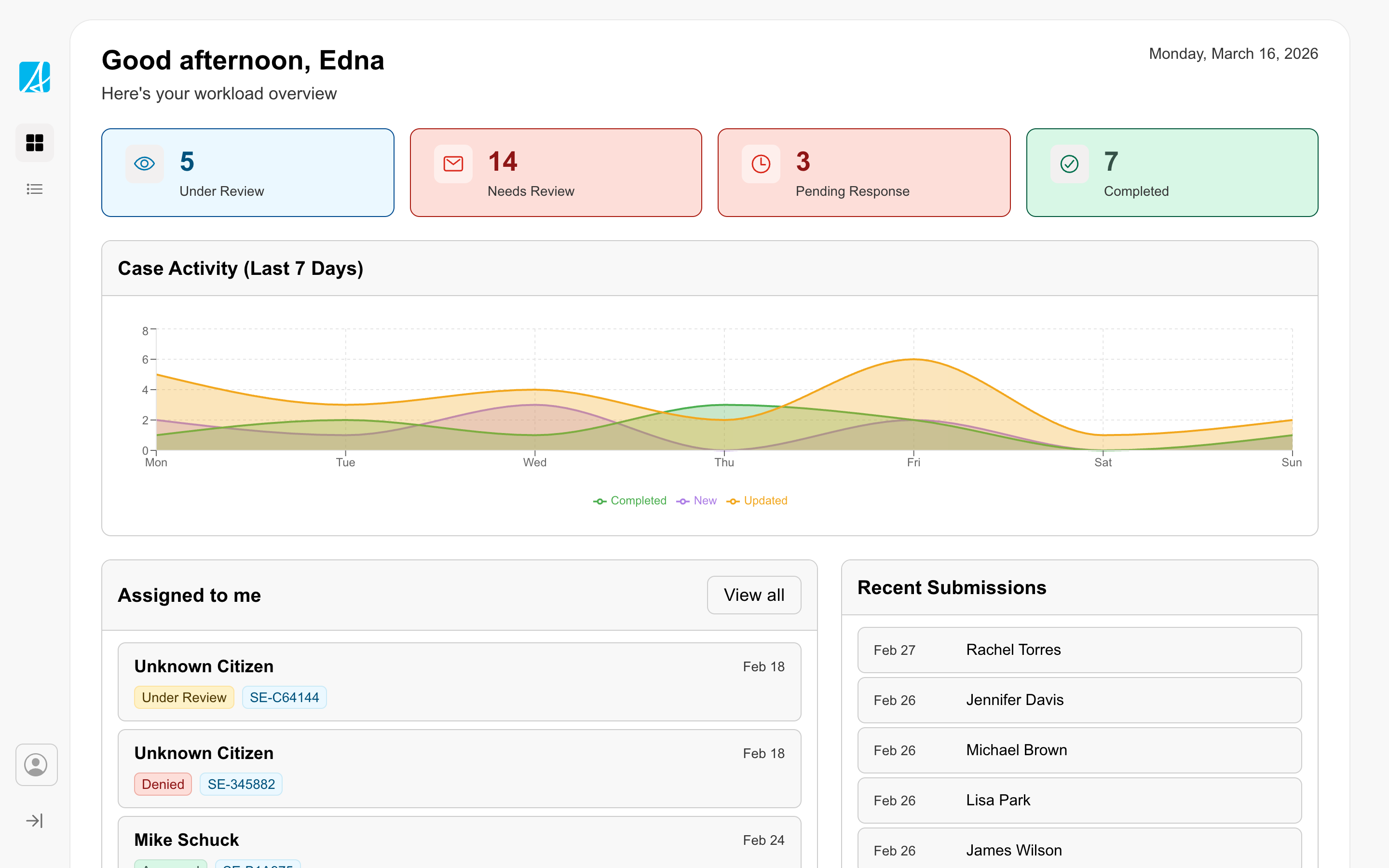
Dashboard
Gives staff an overview of their work with counts, trends, and assigned items.
Disabled button with a required field
Disable a submit button until required form fields are completed.
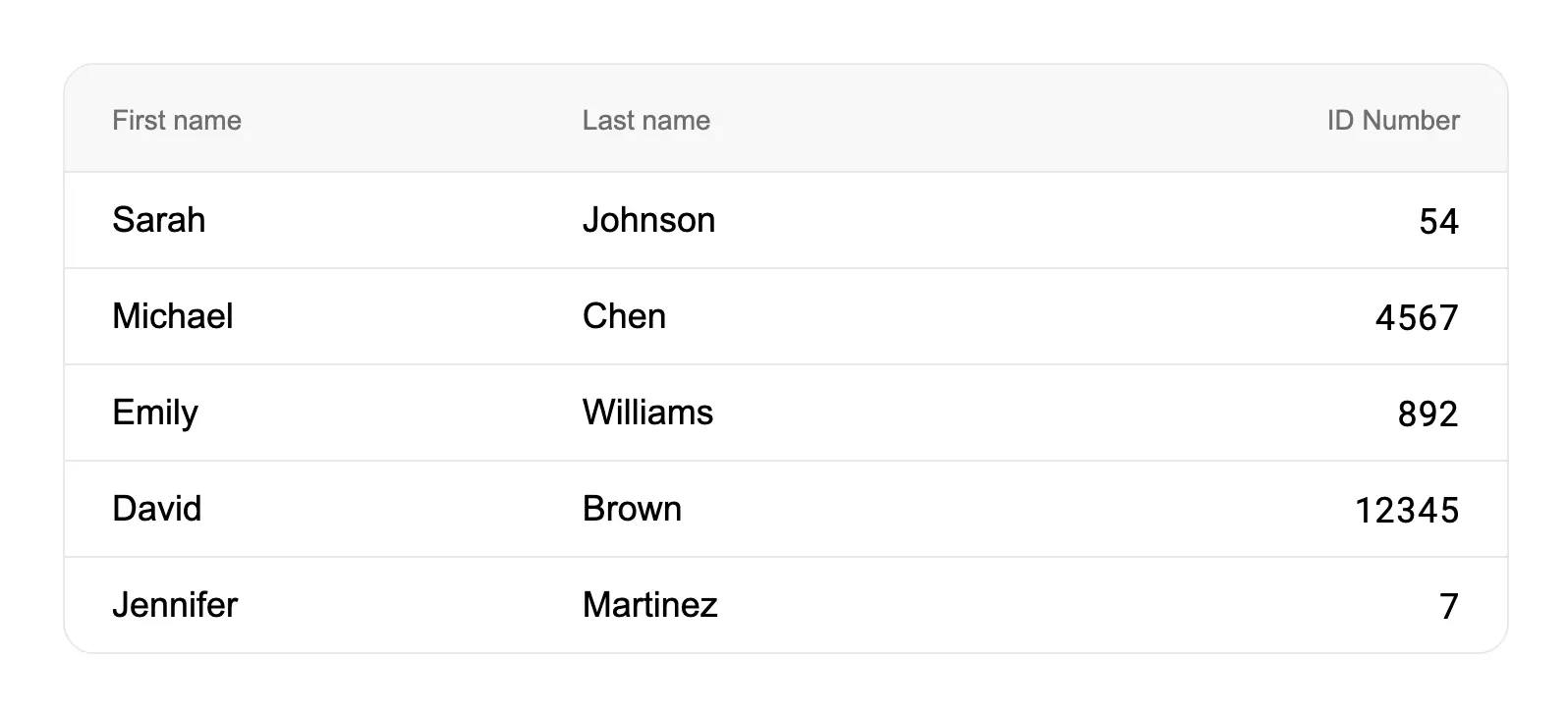
Display numbers in a table so they can be scanned easily
Right-align numeric columns in tables to make them easier to scan and compare.
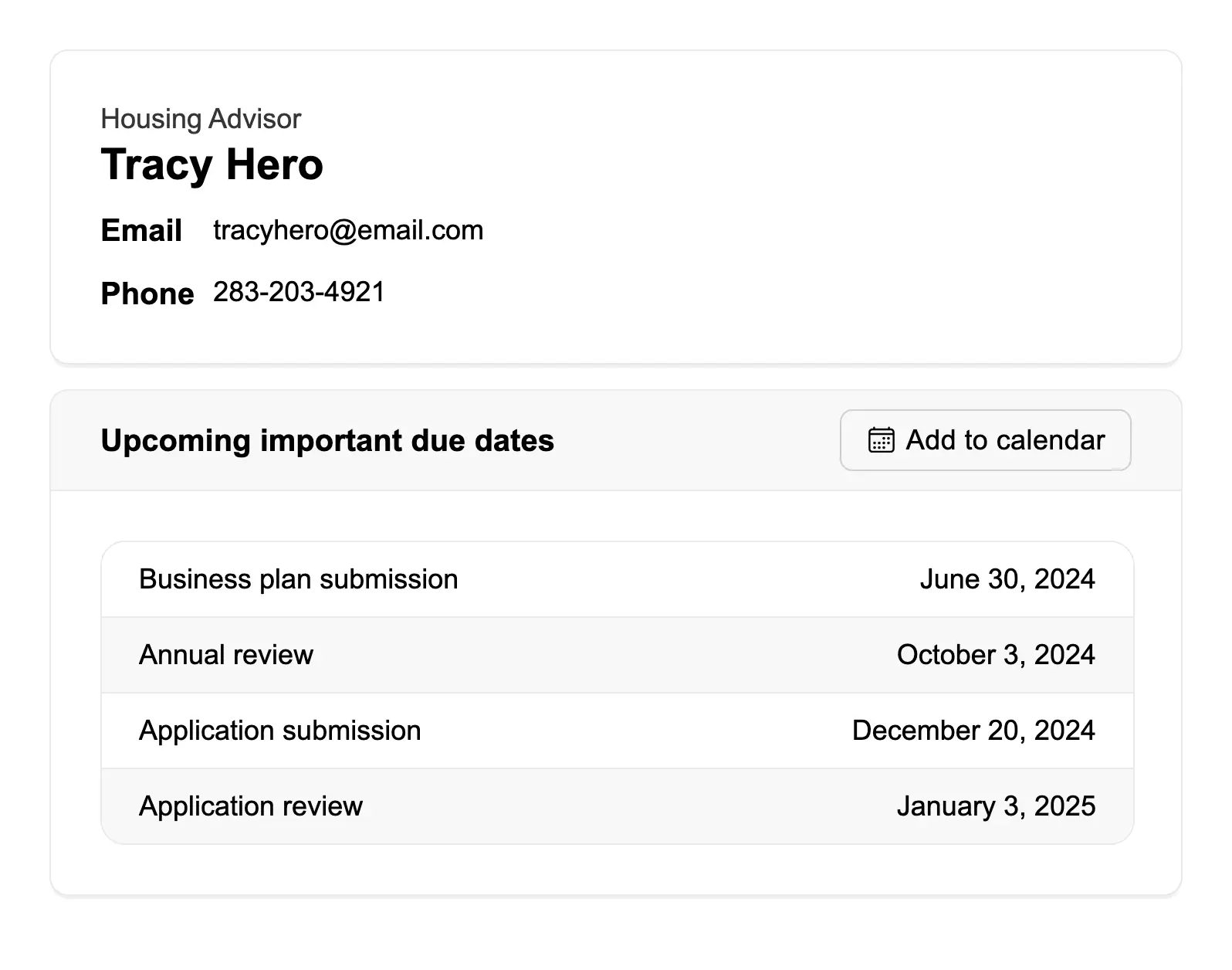
Display user information
Display user contact information and related data using containers with clear visual hierarchy.
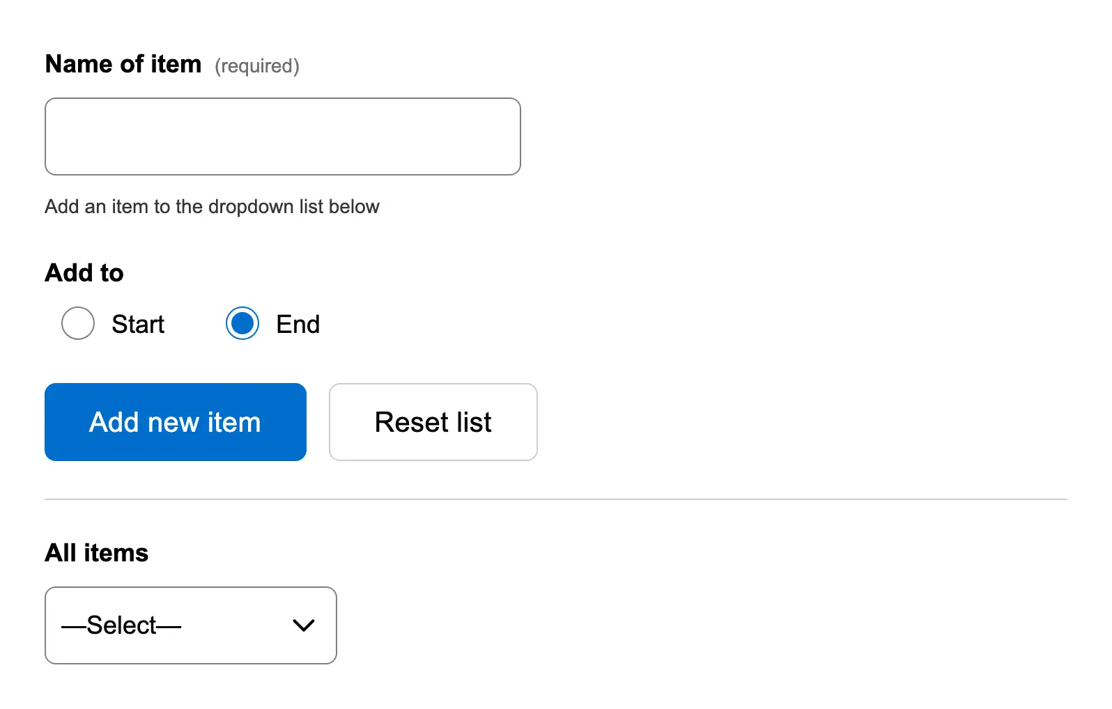
Dynamically add an item to a dropdown list
Allow users to add new items to a dropdown list dynamically.
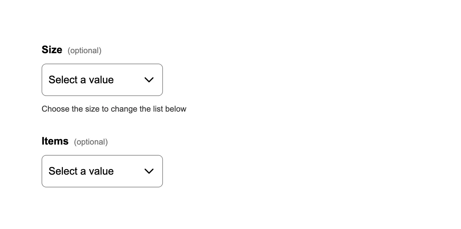
Dynamically change items in a dropdown list
Update dropdown options based on the selection in another dropdown (cascading/dependent dropdowns).
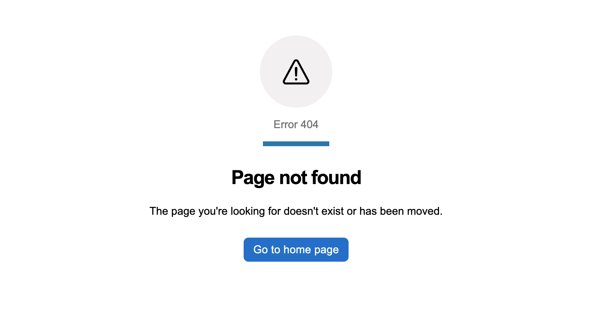
Error pages
Standard error screens for Government of Alberta services. Use when a user lands somewhere that is missing, forbidden, o...
Expand or collapse part of a form
Use accordions to organize form review sections that users can expand or collapse.
Filter a list using a push drawer
Use a push drawer to house filters alongside a list of records. The push drawer keeps the filter controls accessible whi...
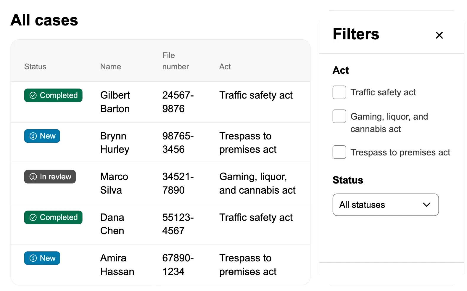
Filter data in a table
Enable users to filter table data using search input and filter chips.
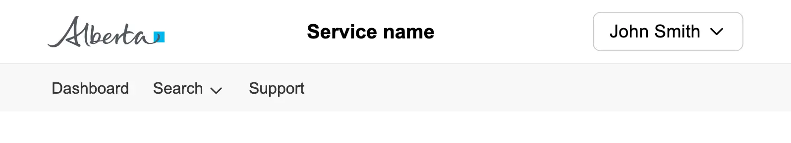
Header with navigation
An application header with navigation links, grouped menu items, and a user account menu.
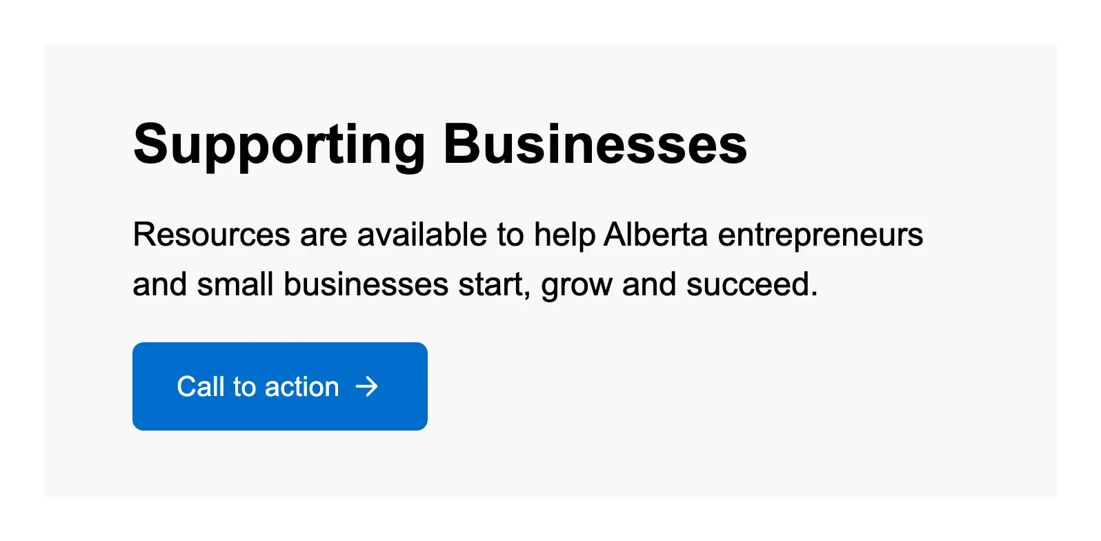
Hero banner with actions
Create a hero banner with a call-to-action button to guide users toward the primary task on a landing page.
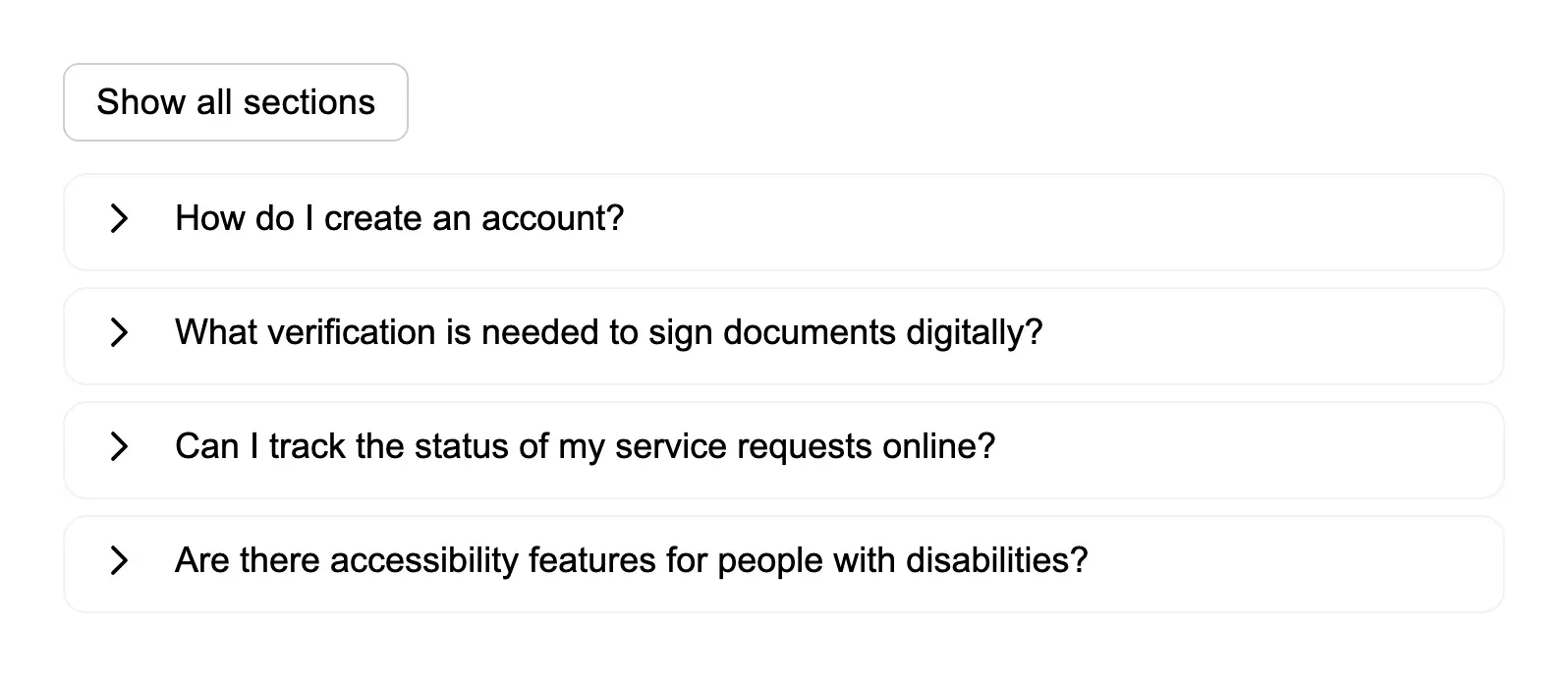
Hide and show many sections of information
Allow users to expand and collapse multiple accordion sections, with a button to show or hide all sections at once.
Include a link in the helper text of an option
Add links within the description text of checkbox options to provide additional context or resources while users are mak...
Include descriptions for items in a checkbox list
Add descriptive text to radio button options to help users understand the implications of each choice.
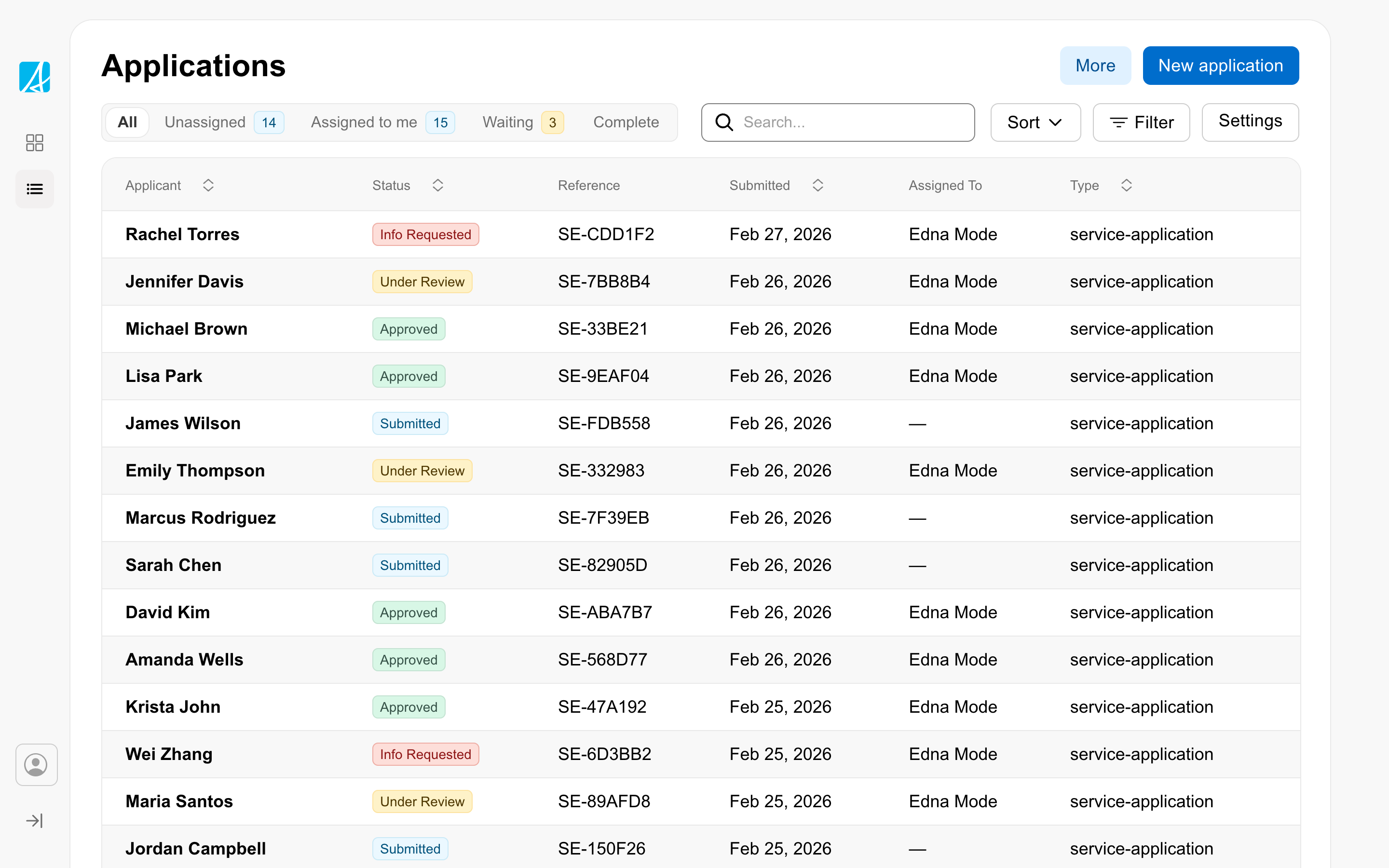
Index page
The page staff land on to scan, filter, sort, and pick records to work on. The home of the workspace's daily queue.

Link the user to give feedback to the service
Use the microsite header's feedback functionality to collect user feedback during alpha or beta phases of a service.

Link to an external page
Use an external link indicator to show users when a link will take them to a different website.
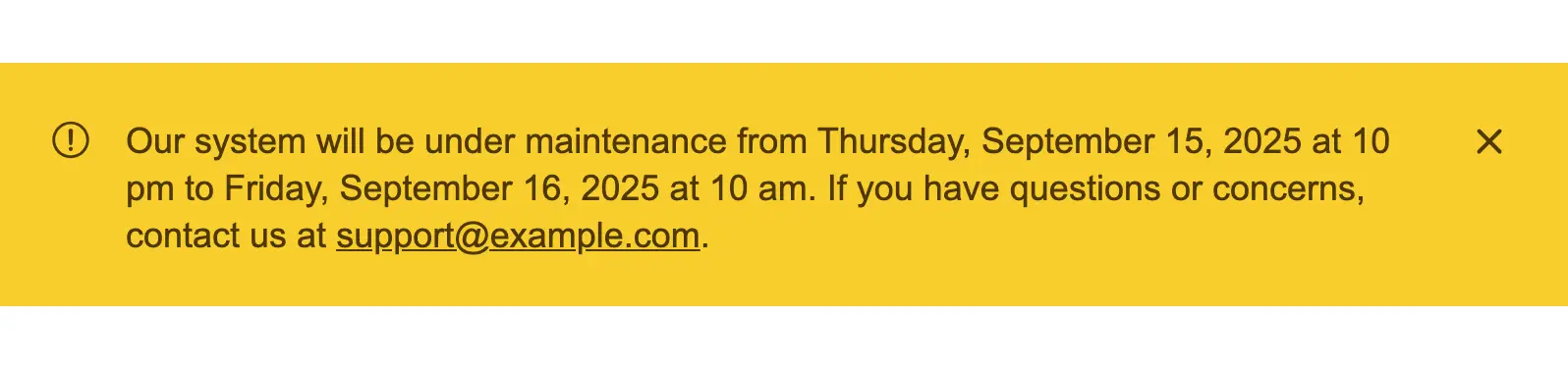
Notify the user of a future service outage
Display a clear message to inform users about an upcoming service outage, including the date, time, and expected impact ...
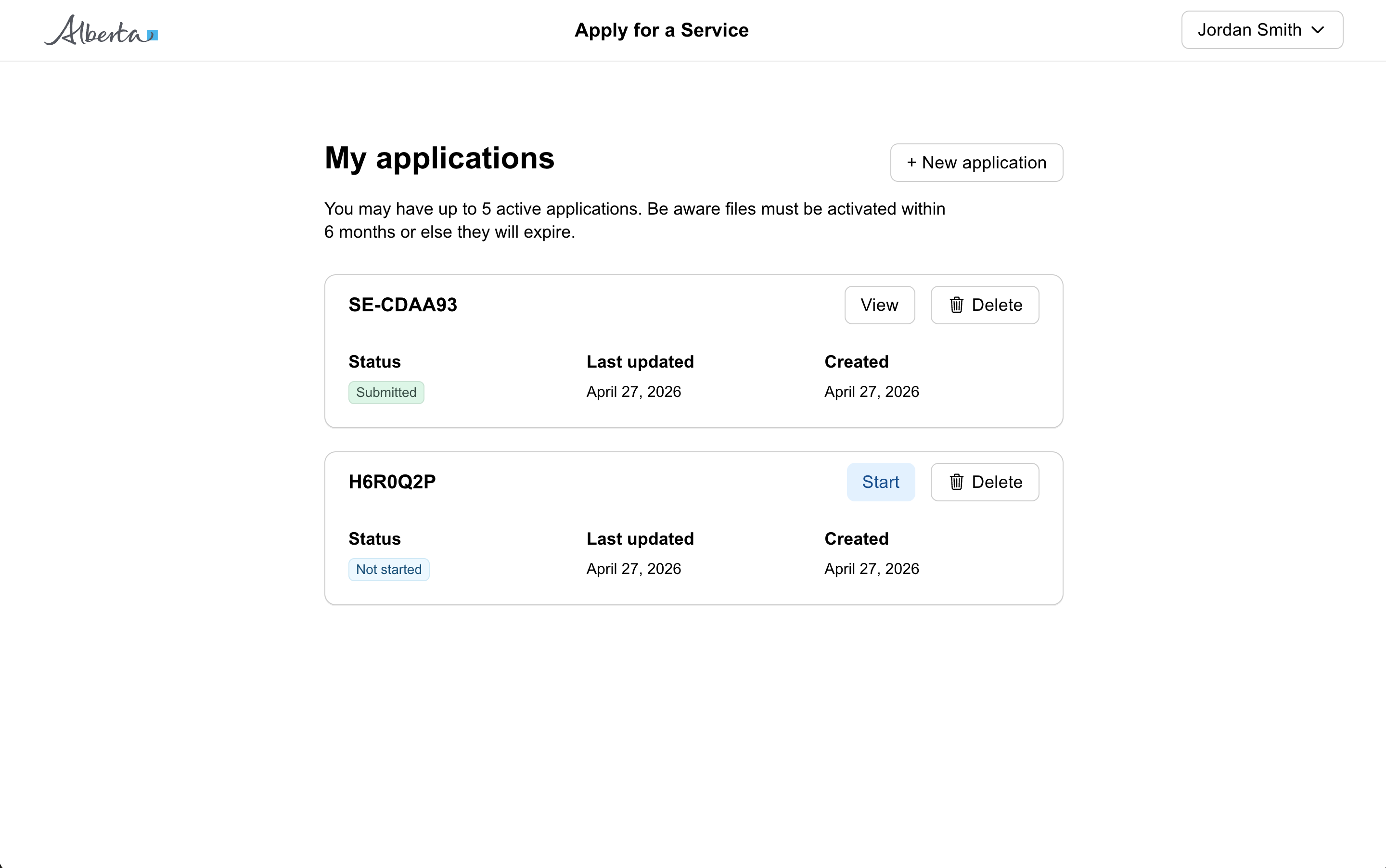
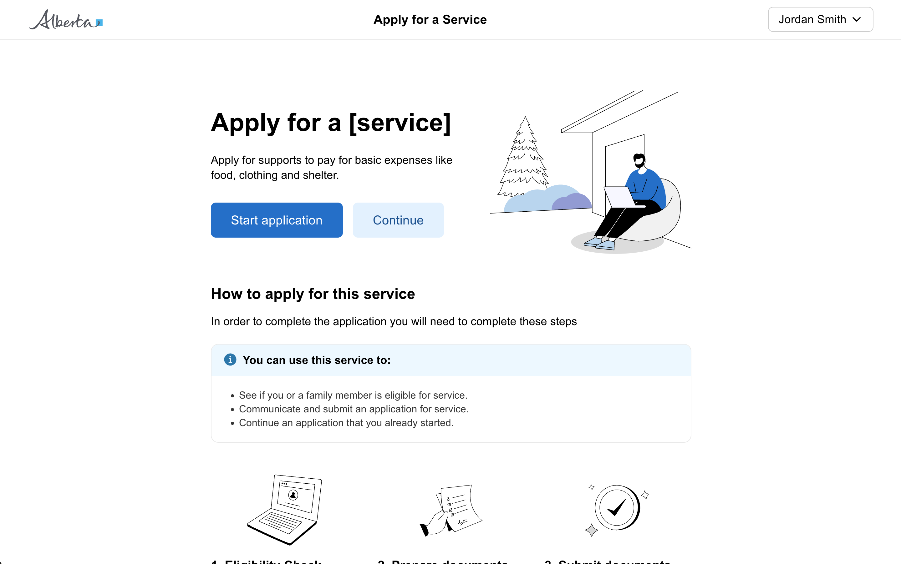
Public form
For citizen-facing services where users apply for a benefit, request a service, or submit information. Designed around s...
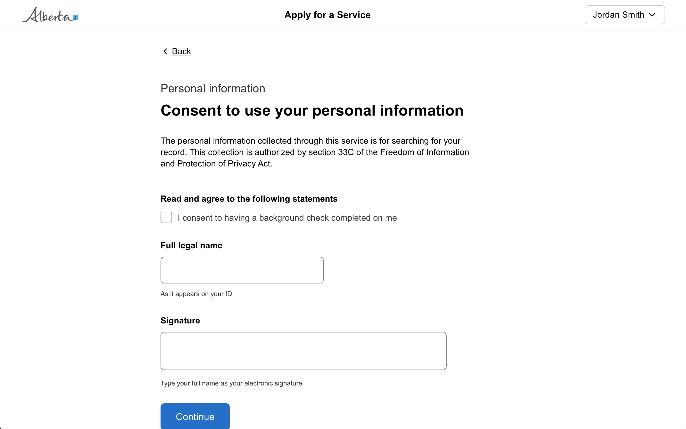
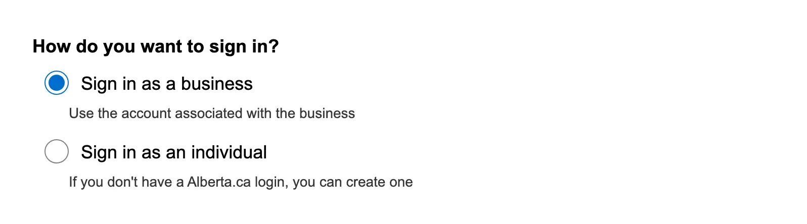
Question page
A question page presents one focused step in a multi-step form. Several variants adapt the shape: section titles, progre...

Remove a filter
Allow users to remove active filters by clicking on filter chips, providing clear visual feedback and dynamic updates to...
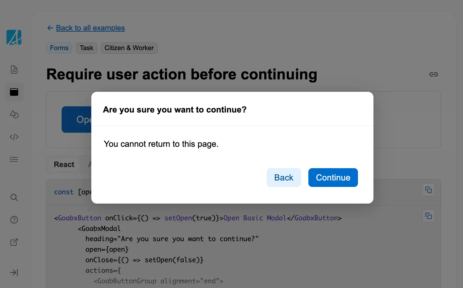
Require user action before continuing
Use a modal dialog to require users to confirm an action before proceeding, especially for irreversible operations or im...
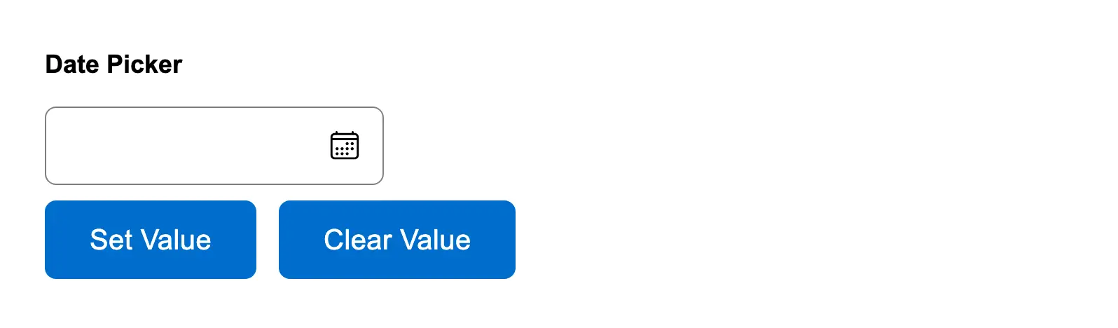
Reset date picker field
Allow users to programmatically set or clear a date picker field value, useful for reset functionality or setting defaul...
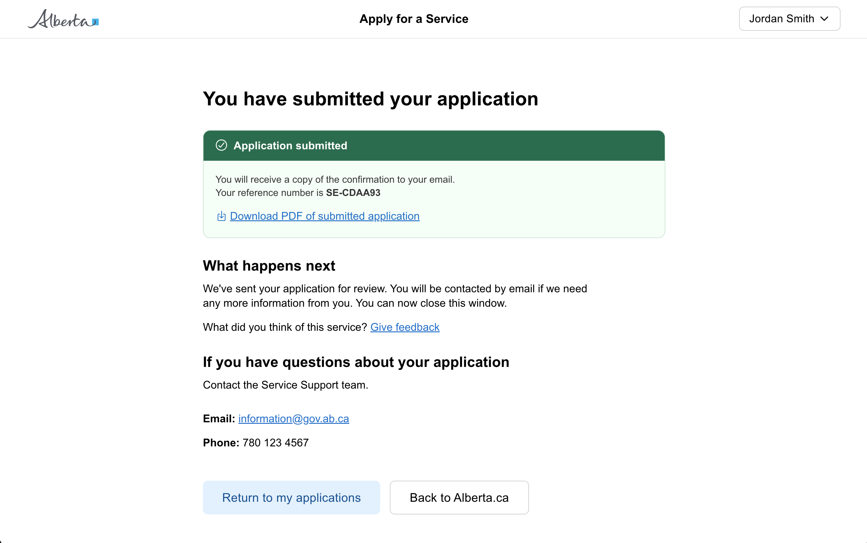
Result page
A result page shown after a citizen has submitted a form, application, or task. Confirms success, explains what happens ...
Reveal input based on a selection
Progressively reveal additional form fields based on user selections, reducing visual complexity while gathering necessa...
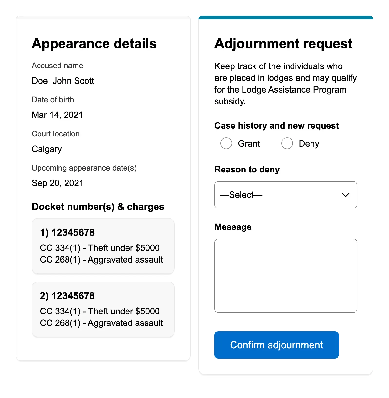
Review and action
A side-by-side layout for workers to review case details while taking an action, commonly used in case management and ap...
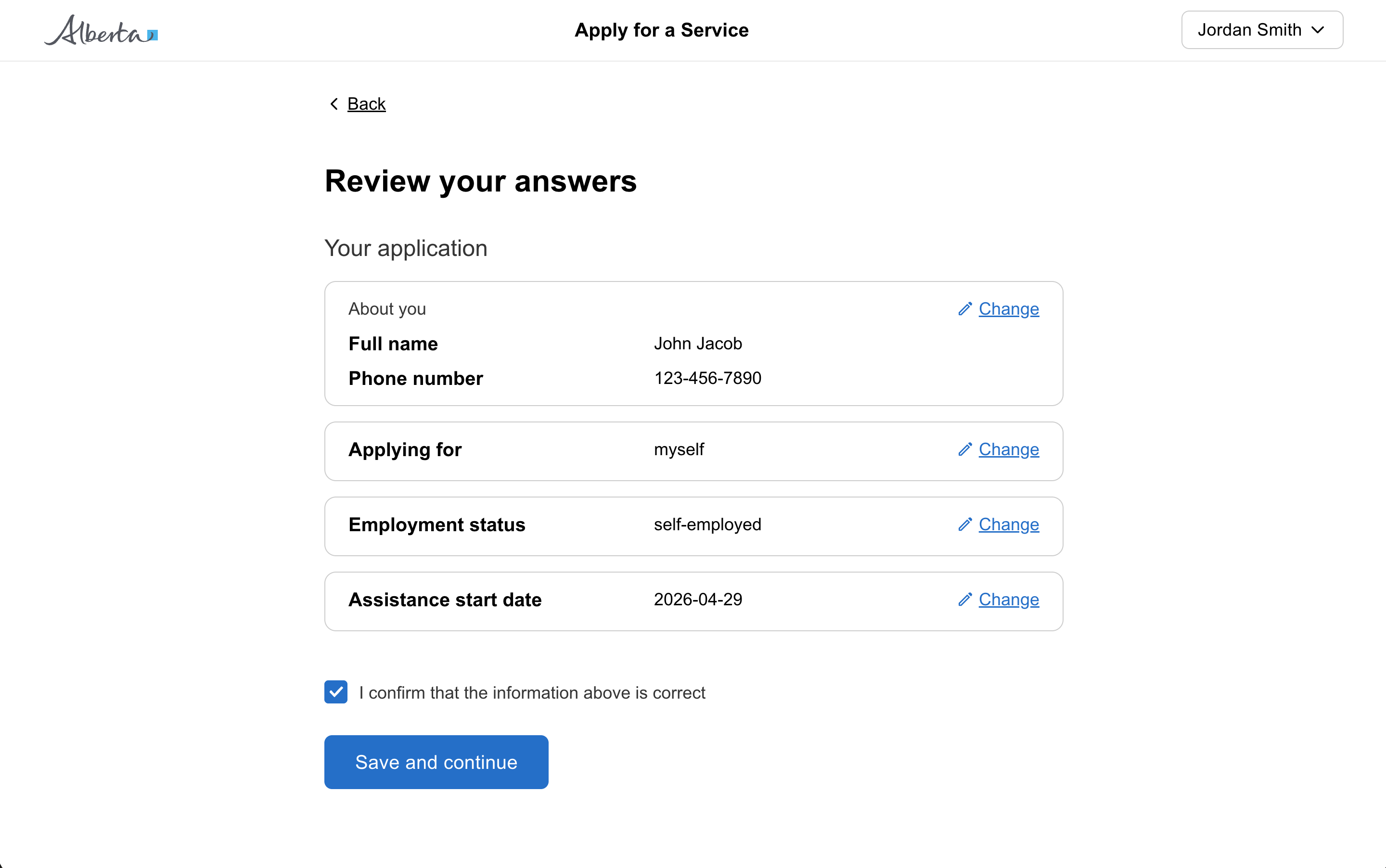
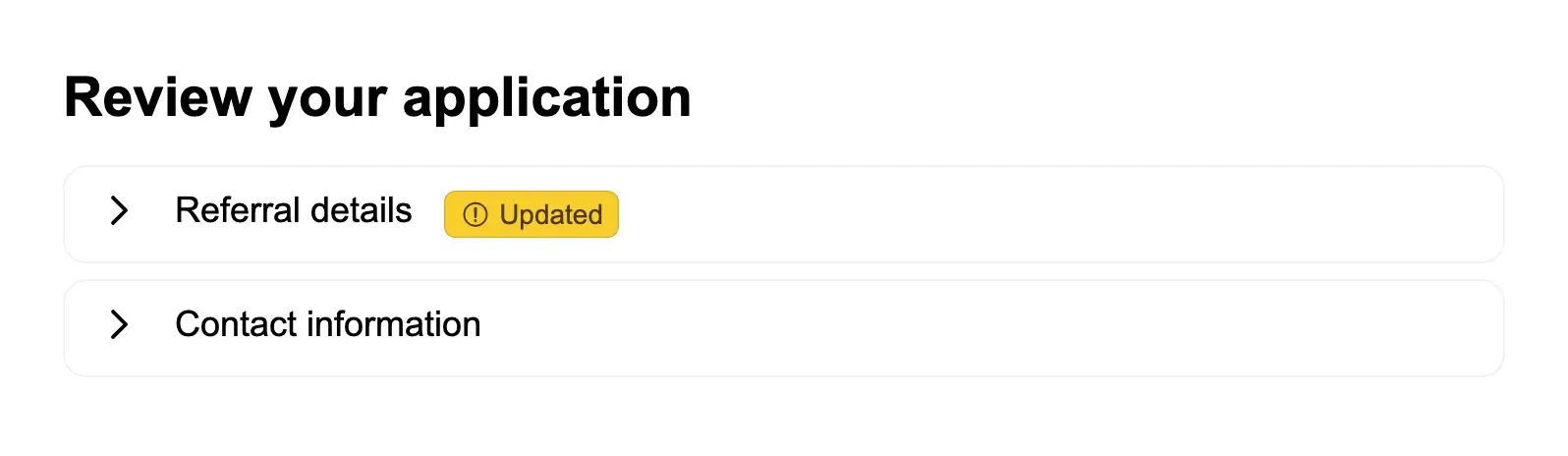
Review page
A review page lets a user check their answers at the end of a form or section before submitting. Each answer has a "chan...

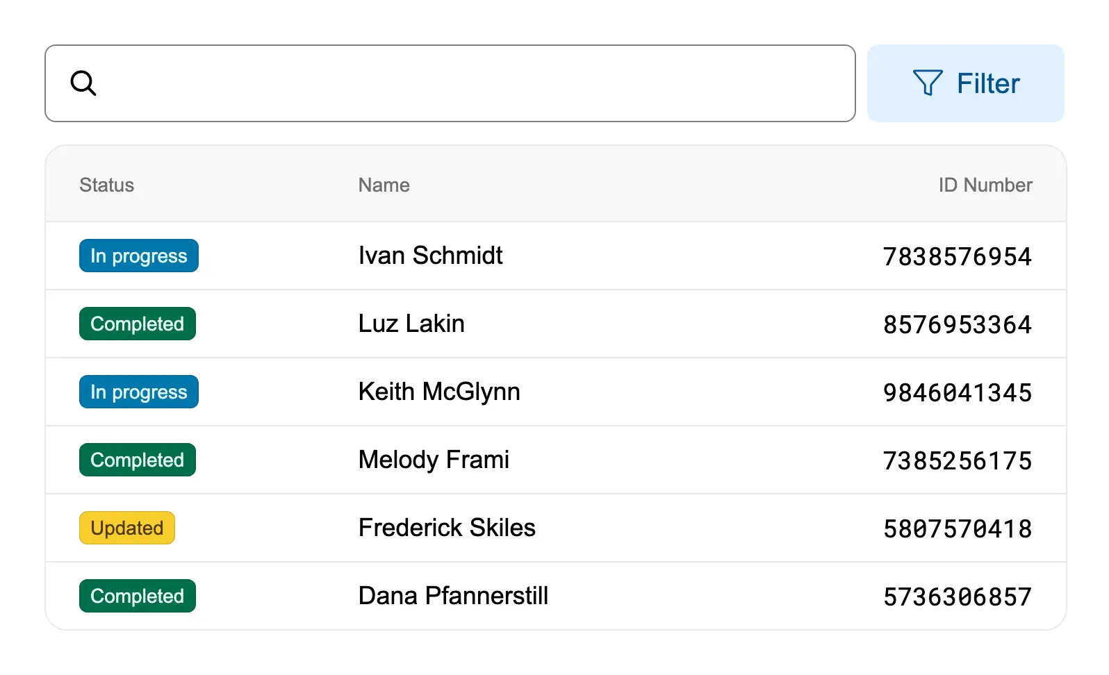
Search
A search input pattern with a search icon and button for users to find content or filter results.
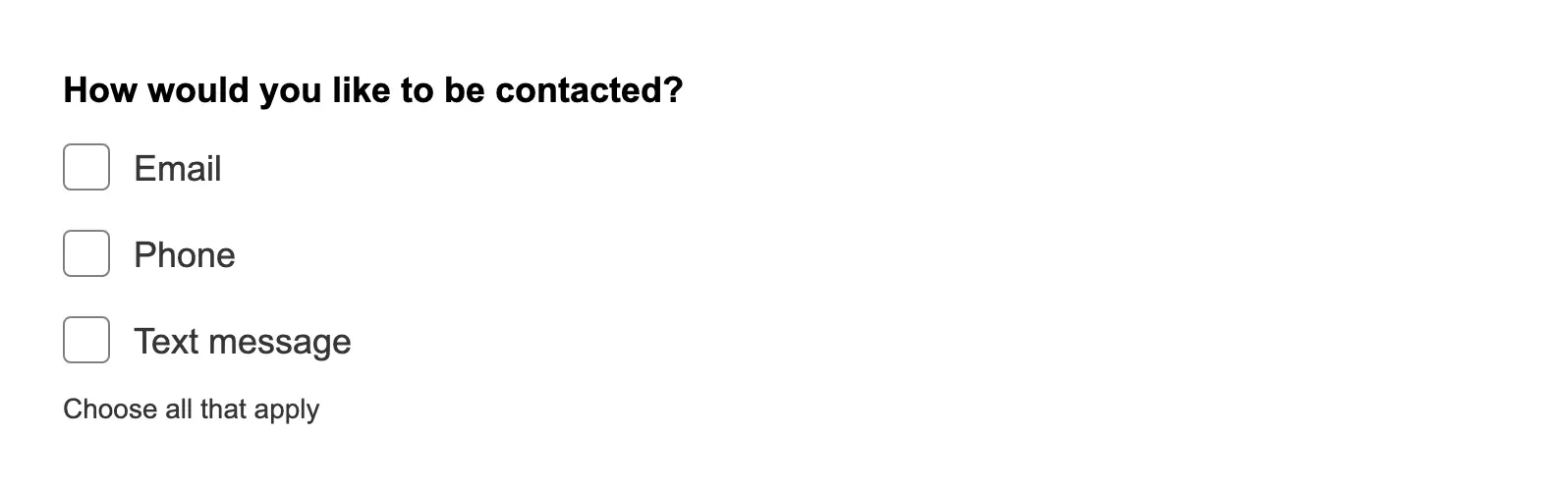
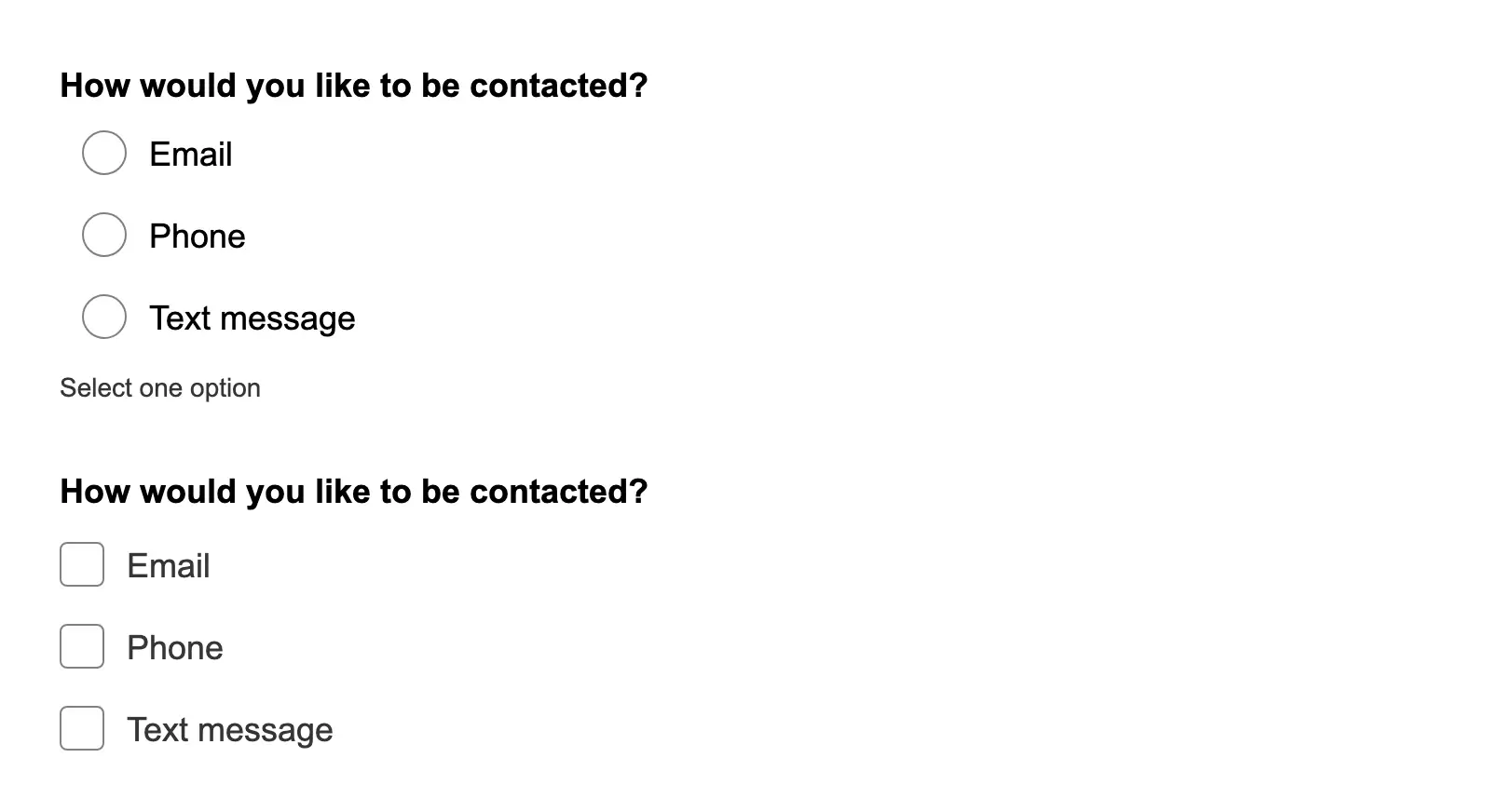
Select one or more from a list of options
Use checkboxes to let users select one or more options from a list when multiple selections are valid.
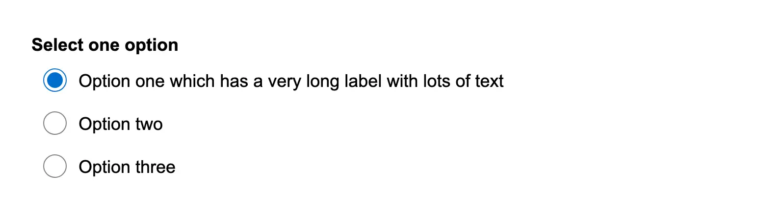
Set a max width on a long radio item
Set a max width on a long radio item to control line wrapping.
Set a specific tab to be active
Set a specific tab to be active on page load using the initialTab property.
Show a label on an icon only button
Show a label on an icon-only button using a tooltip to improve discoverability.
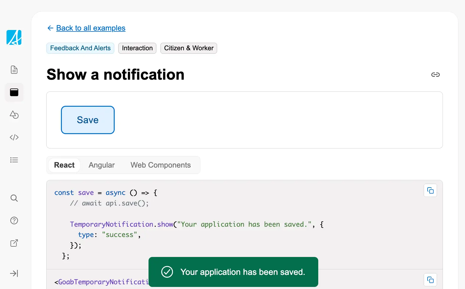
Show a notification
Show a temporary notification to confirm an action was completed successfully.
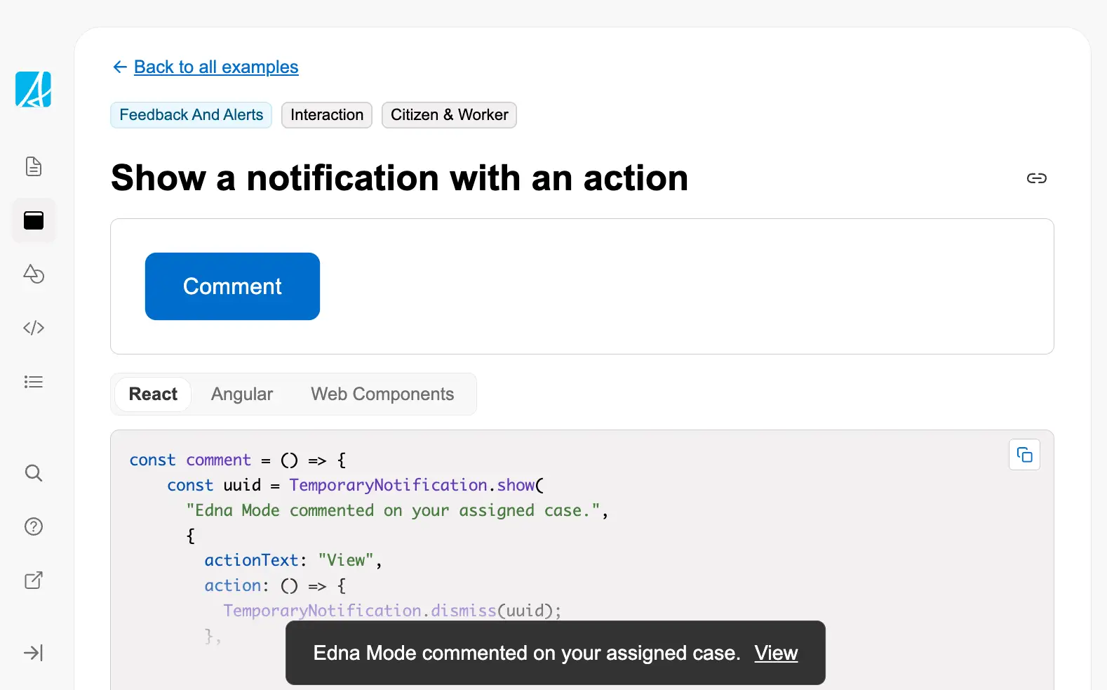
Show a notification with an action
Show a temporary notification with an action button for user interaction.
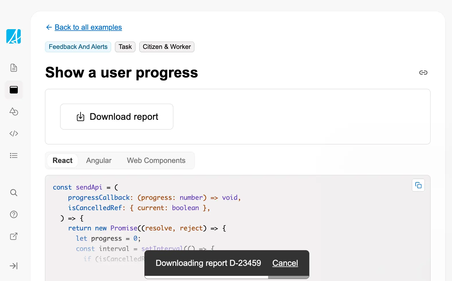
Show a user progress
Display progress feedback during long-running operations like downloads, showing percentage completion with the ability ...
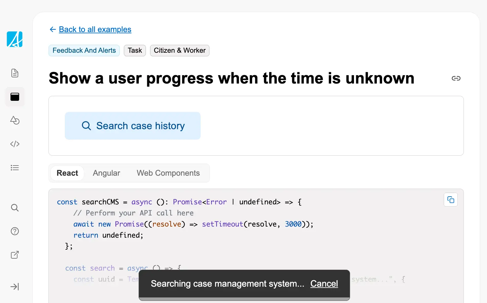
Show a user progress when the time is unknown
Display indeterminate progress for operations where completion time cannot be estimated, such as complex searches or ext...
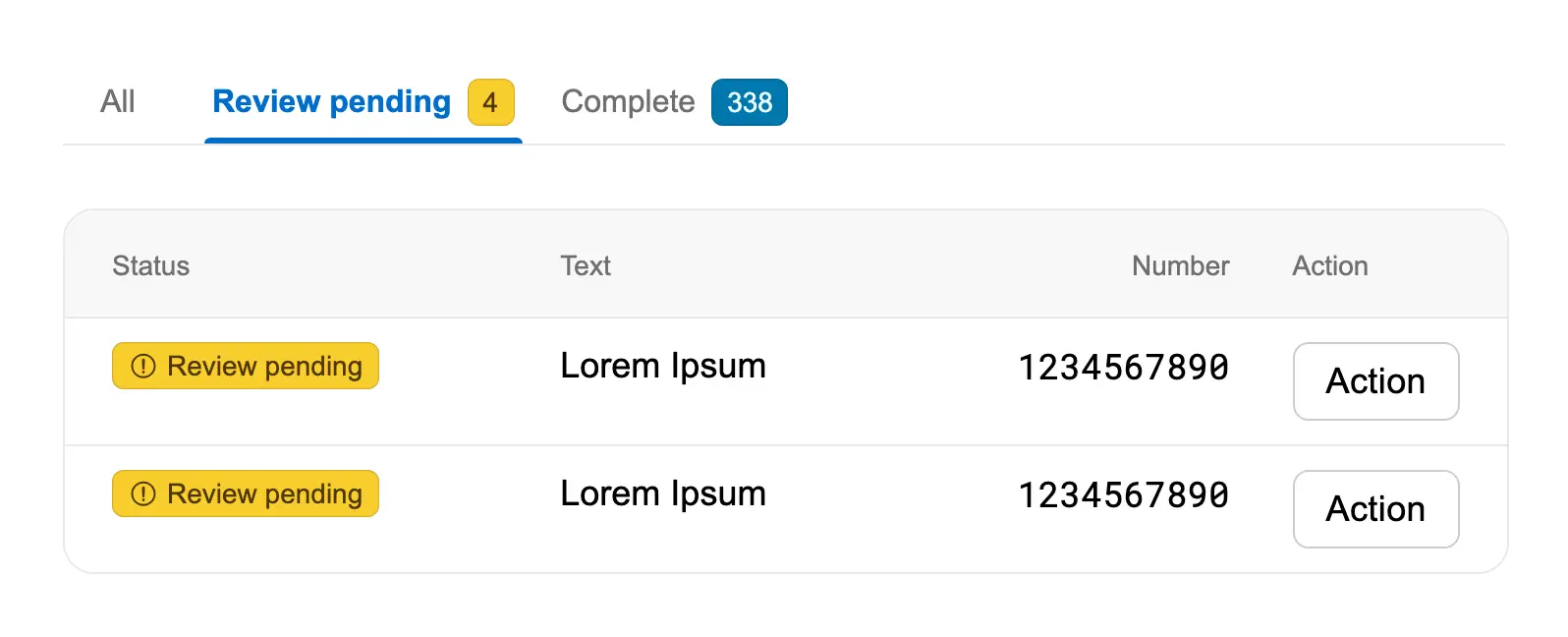
Show different views of data in a table
Use tabs to organize table data into different views based on status or category, showing counts in each tab to help wor...
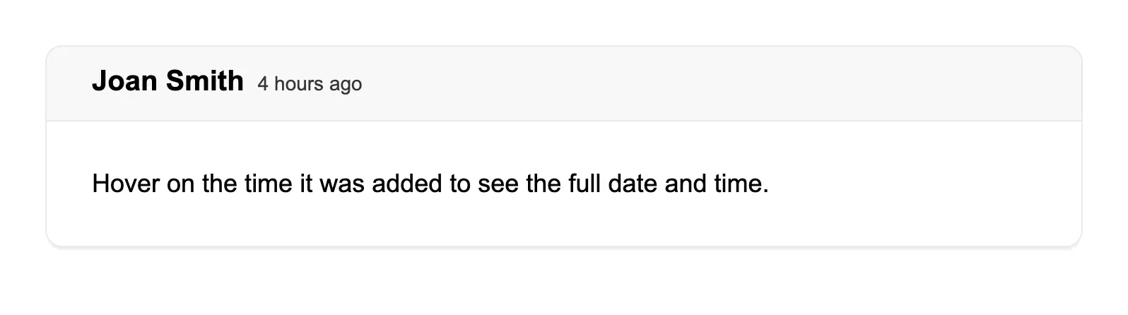
Show full date in a tooltip
Display relative time (like "4 hours ago") while providing the full date and time on hover via tooltip for users who nee...
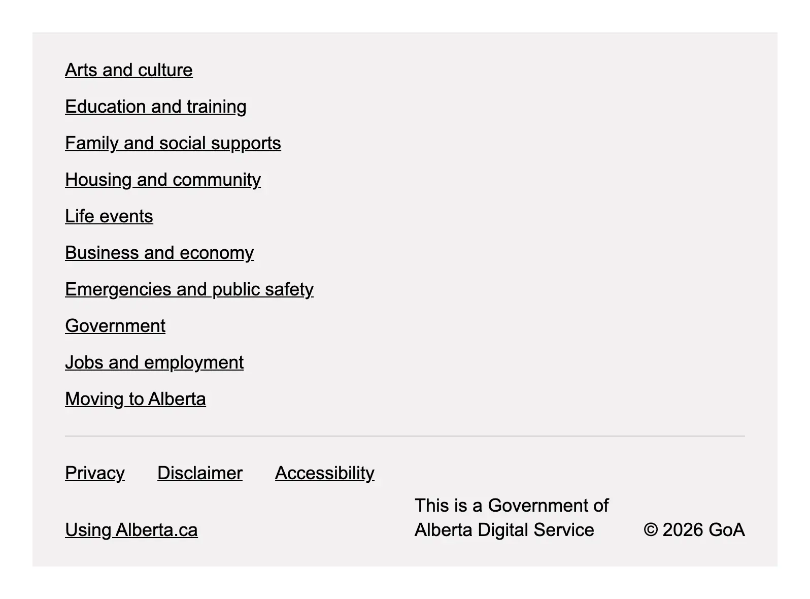
Show links to navigation items
Use the app footer to display comprehensive navigation links organized into sections, along with meta links for common u...
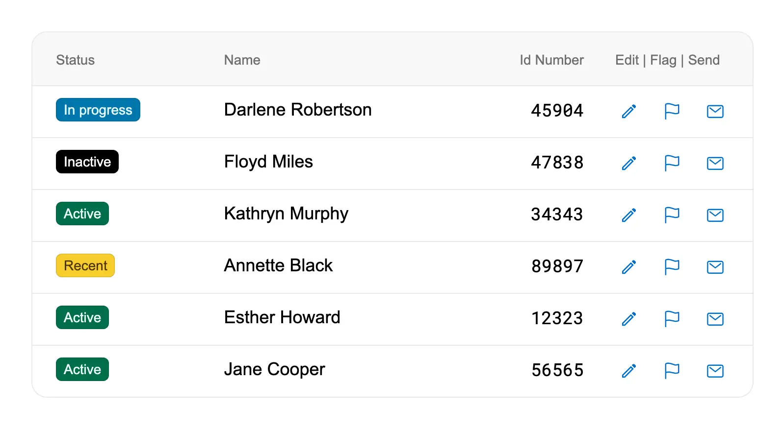
Show multiple actions in a compact table
Use icon buttons to provide multiple row actions in tables where space is limited, keeping the interface compact while m...

Show multiple tags together
Display multiple badges together using GoabBlock with tight spacing to show multiple statuses or categories for a single...
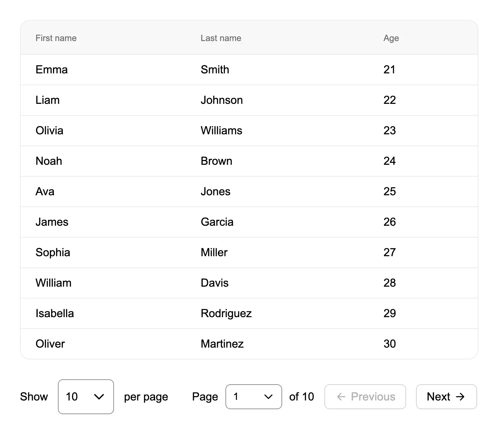
Show number of results per page
Combine pagination with a dropdown selector to let users control how many results appear per page, improving data browsi...
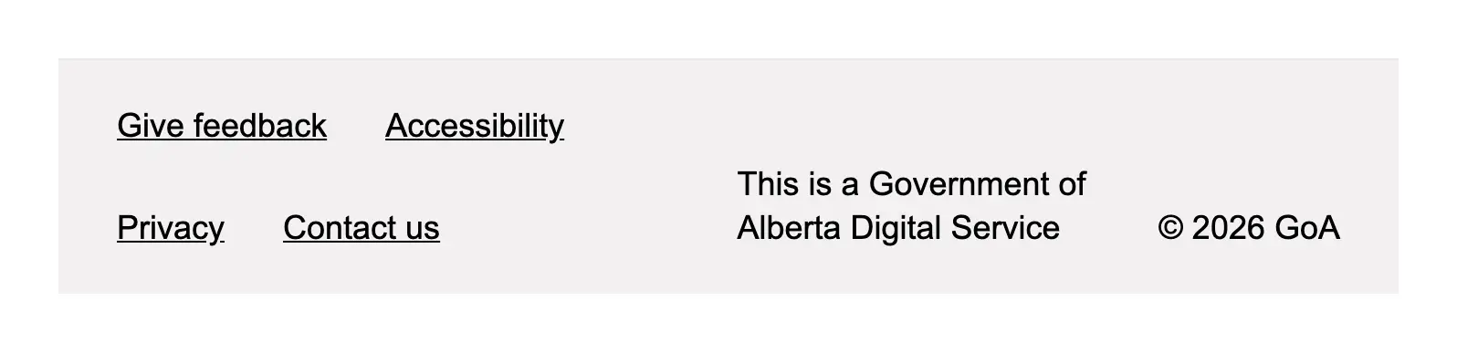
Show quick links
Use the app footer meta section to display essential quick links like feedback, accessibility, privacy, and contact info...
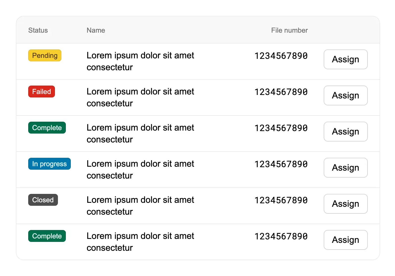
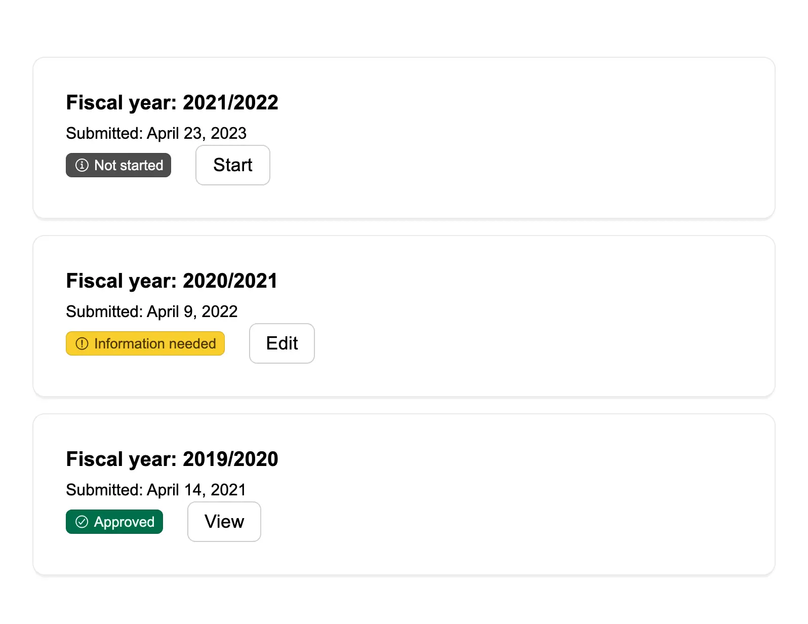
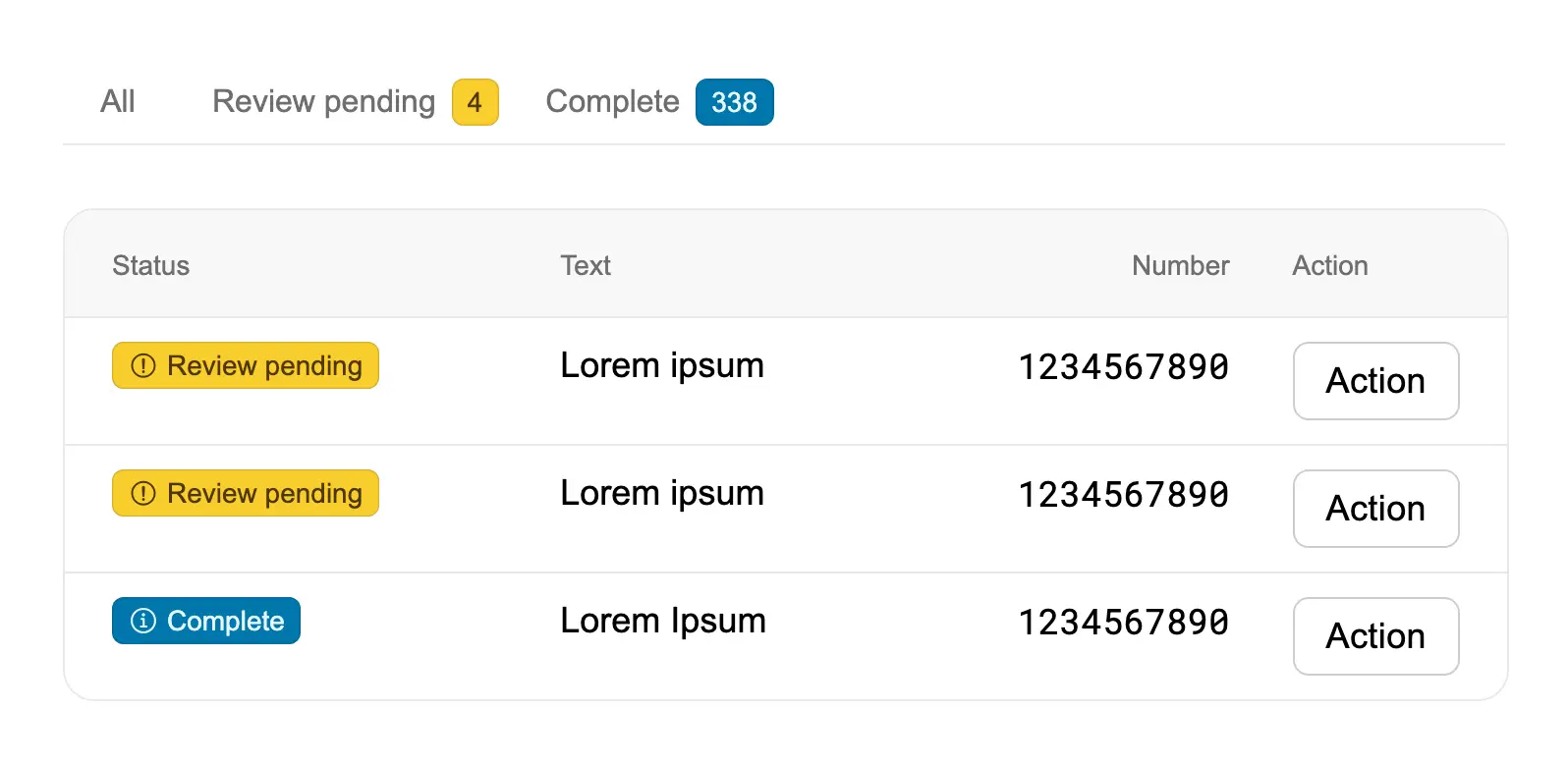
Show status in a table
Display status information within table rows using badges to provide clear visual indicators of item states like pending...
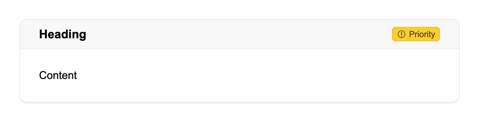
Show status on a card
Display status indicators on cards using badges in the actions slot, allowing workers to quickly see the priority or sta...

Show version number
Display version information in the microsite header using the version slot, allowing custom formatting and styling of ve...
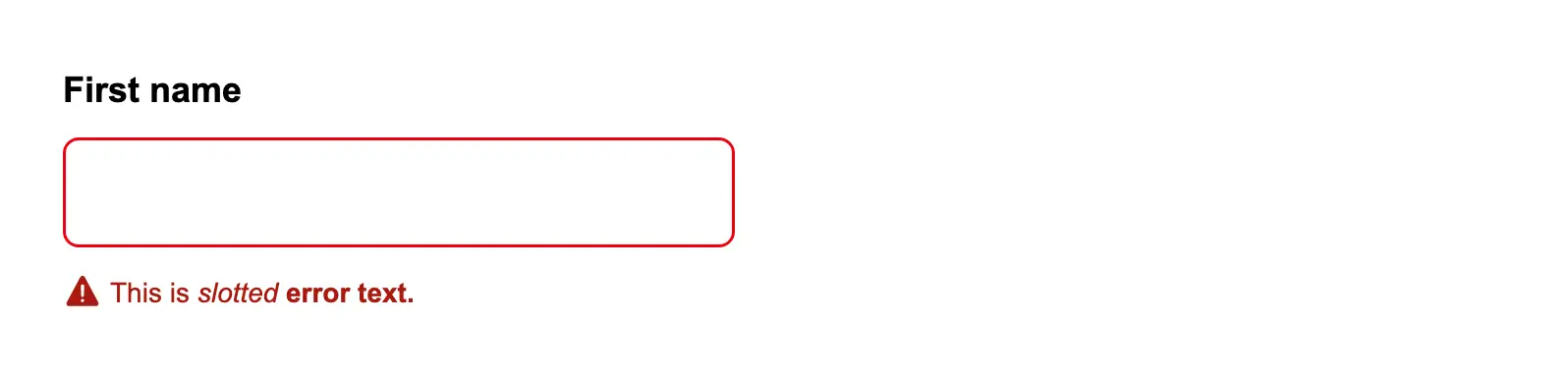
Slotted error text in a form item
Use the error slot in a form item to display formatted error messages with custom styling like bold or italic text.
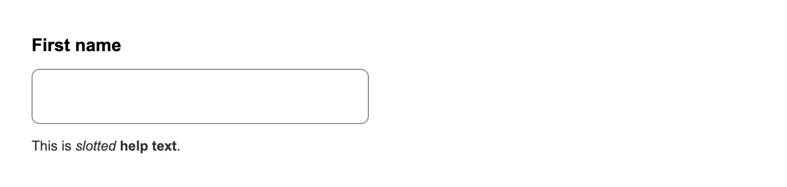
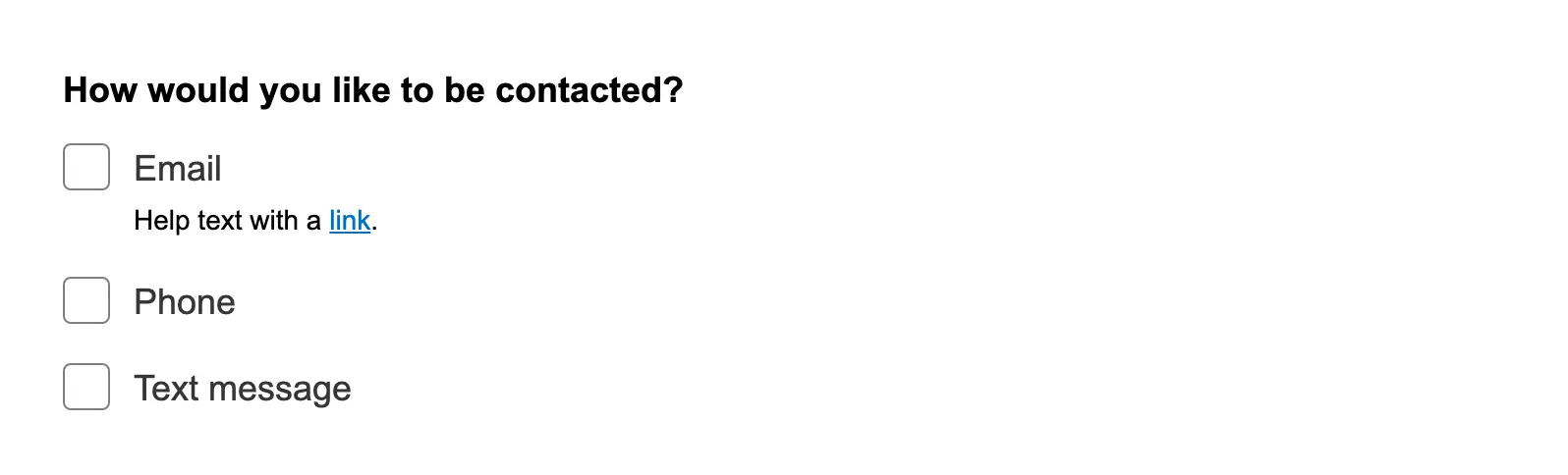
Slotted helper text in a form item
Use the helpText slot in a form item to display formatted helper text with custom styling like bold, italic, or links.
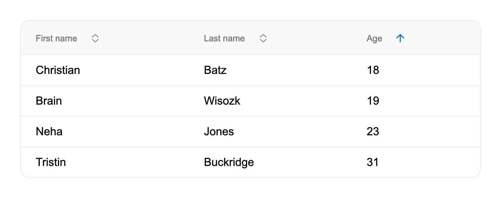
Sort data in a table
Enable column sorting in tables using sort headers, allowing workers to organize data by clicking column headers to togg...
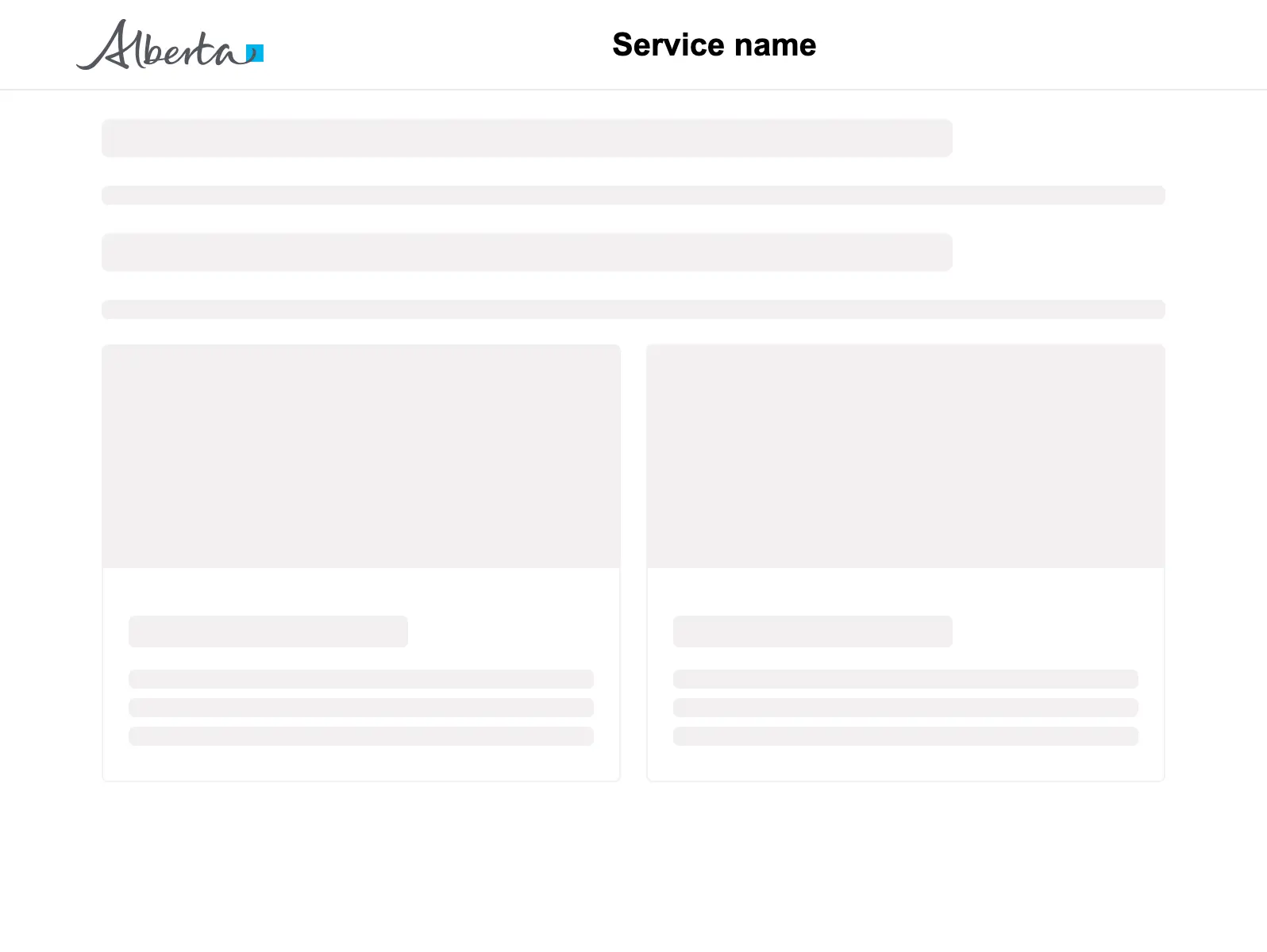
Start page
The front door to a government service for a citizen. It is the way into the service and how citizens access it. Each go...
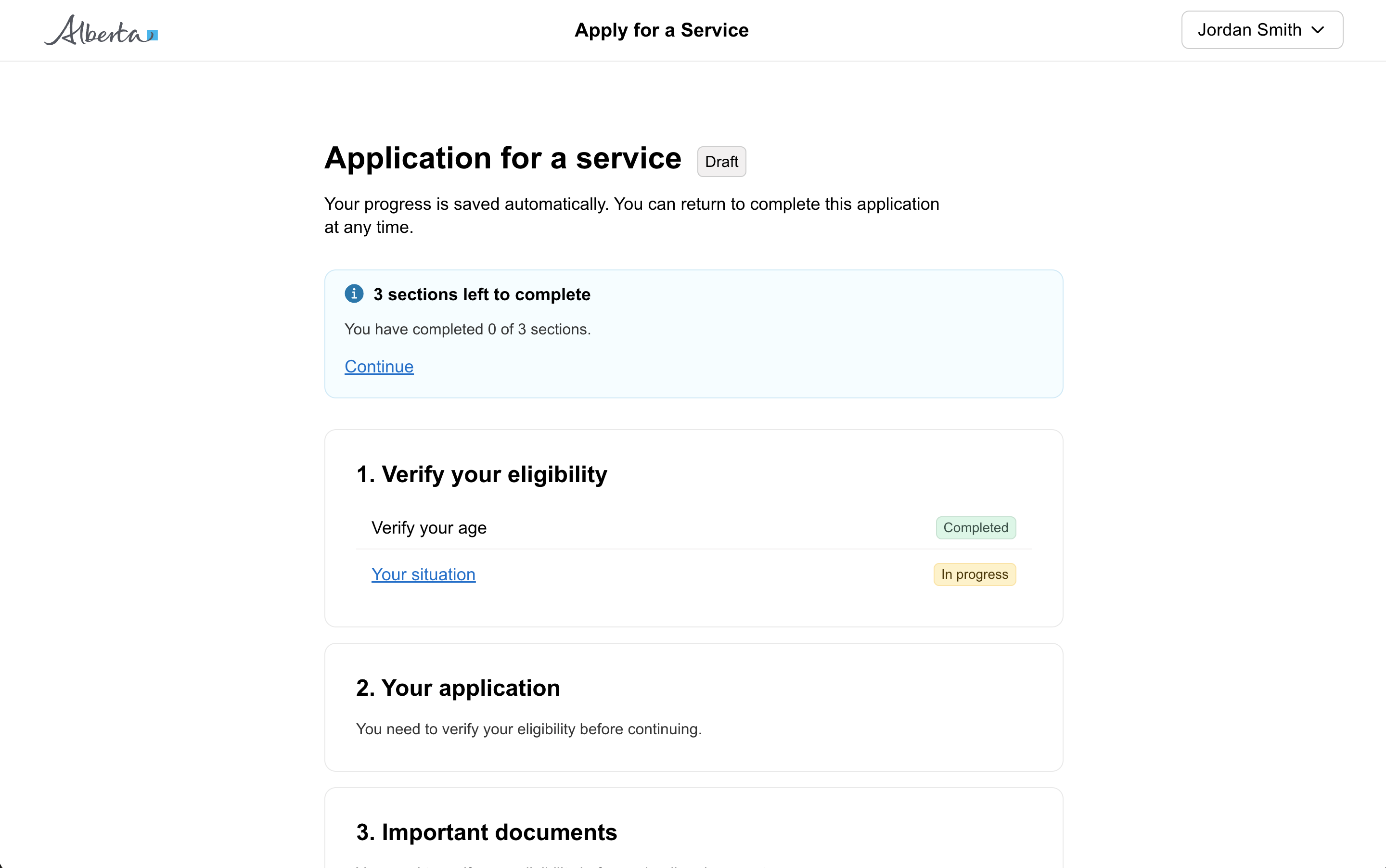
Task list page
A page that provides structure for multiple steps in a service. Use a task list to outline the entire process and show t...
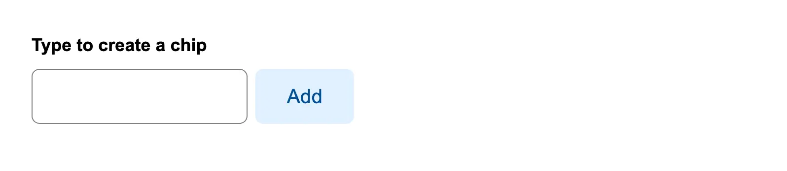
Type to create a new filter
Allow users to type custom filter values and create filter chips by pressing Enter, with the ability to remove chips usi...
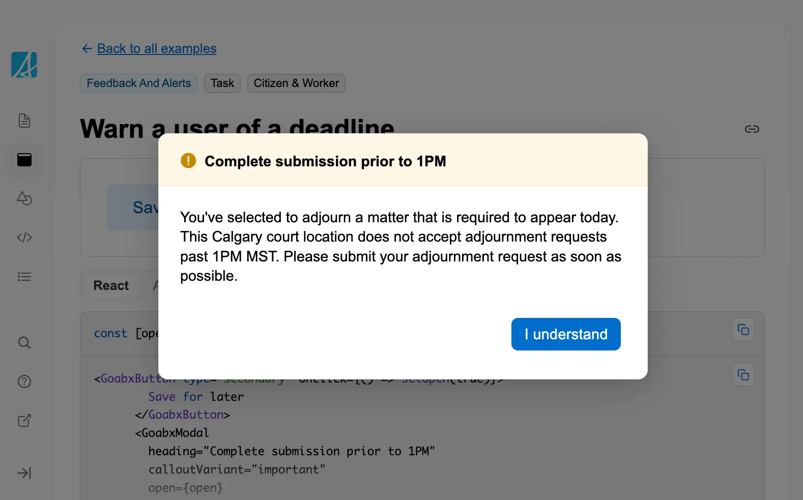
Warn a user of a deadline
Use a modal with important callout styling to warn users about time-sensitive deadlines that could affect their submissi...
Workspace
The workspace is for productivity-focused services used by service delivery staff as a daily tool to review information,...