Public form
For citizen-facing services where users apply for a benefit, request a service, or submit information. Designed around simplicity and low cognitive load, with plain-language questions, focused pages that ask one thing at a time, save-and-resume, and a clear confirmation of what happens next.
The reference example is a starting point to expand on, not a rigid template. Adapt it to fit each service's context.
Pages
A public form is built from a small set of page types. Combine and adapt them to fit the work the service supports.
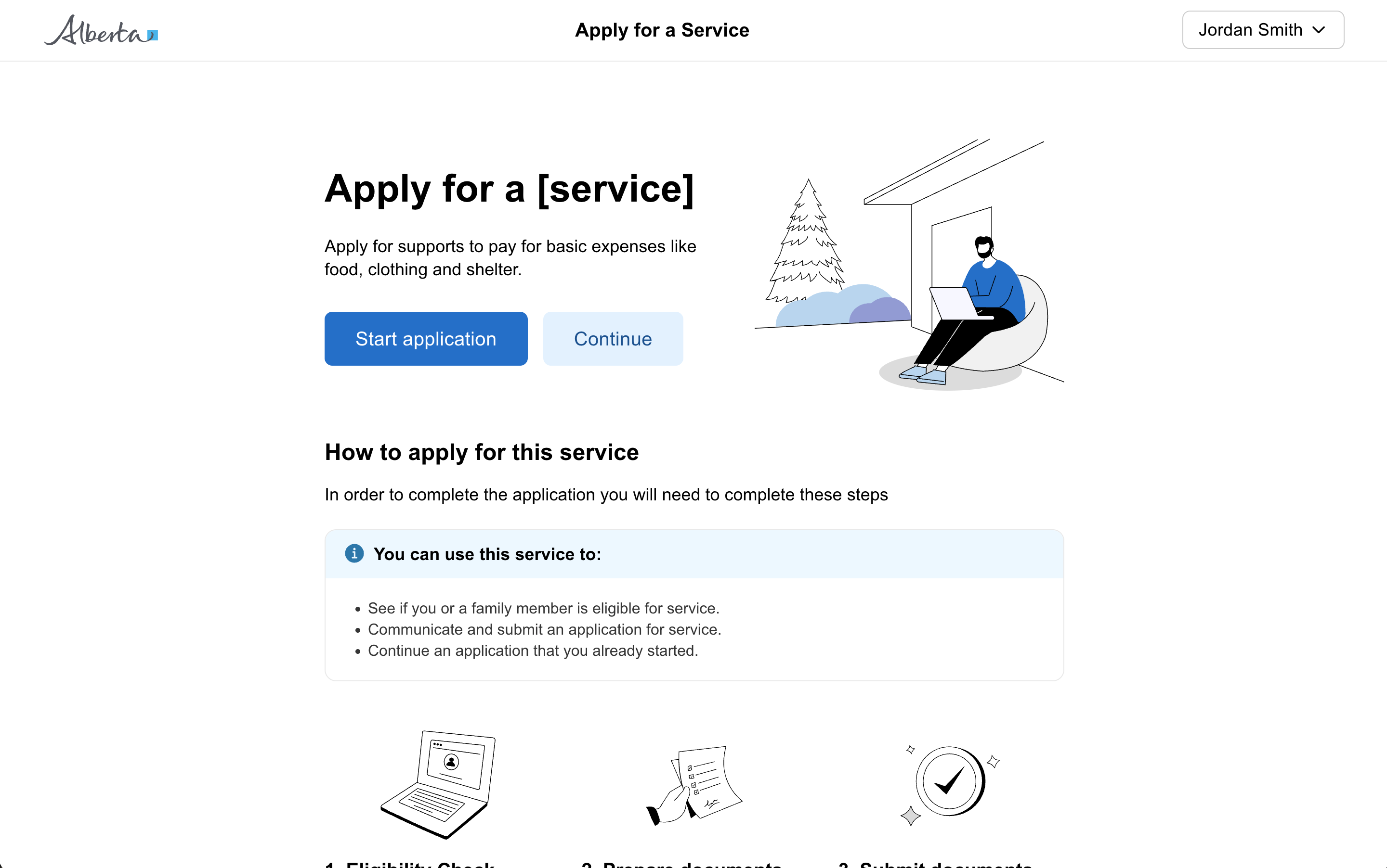
Start page
The starting point for a citizen to begin your form from within your service or from Alberta.ca.
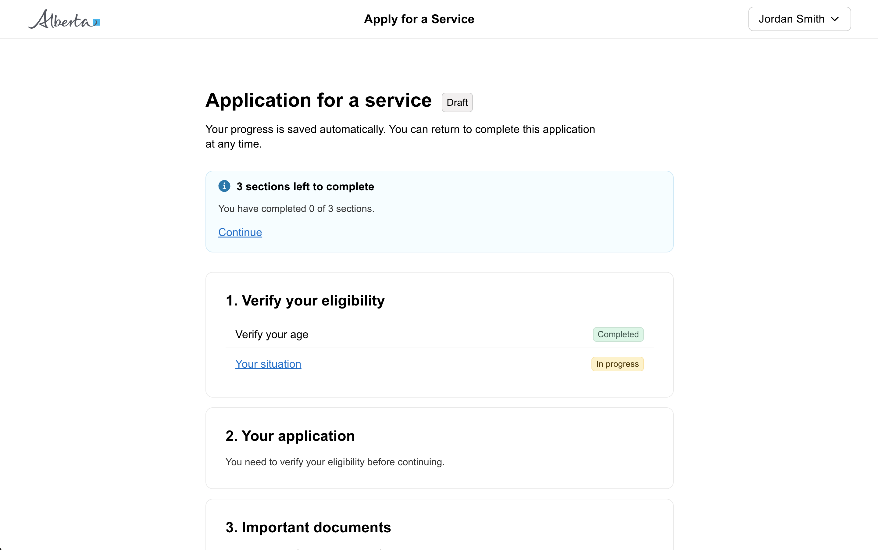
Task list page (optional)
Outline the entire process for the user and help them through it by breaking the experience into individual tasks. Use it for longer or multi-section forms.
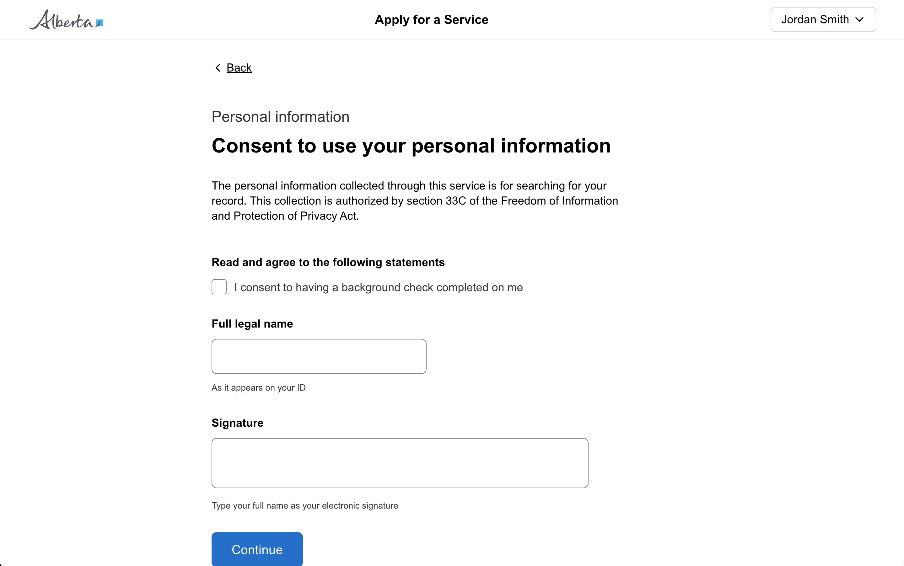
Question page
Ask a user a question, or a small set of closely related questions. The most common page in a public form. Several variants cover progress indicators, section titles, background context, expandable help, and grouped fields.
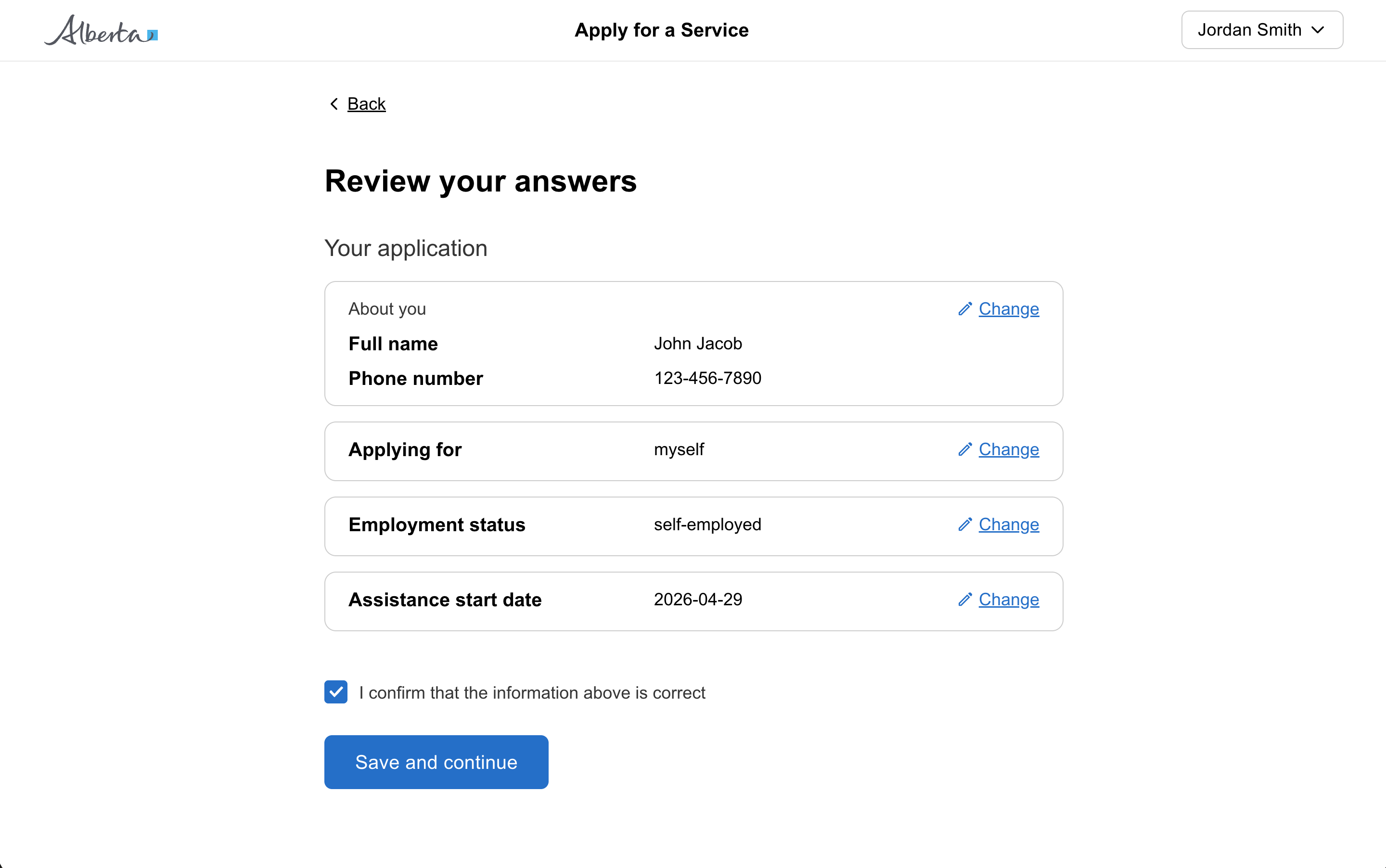
Review page
Let users check their answers before submitting information to the service. Group answers by section and let the user jump back to any answer they want to change.
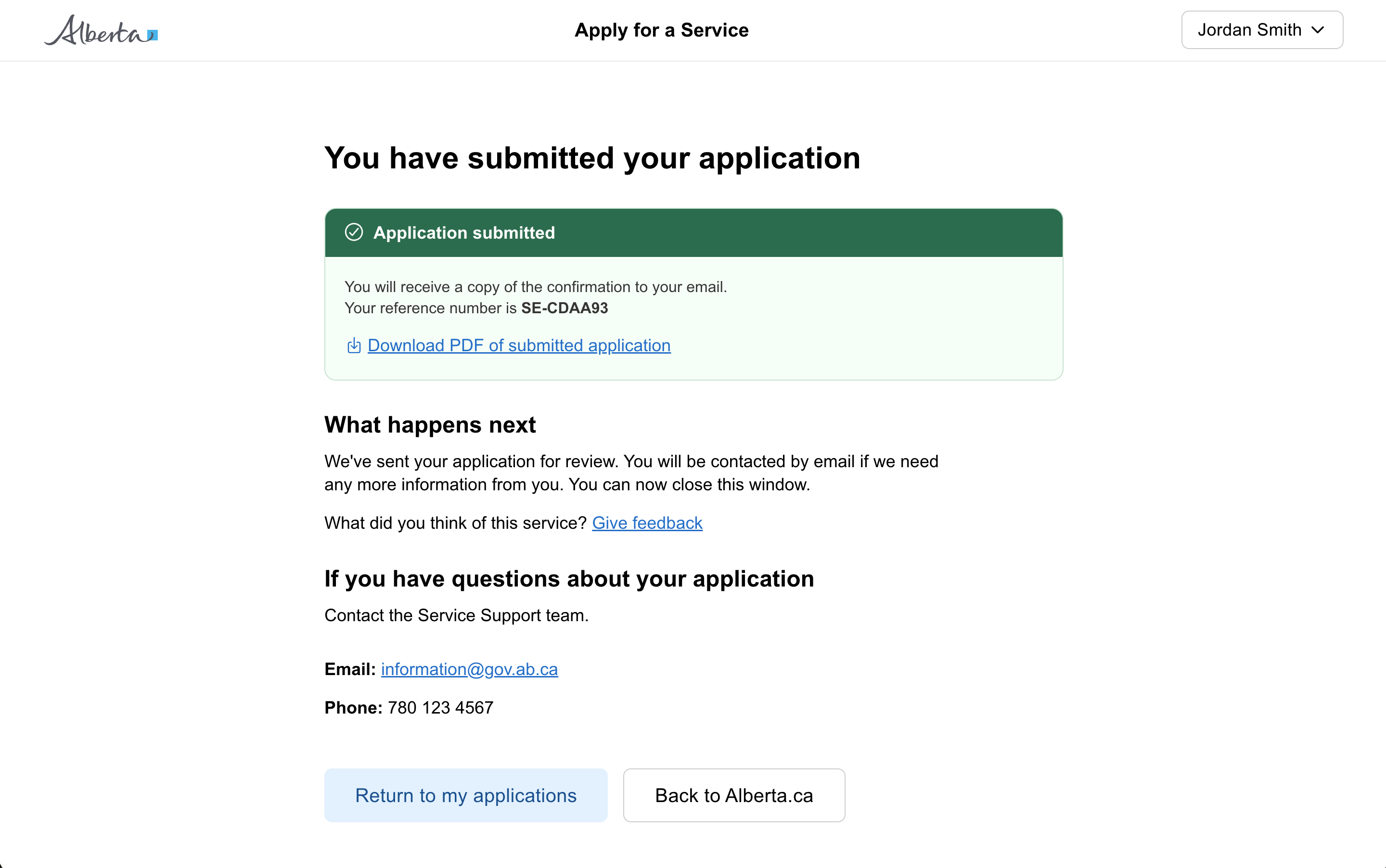
Result page
Confirm to users that they have completed a form, application, or task, and tell them what to do next.
Form structure
Use the public form structure focused on content. Asking the right questions in the right shape keeps the interaction as simple as possible.
Start with one idea per page
Split the form across multiple pages with each page containing just one idea. For example:
- one decision they have to make
- one question they have to answer
- one piece of information you are telling a user
Starting with one thing per page helps users to:
- understand what you are asking them to do
- focus on a specific question and its answer
- find their way through an unfamiliar process
- use the service on a mobile device
- recover easily from form errors
It also helps the service to:
- handle branching questions and loops
- design for mobile use
- save a user’s answers automatically as they go
- capture analytics about each question
Combine questions when helpful
Asking a question does not necessarily mean you should use one form field. Asking a user for their address is best captured all on the same page with multiple fields. See the grouped fields variant on the question page.
When to use
Use the public form pattern when:
- The service is for citizens, not internal staff
- Users may complete the form infrequently and need plain-language guidance
- The form has more than a handful of questions and benefits from being split across pages
- Branching, conditional logic, or save-and-resume matters
Accessibility
Structuring your form with one idea per page simplifies the experience and makes it more accessible.
- Reduced cognitive load. Presenting only one idea at a time reduces cognitive load on the user. This is particularly beneficial for users with cognitive impairments who might find it difficult to process and respond to multiple questions at once.
- Improved navigation for a screen reader. This simplified approach efficiently guides the user through the form based on each answer and makes it easier to navigate with screen readers or other assistive technology.
- Better error handling. With smaller sets of questions validated at a time, errors can be identified and addressed in context. This makes it less confusing and less overwhelming, particularly for users with cognitive impairments and those using assistive technologies.
- Progressive disclosure. One idea per page allows the user to focus on the current task and move through information slowly. This is especially helpful for users who are easily distracted or overwhelmed by too much information.
Adding complexity
Start by making sure the content and questions you are asking the user are as simple as possible.
As the complexity of your form grows, consider:
- adding simple progress indicators on a question page to communicate progress
- breaking the form into sections on a task list page
Form stepper
Avoid using a traditional horizontal form stepper on every form. Research has shown that horizontal steppers shown on every page can distract and confuse some users, take up too much space, and make it hard to handle branching and conditional sections of a form.
As the complexity of your form grows, consider:
- adding simple text progress indicators to communicate progress
- following the one idea per page approach, and breaking the form into sections as needed using a task list page