Error pages
Standard error screens for Government of Alberta services. Use when a user lands somewhere that is missing, forbidden, or broken so they understand what happened and what to do next.
Types of error pages
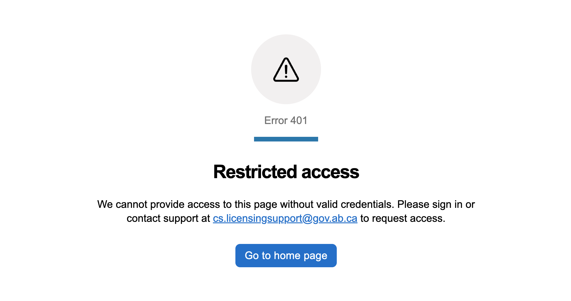
Restricted access (401)
The user is not authorized, either because they need to sign in or because they lack the right permission.
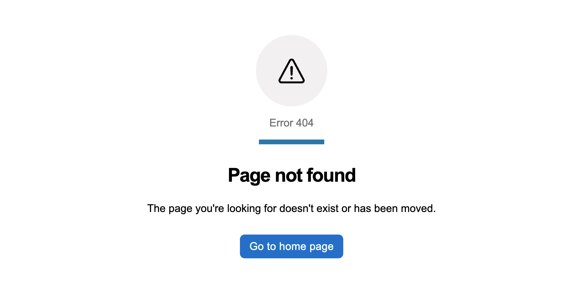
Page not found (404)
The page does not exist, usually because of a typo, a stale bookmark, or a deleted resource.
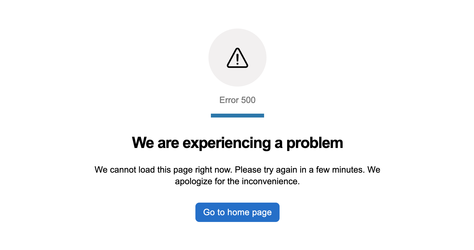
Server problem (500)
A server-side error has interrupted the request, and there is nothing the user can do to fix it.
When to use
Every service needs a story for the moments where something has gone wrong. These pages are the baseline. Each one is a small, self-contained page composition you drop into an existing service as a single route, no starter repo needed. Use them as the routes behind your router’s catch-all outlets, or as the fallback view your outer error boundary renders when nothing else caught the failure.
Considerations
- Use plain language. Explain what happened in one short sentence. “Page not found” beats “HTTP 404 resource unavailable”.
- Offer a way back. A home link is the usual fallback. Add a contact link when the user may need help.
- Keep the tone helpful, not accusatory. Do not blame the user for the error, especially for 500-level failures the user could not have caused.
- Avoid exposing technical detail like raw error codes, stack traces, or correlation IDs. Log them instead. If support needs a correlation id, give the user only what is useful.
- Do not render the service’s navigation on the error page. The error page is its own context.
How these pages are built
Each error page is a composition of GoA components: goa-page-block, goa-block, goa-text, goa-icon, goa-button, and goa-link (on 401). A small amount of custom CSS covers the icon-in-circle treatment, accent bar, centred text, and icon scaling. Those are gaps the design system has not absorbed yet and are tracked for follow-up.
Framework variants for React, Angular, and Web Components live alongside each preview route as sibling files. Click the React or Angular icon on a preview to open the folder on GitHub and copy the framework file you need.