Question page
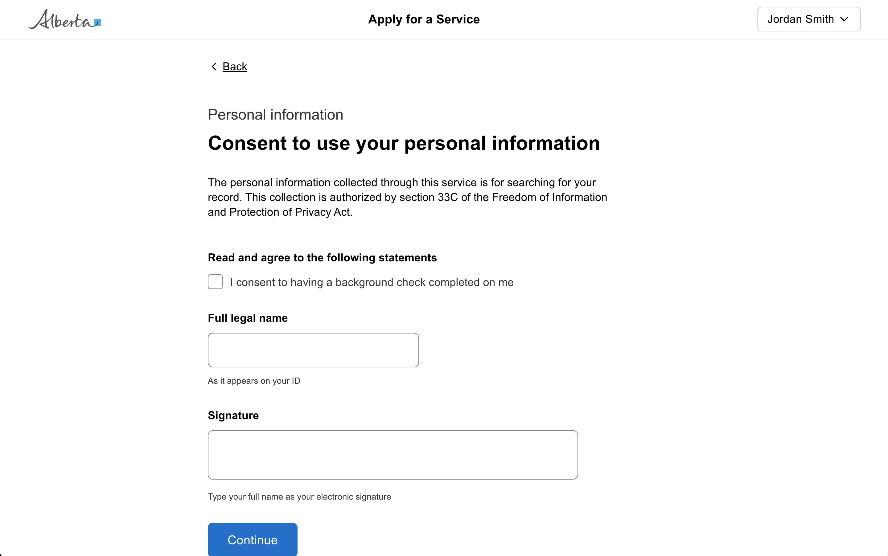
A multi-line field where users can input and edit text.
60ch.
3.
100%.
const [open, setOpen] = useState(false);
const [type, setType] = useState<string>();
const [name, setName] = useState<string>();
const [description, setDescription] = useState<string>();
<GoabButton type="tertiary" leadingIcon="add" onClick={() => setOpen(true)}>
Add another item
</GoabButton>
<GoabModal
heading="Add a new item"
open={open}
actions={
<GoabButtonGroup alignment="end">
<GoabButton type="tertiary" size="compact" onClick={() => setOpen(false)}>
Cancel
</GoabButton>
<GoabButton type="primary" size="compact" onClick={() => setOpen(false)}>
Save new item
</GoabButton>
</GoabButtonGroup>
}
>
<p>Fill in the information to create a new item</p>
<GoabFormItem label="Type" mt="l">
<GoabDropdown onChange={(e) => setType(e.value)} value={type}>
<GoabDropdownItem value="1" label="Option 1" />
<GoabDropdownItem value="2" label="Option 2" />
</GoabDropdown>
</GoabFormItem>
<GoabFormItem label="Name" mt="l">
<GoabInput
onChange={(e) => setName(e.value)}
value={name}
name="name"
width="100%"
/>
</GoabFormItem>
<GoabFormItem label="Description" mt="l">
<GoabTextArea
name="description"
rows={3}
width="100%"
onChange={(e) => setDescription(e.value)}
value={description}
/>
</GoabFormItem>
</GoabModal>import { Component } from "@angular/core";
open = false;
type: string | undefined = "";
name = "";
description = "";
toggleModal() {
this.open = !this.open;
}
updateType(event: any) {
this.type = event.value;
}
updateName(event: any) {
this.name = event.value;
}
updateDescription(event: any) {
this.description = event.value;
}<goab-button type="tertiary" leadingIcon="add" (onClick)="toggleModal()"
>Add another item</goab-button
>
<goab-modal
[open]="open"
(onClose)="toggleModal()"
heading="Add a new item"
[actions]="actions"
>
<p>Fill in the information to create a new item</p>
<goab-form-item label="Type" mt="l">
<goab-dropdown (onChange)="updateType($event)" [value]="type">
<goab-dropdown-item value="1" label="Option 1"></goab-dropdown-item>
<goab-dropdown-item value="2" label="Option 2"></goab-dropdown-item>
</goab-dropdown>
</goab-form-item>
<goab-form-item label="Name" mt="l">
<goab-input
name="name"
width="100%"
(onChange)="updateName($event)"
[value]="name"
></goab-input>
</goab-form-item>
<goab-form-item label="Description" mt="l">
<goab-textarea
name="description"
width="100%"
[rows]="3"
(onChange)="updateDescription($event)"
[value]="description"
></goab-textarea>
</goab-form-item>
<ng-template #actions>
<goab-button-group alignment="end">
<goab-button type="tertiary" size="compact" (onClick)="toggleModal()"
>Cancel</goab-button
>
<goab-button type="primary" size="compact" (onClick)="toggleModal()"
>Save new item</goab-button
>
</goab-button-group>
</ng-template>
</goab-modal>const modal = document.getElementById("add-item-modal");
const openBtn = document.getElementById("open-modal-btn");
const cancelBtn = document.getElementById("cancel-btn");
const saveBtn = document.getElementById("save-btn");
openBtn.addEventListener("_click", () => {
modal.setAttribute("open", "true");
});
modal.addEventListener("_close", () => {
modal.removeAttribute("open");
});
cancelBtn.addEventListener("_click", () => {
modal.removeAttribute("open");
});
saveBtn.addEventListener("_click", () => {
modal.removeAttribute("open");
});<goa-button version="2" id="open-modal-btn" type="tertiary" leadingicon="add"
>Add another item</goa-button
>
<goa-modal version="2" id="add-item-modal" heading="Add a new item">
<p>Fill in the information to create a new item</p>
<goa-form-item version="2" label="Type" mt="l">
<goa-dropdown version="2" id="type-dropdown">
<goa-dropdown-item value="1" label="Option 1"></goa-dropdown-item>
<goa-dropdown-item value="2" label="Option 2"></goa-dropdown-item>
</goa-dropdown>
</goa-form-item>
<goa-form-item version="2" label="Name" mt="l">
<goa-input version="2" name="name" width="100%" id="name-input"></goa-input>
</goa-form-item>
<goa-form-item version="2" label="Description" mt="l">
<goa-textarea
version="2"
name="description"
width="100%"
rows="3"
id="description-textarea"
></goa-textarea>
</goa-form-item>
<div slot="actions">
<goa-button-group alignment="end">
<goa-button version="2" id="cancel-btn" type="tertiary" size="compact"
>Cancel</goa-button
>
<goa-button version="2" id="save-btn" type="primary" size="compact"
>Save new item</goa-button
>
</goa-button-group>
</div>
</goa-modal>const [value, setValue] = useState("");<GoabFormItem
label="Provide more detail"
helpText="Maximum 500 words. Do not include personal or financial information."
>
<GoabTextArea
name="program"
onChange={(e) => setValue(e.value)}
value={value}
width="100%"
rows={6}
maxCount={500}
countBy="word"
/>
</GoabFormItem>import { Component } from "@angular/core";
import { FormBuilder, FormGroup } from "@angular/forms";
form!: FormGroup;
constructor(private fb: FormBuilder) {
this.form = this.fb.group({
program: [""],
});
}<goab-form-item
label="Provide more detail"
helpText="Maximum 500 words. Do not include personal or financial information."
>
<goab-textarea
name="program"
[formControl]="form.controls.program"
width="100%"
[rows]="6"
[maxCount]="500"
countBy="word"
>
</goab-textarea>
</goab-form-item>document.getElementById("program-textarea")?.addEventListener("_change", (e) => {
console.log("Value:", e.detail.value);
});<goa-form-item
version="2"
label="Provide more detail"
helptext="Maximum 500 words. Do not include personal or financial information."
>
<goa-textarea
version="2"
name="program"
id="program-textarea"
width="100%"
rows="6"
maxcount="500"
countby="word"
>
</goa-textarea>
</goa-form-item><GoabGrid minChildWidth="315px">
<GoabContainer accent="thin" type="non-interactive">
<GoabText size="heading-m" mt="none" mb="m">
Appearance details
</GoabText>
<GoabGrid minChildWidth="200px" gap="m">
<GoabBlock direction="column" gap="xs">
<GoabText size="body-s" color="secondary" mt="none" mb="none">
Accused name
</GoabText>
<GoabText size="body-m" mt="none" mb="none">
Doe, John Scott
</GoabText>
</GoabBlock>
<GoabBlock direction="column" gap="xs">
<GoabText size="body-s" color="secondary" mt="none" mb="none">
Date of birth
</GoabText>
<GoabText size="body-m" mt="none" mb="none">
Mar 14, 2021
</GoabText>
</GoabBlock>
<GoabBlock direction="column" gap="xs">
<GoabText size="body-s" color="secondary" mt="none" mb="none">
Court location
</GoabText>
<GoabText size="body-m" mt="none" mb="none">
Calgary
</GoabText>
</GoabBlock>
<GoabBlock direction="column" gap="xs">
<GoabText size="body-s" color="secondary" mt="none" mb="none">
Upcoming appearance date{"(s)"}
</GoabText>
<GoabText size="body-m" mt="none" mb="none">
Sep 20, 2021
</GoabText>
</GoabBlock>
</GoabGrid>
<GoabText size="heading-xs" mt="l" mb="s">
Docket number{"(s)"} & charges
</GoabText>
<GoabContainer type="non-interactive" padding="compact">
<GoabText size="heading-xs" mt="none" mb="xs">
{"1) 12345678"}
</GoabText>
<GoabText size="body-m" mt="none" mb="none">
{"CC 334(1) - Theft under $5000"}
</GoabText>
<GoabText size="body-m" mt="none" mb="none">
{"CC 268(1) - Aggravated assault"}
</GoabText>
</GoabContainer>
<GoabContainer type="non-interactive" padding="compact">
<GoabText size="heading-xs" mt="none" mb="xs">
{"2) 12345678"}
</GoabText>
<GoabText size="body-m" mt="none" mb="none">
{"CC 334(1) - Theft under $5000"}
</GoabText>
<GoabText size="body-m" mt="none" mb="none">
{"CC 268(1) - Aggravated assault"}
</GoabText>
</GoabContainer>
</GoabContainer>
<GoabContainer accent="thin" width="content">
<form>
<GoabText size="heading-m" mt="none" mb="m">
Adjournment request
</GoabText>
<GoabText size="body-m" mt="none" mb="none">
Keep track of the individuals who are placed in lodges and may qualify for the
Lodge Assistance Program subsidy.
</GoabText>
<GoabFormItem label="Case history and new request" mt="l">
<GoabRadioGroup name="case" orientation="horizontal" onChange={() => {}}>
<GoabRadioItem value="grant" label="Grant" />
<GoabRadioItem value="deny" label="Deny" />
</GoabRadioGroup>
</GoabFormItem>
<GoabFormItem label="Reason to deny" mt="l">
<GoabDropdown name="reason" width="100%" onChange={() => {}}>
<GoabDropdownItem value="1" label="Incomplete Application" />
<GoabDropdownItem value="2" label="Eligibility Criteria Not Met" />
<GoabDropdownItem value="3" label="Documentation Verification Failure" />
</GoabDropdown>
</GoabFormItem>
<GoabFormItem label="Message" mt="l">
<GoabTextArea
name="message"
rows={5}
width="100%"
value=""
onChange={() => {}}
/>
</GoabFormItem>
<GoabButton mt="xl" onClick={() => {}}>
Confirm adjournment
</GoabButton>
</form>
</GoabContainer>
</GoabGrid>import { Component } from "@angular/core";
import { FormBuilder, FormGroup } from "@angular/forms";
form: FormGroup;
constructor(private fb: FormBuilder) {
this.form = this.fb.group({
case: [""],
reason: [""],
message: [""],
});
}
onClick(): void {
console.log("Confirm clicked!");
}<goab-grid minChildWidth="315px">
<goab-container accent="thin" type="non-interactive">
<goab-text size="heading-m" mt="none" mb="m">Appearance details</goab-text>
<goab-grid minChildWidth="200px" gap="m">
<goab-block direction="column" gap="xs">
<goab-text size="body-s" color="secondary" mt="none" mb="none"
>Accused name</goab-text
>
<goab-text size="body-m" mt="none" mb="none">Doe, John Scott</goab-text>
</goab-block>
<goab-block direction="column" gap="xs">
<goab-text size="body-s" color="secondary" mt="none" mb="none"
>Date of birth</goab-text
>
<goab-text size="body-m" mt="none" mb="none">Mar 14, 2021</goab-text>
</goab-block>
<goab-block direction="column" gap="xs">
<goab-text size="body-s" color="secondary" mt="none" mb="none"
>Court location</goab-text
>
<goab-text size="body-m" mt="none" mb="none">Calgary</goab-text>
</goab-block>
<goab-block direction="column" gap="xs">
<goab-text size="body-s" color="secondary" mt="none" mb="none"
>Upcoming appearance date(s)</goab-text
>
<goab-text size="body-m" mt="none" mb="none">Sep 20, 2021</goab-text>
</goab-block>
</goab-grid>
<goab-text size="heading-xs" mt="l" mb="s">Docket number(s) & charges</goab-text>
<goab-container type="non-interactive" padding="compact">
<goab-text size="heading-xs" mt="none" mb="xs">1) 12345678</goab-text>
<goab-text size="body-m" mt="none" mb="none"
>CC 334(1) - Theft under $5000</goab-text
>
<goab-text size="body-m" mt="none" mb="none"
>CC 268(1) - Aggravated assault</goab-text
>
</goab-container>
<goab-container type="non-interactive" padding="compact">
<goab-text size="heading-xs" mt="none" mb="xs">2) 12345678</goab-text>
<goab-text size="body-m" mt="none" mb="none"
>CC 334(1) - Theft under $5000</goab-text
>
<goab-text size="body-m" mt="none" mb="none"
>CC 268(1) - Aggravated assault</goab-text
>
</goab-container>
</goab-container>
<goab-container accent="thin" width="content">
<form [formGroup]="form">
<goab-text size="heading-m" mt="none" mb="m">Adjournment request</goab-text>
<goab-text size="body-m" mt="none" mb="none">
Keep track of the individuals who are placed in lodges and may qualify for the
Lodge Assistance Program subsidy.
</goab-text>
<goab-form-item label="Case history and new request" mt="l">
<goab-radio-group name="case" orientation="horizontal" formControlName="case">
<goab-radio-item value="grant" label="Grant"></goab-radio-item>
<goab-radio-item value="deny" label="Deny"></goab-radio-item>
</goab-radio-group>
</goab-form-item>
<goab-form-item label="Reason to deny" mt="l">
<goab-dropdown name="reason" width="100%" formControlName="reason">
<goab-dropdown-item
value="1"
label="Incomplete Application"
></goab-dropdown-item>
<goab-dropdown-item
value="2"
label="Eligibility Criteria Not Met"
></goab-dropdown-item>
<goab-dropdown-item
value="3"
label="Documentation Verification Failure"
></goab-dropdown-item>
</goab-dropdown>
</goab-form-item>
<goab-form-item label="Message" mt="l">
<goab-textarea
name="message"
[rows]="5"
width="100%"
formControlName="message"
></goab-textarea>
</goab-form-item>
<goab-button mt="xl" (onClick)="onClick()">Confirm adjournment</goab-button>
</form>
</goab-container>
</goab-grid>document.getElementById("confirm-btn").addEventListener("_click", () => {
console.log("Confirm clicked!");
});<goa-grid minchildwidth="315px">
<goa-container accent="thin" type="non-interactive">
<goa-text size="heading-m" mt="none" mb="m">Appearance details</goa-text>
<goa-grid minchildwidth="200px" gap="m">
<goa-block direction="column" gap="xs">
<goa-text size="body-s" color="secondary" mt="none" mb="none"
>Accused name</goa-text
>
<goa-text size="body-m" mt="none" mb="none">Doe, John Scott</goa-text>
</goa-block>
<goa-block direction="column" gap="xs">
<goa-text size="body-s" color="secondary" mt="none" mb="none"
>Date of birth</goa-text
>
<goa-text size="body-m" mt="none" mb="none">Mar 14, 2021</goa-text>
</goa-block>
<goa-block direction="column" gap="xs">
<goa-text size="body-s" color="secondary" mt="none" mb="none"
>Court location</goa-text
>
<goa-text size="body-m" mt="none" mb="none">Calgary</goa-text>
</goa-block>
<goa-block direction="column" gap="xs">
<goa-text size="body-s" color="secondary" mt="none" mb="none"
>Upcoming appearance date(s)</goa-text
>
<goa-text size="body-m" mt="none" mb="none">Sep 20, 2021</goa-text>
</goa-block>
</goa-grid>
<goa-text size="heading-xs" mt="l" mb="s">Docket number(s) & charges</goa-text>
<goa-container type="non-interactive" padding="compact">
<goa-text size="heading-xs" mt="none" mb="xs">1) 12345678</goa-text>
<goa-text size="body-m" mt="none" mb="none">CC 334(1) - Theft under $5000</goa-text>
<goa-text size="body-m" mt="none" mb="none"
>CC 268(1) - Aggravated assault</goa-text
>
</goa-container>
<goa-container type="non-interactive" padding="compact">
<goa-text size="heading-xs" mt="none" mb="xs">2) 12345678</goa-text>
<goa-text size="body-m" mt="none" mb="none">CC 334(1) - Theft under $5000</goa-text>
<goa-text size="body-m" mt="none" mb="none"
>CC 268(1) - Aggravated assault</goa-text
>
</goa-container>
</goa-container>
<goa-container accent="thin" width="content">
<form>
<goa-text size="heading-m" mt="none" mb="m">Adjournment request</goa-text>
<goa-text size="body-m" mt="none" mb="none">
Keep track of the individuals who are placed in lodges and may qualify for the
Lodge Assistance Program subsidy.
</goa-text>
<goa-form-item version="2" label="Case history and new request" mt="l">
<goa-radio-group version="2" name="case" orientation="horizontal">
<goa-radio-item value="grant" label="Grant"></goa-radio-item>
<goa-radio-item value="deny" label="Deny"></goa-radio-item>
</goa-radio-group>
</goa-form-item>
<goa-form-item version="2" label="Reason to deny" mt="l">
<goa-dropdown version="2" name="reason" width="100%">
<goa-dropdown-item value="1" label="Incomplete Application"></goa-dropdown-item>
<goa-dropdown-item
value="2"
label="Eligibility Criteria Not Met"
></goa-dropdown-item>
<goa-dropdown-item
value="3"
label="Documentation Verification Failure"
></goa-dropdown-item>
</goa-dropdown>
</goa-form-item>
<goa-form-item version="2" label="Message" mt="l">
<goa-textarea version="2" name="message" rows="5" width="100%"></goa-textarea>
</goa-form-item>
<goa-button version="2" id="confirm-btn" mt="xl">Confirm adjournment</goa-button>
</form>
</goa-container>
</goa-grid>When you must disable a button or input:
The form item automatically associates the label with the input for screen readers, ensuring your form is accessible.
Known input length: Use fixed-width inputs for content with a specific length, such as postal code (7 characters) or year (4 characters).
Unknown input length: If you don’t know how many characters the user will need (like their name), make your text input 100% of the container.

