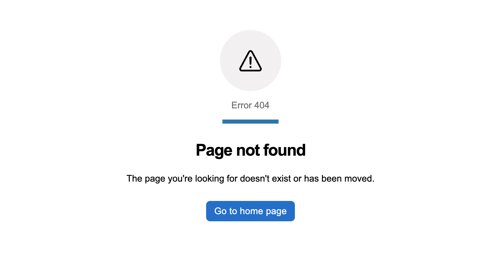
Error pages
Carry out an important action or navigate to another page.
normal.
primary.
normal.
const [activeFilters, setActiveFilters] = useState<string[]>([]);

const addFilter = () => {
  const randomFilter = `Filter ${Math.floor(Math.random() * 100)}`;
  if (!activeFilters.includes(randomFilter)) {
    setActiveFilters((prevFilters) => [...prevFilters, randomFilter]);
  }
};

const removeFilter = (filter: string) => {
  setActiveFilters((prevFilters) => prevFilters.filter((f) => f !== filter));
};
<div>
{activeFilters.map((filter) => (
<GoabFilterChip
key={filter}
content={filter}
onClick={() => removeFilter(filter)}
mr="s"
mb="s"
mt="s"
/>
))}
</div>
<GoabButton mt="l" onClick={addFilter}>
Add Random Filter
</GoabButton>import { Component } from "@angular/core";
activeFilters: string[] = [];
removeFilter(filter: string): void {
this.activeFilters = this.activeFilters.filter((f) => f !== filter);
}
addFilter(): void {
const randomFilter = "Filter " + Math.floor(Math.random() * 100);
if (!this.activeFilters.includes(randomFilter)) {
this.activeFilters.push(randomFilter);
}
}<div>
@for (filter of activeFilters; track filter) {
<goab-filter-chip
[content]="filter"
(onClick)="removeFilter(filter)"
mr="s"
mb="s"
mt="s"
>
</goab-filter-chip>
}
</div>
<goab-button mt="l" (onClick)="addFilter()">Add Random Filter</goab-button>const activeFilters = [];
const container = document.getElementById("filter-container");
const addBtn = document.getElementById("add-filter-btn");
function renderFilters() {
container.innerHTML = "";
activeFilters.forEach((filter) => {
const chip = document.createElement("goa-filter-chip");
chip.setAttribute("version", "2");
chip.setAttribute("content", filter);
chip.setAttribute("mr", "s");
chip.setAttribute("mb", "s");
chip.setAttribute("mt", "s");
chip.addEventListener("_click", () => removeFilter(filter));
container.appendChild(chip);
});
}
function addFilter() {
const randomFilter = "Filter " + Math.floor(Math.random() * 100);
if (!activeFilters.includes(randomFilter)) {
activeFilters.push(randomFilter);
renderFilters();
}
}
function removeFilter(filter) {
const index = activeFilters.indexOf(filter);
if (index > -1) {
activeFilters.splice(index, 1);
renderFilters();
}
}
addBtn.addEventListener("_click", addFilter);<div id="filter-container"></div>
<goa-button version="2" mt="l" id="add-filter-btn">Add Random Filter</goa-button>const [open, setOpen] = useState(false);<GoabButton leadingIcon="add" onClick={() => setOpen(true)}>
Add Record
</GoabButton>
<GoabDrawer
maxSize="492px"
open={open}
heading="Add Record"
position="right"
onClose={() => setOpen(false)}
actions={
<GoabButtonGroup alignment="start">
<GoabButton type="primary" size="compact" onClick={() => setOpen(false)}>
Add record
</GoabButton>
<GoabButton type="tertiary" size="compact" onClick={() => setOpen(false)}>
Cancel
</GoabButton>
</GoabButtonGroup>
}
>
<GoabFormItem label="Level of education">
<GoabDropdown onChange={() => {}} name="education" value="university">
<GoabDropdownItem value="high-school" label="High School Diploma" />
<GoabDropdownItem value="college" label="College Diploma" />
<GoabDropdownItem value="university" label="University Degree" />
<GoabDropdownItem value="masters" label="Master's Degree" />
<GoabDropdownItem value="doctorate" label="Doctorate" />
</GoabDropdown>
</GoabFormItem>
<GoabFormItem label="Educational institution" mt="l">
<GoabInput name="education" type="text" onChange={() => {}} />
</GoabFormItem>
<GoabFormItem label="Field of study" requirement="optional" mt="l">
<GoabInput name="fieldOfStudy" type="text" onChange={() => {}} />
</GoabFormItem>
<GoabFormItem label="Is the person currently attending?" mt="l">
<GoabRadioGroup
name="attendTraining"
orientation="horizontal"
onChange={() => {}}
>
<GoabRadioItem value="yes" label="Yes" />
<GoabRadioItem value="no" label="No" />
</GoabRadioGroup>
</GoabFormItem>
<GoabFormItem label="Start date" mt="l">
<GoabDatePicker onChange={() => {}} value={new Date("2022-09-01")} />
<GoabCheckbox
name="startDateApproximate"
text="Approximate date"
value="y"
mt="s"
/>
</GoabFormItem>
<GoabFormItem label="Credential received?" mt="l">
<GoabRadioGroup
name="credentialReceived"
orientation="horizontal"
onChange={() => {}}
>
<GoabRadioItem value="yes" label="Yes" />
<GoabRadioItem value="no" label="No" />
</GoabRadioGroup>
</GoabFormItem>
</GoabDrawer>import { Component } from "@angular/core";
open = false;
onClick() {
this.open = true;
}
onClose() {
this.open = false;
}
dropdownOnChange(event: any) {
console.log(event);
}
inputOnChange(event: any) {
console.log(event);
}
radioOnChange(event: any) {
console.log(event);
}
dateOnChange(event: any) {
console.log(event);
}
closeDrawer() {
this.open = false;
}<goab-button leadingIcon="add" (onClick)="onClick()">Add Record</goab-button>
<goab-drawer
maxSize="492px"
[open]="open"
heading="Add Record"
position="right"
(onClose)="onClose()"
[actions]="actions"
>
<goab-form-item label="Level of education">
<goab-dropdown
(onChange)="dropdownOnChange($event)"
name="education"
value="university"
>
<goab-dropdown-item
value="high-school"
label="High School Diploma"
></goab-dropdown-item>
<goab-dropdown-item value="college" label="College Diploma"></goab-dropdown-item>
<goab-dropdown-item
value="university"
label="University Degree"
></goab-dropdown-item>
<goab-dropdown-item value="masters" label="Master's Degree"></goab-dropdown-item>
<goab-dropdown-item value="doctorate" label="Doctorate"></goab-dropdown-item>
</goab-dropdown>
</goab-form-item>
<goab-form-item label="Educational institution" mt="l">
<goab-input
name="education"
type="text"
(onChange)="inputOnChange($event)"
></goab-input>
</goab-form-item>
<goab-form-item label="Field of study" requirement="optional" mt="l">
<goab-input
name="fieldOfStudy"
type="text"
(onChange)="inputOnChange($event)"
></goab-input>
</goab-form-item>
<goab-form-item label="Is the person currently attending?" mt="l">
<goab-radio-group
name="attendTraining"
orientation="horizontal"
(onChange)="radioOnChange($event)"
>
<goab-radio-item value="yes" label="Yes"></goab-radio-item>
<goab-radio-item value="no" label="No"></goab-radio-item>
</goab-radio-group>
</goab-form-item>
<goab-form-item label="Start date" mt="l">
<goab-date-picker (onChange)="dateOnChange($event)"></goab-date-picker>
<goab-checkbox
name="startDateApproximate"
text="Approximate date"
value="y"
mt="s"
></goab-checkbox>
</goab-form-item>
<goab-form-item label="Credential received?" mt="l">
<goab-radio-group
name="credentialReceived"
orientation="horizontal"
(onChange)="radioOnChange($event)"
>
<goab-radio-item value="yes" label="Yes"></goab-radio-item>
<goab-radio-item value="no" label="No"></goab-radio-item>
</goab-radio-group>
</goab-form-item>
<ng-template #actions>
<goab-button-group alignment="start">
<goab-button type="primary" size="compact" (onClick)="closeDrawer()"
>Add record</goab-button
>
<goab-button type="tertiary" size="compact" (onClick)="closeDrawer()"
>Cancel</goab-button
>
</goab-button-group>
</ng-template>
</goab-drawer>const drawer = document.getElementById("record-drawer");
const openBtn = document.getElementById("open-drawer-btn");
const addBtn = document.getElementById("add-record-btn");
const cancelBtn = document.getElementById("cancel-btn");
openBtn.addEventListener("_click", () => {
drawer.setAttribute("open", "true");
});
drawer.addEventListener("_close", () => {
drawer.removeAttribute("open");
});
addBtn.addEventListener("_click", () => {
drawer.removeAttribute("open");
});
cancelBtn.addEventListener("_click", () => {
drawer.removeAttribute("open");
});<goa-button version="2" id="open-drawer-btn" leadingicon="add">Add Record</goa-button>
<goa-drawer
version="2"
id="record-drawer"
max-size="492px"
heading="Add Record"
position="right"
>
<goa-form-item version="2" label="Level of education">
<goa-dropdown version="2" name="education" value="university">
<goa-dropdown-item
value="high-school"
label="High School Diploma"
></goa-dropdown-item>
<goa-dropdown-item value="college" label="College Diploma"></goa-dropdown-item>
<goa-dropdown-item value="university" label="University Degree"></goa-dropdown-item>
<goa-dropdown-item value="masters" label="Master's Degree"></goa-dropdown-item>
<goa-dropdown-item value="doctorate" label="Doctorate"></goa-dropdown-item>
</goa-dropdown>
</goa-form-item>
<goa-form-item version="2" label="Educational institution" mt="l">
<goa-input version="2" name="education" type="text"></goa-input>
</goa-form-item>
<goa-form-item version="2" label="Field of study" requirement="optional" mt="l">
<goa-input version="2" name="fieldOfStudy" type="text"></goa-input>
</goa-form-item>
<goa-form-item version="2" label="Is the person currently attending?" mt="l">
<goa-radio-group version="2" name="attendTraining" orientation="horizontal">
<goa-radio-item value="yes" label="Yes"></goa-radio-item>
<goa-radio-item value="no" label="No"></goa-radio-item>
</goa-radio-group>
</goa-form-item>
<goa-form-item version="2" label="Start date" mt="l">
<goa-date-picker version="2"></goa-date-picker>
<goa-checkbox
version="2"
name="startDateApproximate"
text="Approximate date"
value="y"
mt="s"
></goa-checkbox>
</goa-form-item>
<goa-form-item version="2" label="Credential received?" mt="l">
<goa-radio-group version="2" name="credentialReceived" orientation="horizontal">
<goa-radio-item value="yes" label="Yes"></goa-radio-item>
<goa-radio-item value="no" label="No"></goa-radio-item>
</goa-radio-group>
</goa-form-item>
<div slot="actions">
<goa-button-group alignment="start">
<goa-button version="2" id="add-record-btn" type="primary" size="compact"
>Add record</goa-button
>
<goa-button version="2" id="cancel-btn" type="tertiary" size="compact"
>Cancel</goa-button
>
</goa-button-group>
</div>
</goa-drawer>const [open, setOpen] = useState(false);<GoabButton onClick={() => setOpen(true)}>Filters</GoabButton>
<GoabDrawer
heading="Filters"
open={open}
onClose={() => setOpen(false)}
position="right"
actions={
<GoabButtonGroup alignment="start">
<GoabButton type="primary" size="compact" onClick={() => setOpen(false)}>
Apply filters
</GoabButton>
<GoabButton type="tertiary" size="compact" onClick={() => setOpen(false)}>
Cancel
</GoabButton>
</GoabButtonGroup>
}
>
<GoabFormItem label="Entry status">
<GoabCheckboxList name="entryStatus" onChange={() => {}}>
<GoabCheckbox name="draft" text="Draft" value="draft" />
<GoabCheckbox name="published" text="Published" value="published" />
</GoabCheckboxList>
</GoabFormItem>
<GoabFormItem label="Assigned to - Region" mt="l">
<GoabCheckboxList name="region" onChange={() => {}}>
<GoabCheckbox name="calgary" text="Calgary" value="calgary" />
<GoabCheckbox name="central" text="Central" value="central" />
<GoabCheckbox name="edmonton" text="Edmonton" value="edmonton" />
<GoabCheckbox name="north" text="North" value="north" />
<GoabCheckbox name="south" text="South" value="south" />
</GoabCheckboxList>
</GoabFormItem>
<GoabFormItem label="Assigned to" mt="l">
<GoabDropdown name="assignedTo" onChange={() => {}}>
<GoabDropdownItem value="1" label="Person 1" />
<GoabDropdownItem value="2" label="Person 2" />
</GoabDropdown>
</GoabFormItem>
<GoabFormItem label="Date taken" mt="l">
<GoabRadioGroup name="dateTaken" onChange={() => {}}>
<GoabRadioItem value="24" label="Last 24 hours" />
<GoabRadioItem value="72" label="Last 72 hours" />
</GoabRadioGroup>
</GoabFormItem>
</GoabDrawer>import { Component } from "@angular/core";
open = false;
assignedTo = "";
takenBy = "";
onClick() {
this.open = true;
}
onClose() {
this.open = false;
}
radioOnChange(event: any) {
console.log(event);
}
onChangeAssignedTo(e: any) {
this.assignedTo = e.value as string;
}
closeDrawer() {
this.open = false;
}<goab-button (onClick)="onClick()">Filters</goab-button>
<goab-drawer
heading="Filters"
[open]="open"
(onClose)="onClose()"
position="right"
[actions]="actions"
>
<goab-form-item label="Entry status">
<goab-checkbox-list name="entryStatus" (onChange)="onCheckboxChange($event)">
<goab-checkbox name="draft" text="Draft" value="draft"></goab-checkbox>
<goab-checkbox name="published" text="Published" value="published"></goab-checkbox>
</goab-checkbox-list>
</goab-form-item>
<goab-form-item label="Assigned to - Region" mt="l">
<goab-checkbox-list name="region" (onChange)="onCheckboxChange($event)">
<goab-checkbox name="calgary" text="Calgary" value="calgary"></goab-checkbox>
<goab-checkbox name="central" text="Central" value="central"></goab-checkbox>
<goab-checkbox name="edmonton" text="Edmonton" value="edmonton"></goab-checkbox>
<goab-checkbox name="north" text="North" value="north"></goab-checkbox>
<goab-checkbox name="south" text="South" value="south"></goab-checkbox>
</goab-checkbox-list>
</goab-form-item>
<goab-form-item label="Assigned to" mt="l">
<goab-dropdown
[value]="assignedTo"
name="assignedToData"
(onChange)="onChangeAssignedTo($event)"
>
<goab-dropdown-item value="1" label="Person 1"></goab-dropdown-item>
<goab-dropdown-item value="2" label="Person 2"></goab-dropdown-item>
</goab-dropdown>
</goab-form-item>
<goab-form-item label="Date taken" mt="l">
<goab-radio-group name="dateTaken" (onChange)="radioOnChange($event)">
<goab-radio-item value="24" label="Last 24 hours"></goab-radio-item>
<goab-radio-item value="72" label="Last 72 hours"></goab-radio-item>
</goab-radio-group>
</goab-form-item>
<ng-template #actions>
<goab-button-group alignment="start">
<goab-button type="primary" size="compact" (onClick)="closeDrawer()"
>Apply filters</goab-button
>
<goab-button type="tertiary" size="compact" (onClick)="closeDrawer()"
>Cancel</goab-button
>
</goab-button-group>
</ng-template>
</goab-drawer>const drawer = document.getElementById("filters-drawer");
const openBtn = document.getElementById("open-filters-btn");
const applyBtn = document.getElementById("apply-filters-btn");
const cancelBtn = document.getElementById("cancel-btn");
openBtn.addEventListener("_click", () => {
drawer.setAttribute("open", "true");
});
drawer.addEventListener("_close", () => {
drawer.removeAttribute("open");
});
applyBtn.addEventListener("_click", () => {
drawer.removeAttribute("open");
});
cancelBtn.addEventListener("_click", () => {
drawer.removeAttribute("open");
});<goa-button version="2" id="open-filters-btn">Filters</goa-button>
<goa-drawer version="2" id="filters-drawer" heading="Filters" position="right">
<goa-form-item version="2" label="Entry status">
<goa-checkbox-list name="entryStatus">
<goa-checkbox version="2" name="draft" text="Draft" value="draft"></goa-checkbox>
<goa-checkbox
version="2"
name="published"
text="Published"
value="published"
></goa-checkbox>
</goa-checkbox-list>
</goa-form-item>
<goa-form-item version="2" label="Assigned to - Region" mt="l">
<goa-checkbox-list name="region">
<goa-checkbox
version="2"
name="calgary"
text="Calgary"
value="calgary"
></goa-checkbox>
<goa-checkbox
version="2"
name="central"
text="Central"
value="central"
></goa-checkbox>
<goa-checkbox
version="2"
name="edmonton"
text="Edmonton"
value="edmonton"
></goa-checkbox>
<goa-checkbox version="2" name="north" text="North" value="north"></goa-checkbox>
<goa-checkbox version="2" name="south" text="South" value="south"></goa-checkbox>
</goa-checkbox-list>
</goa-form-item>
<goa-form-item version="2" label="Assigned to" mt="l">
<goa-dropdown version="2" name="assignedTo">
<goa-dropdown-item value="1" label="Person 1"></goa-dropdown-item>
<goa-dropdown-item value="2" label="Person 2"></goa-dropdown-item>
</goa-dropdown>
</goa-form-item>
<goa-form-item version="2" label="Date taken" mt="l">
<goa-radio-group version="2" name="dateTaken">
<goa-radio-item value="24" label="Last 24 hours"></goa-radio-item>
<goa-radio-item value="72" label="Last 72 hours"></goa-radio-item>
</goa-radio-group>
</goa-form-item>
<div slot="actions">
<goa-button-group alignment="start">
<goa-button version="2" id="apply-filters-btn" type="primary" size="compact"
>Apply filters</goa-button
>
<goa-button version="2" id="cancel-btn" type="tertiary" size="compact"
>Cancel</goa-button
>
</goa-button-group>
</div>
</goa-drawer>const [open, setOpen] = useState(false);
const [type, setType] = useState<string>();
const [name, setName] = useState<string>();
const [description, setDescription] = useState<string>();<GoabButton type="tertiary" leadingIcon="add" onClick={() => setOpen(true)}>
Add another item
</GoabButton>
<GoabModal
heading="Add a new item"
open={open}
actions={
<GoabButtonGroup alignment="end">
<GoabButton type="tertiary" size="compact" onClick={() => setOpen(false)}>
Cancel
</GoabButton>
<GoabButton type="primary" size="compact" onClick={() => setOpen(false)}>
Save new item
</GoabButton>
</GoabButtonGroup>
}
>
<p>Fill in the information to create a new item</p>
<GoabFormItem label="Type" mt="l">
<GoabDropdown onChange={(e) => setType(e.value)} value={type}>
<GoabDropdownItem value="1" label="Option 1" />
<GoabDropdownItem value="2" label="Option 2" />
</GoabDropdown>
</GoabFormItem>
<GoabFormItem label="Name" mt="l">
<GoabInput
onChange={(e) => setName(e.value)}
value={name}
name="name"
width="100%"
/>
</GoabFormItem>
<GoabFormItem label="Description" mt="l">
<GoabTextArea
name="description"
rows={3}
width="100%"
onChange={(e) => setDescription(e.value)}
value={description}
/>
</GoabFormItem>
</GoabModal>import { Component } from "@angular/core";
open = false;
type: string | undefined = "";
name = "";
description = "";
toggleModal() {
this.open = !this.open;
}
updateType(event: any) {
this.type = event.value;
}
updateName(event: any) {
this.name = event.value;
}
updateDescription(event: any) {
this.description = event.value;
}<goab-button type="tertiary" leadingIcon="add" (onClick)="toggleModal()"
>Add another item</goab-button
>
<goab-modal
[open]="open"
(onClose)="toggleModal()"
heading="Add a new item"
[actions]="actions"
>
<p>Fill in the information to create a new item</p>
<goab-form-item label="Type" mt="l">
<goab-dropdown (onChange)="updateType($event)" [value]="type">
<goab-dropdown-item value="1" label="Option 1"></goab-dropdown-item>
<goab-dropdown-item value="2" label="Option 2"></goab-dropdown-item>
</goab-dropdown>
</goab-form-item>
<goab-form-item label="Name" mt="l">
<goab-input
name="name"
width="100%"
(onChange)="updateName($event)"
[value]="name"
></goab-input>
</goab-form-item>
<goab-form-item label="Description" mt="l">
<goab-textarea
name="description"
width="100%"
[rows]="3"
(onChange)="updateDescription($event)"
[value]="description"
></goab-textarea>
</goab-form-item>
<ng-template #actions>
<goab-button-group alignment="end">
<goab-button type="tertiary" size="compact" (onClick)="toggleModal()"
>Cancel</goab-button
>
<goab-button type="primary" size="compact" (onClick)="toggleModal()"
>Save new item</goab-button
>
</goab-button-group>
</ng-template>
</goab-modal>const modal = document.getElementById("add-item-modal");
const openBtn = document.getElementById("open-modal-btn");
const cancelBtn = document.getElementById("cancel-btn");
const saveBtn = document.getElementById("save-btn");
openBtn.addEventListener("_click", () => {
modal.setAttribute("open", "true");
});
modal.addEventListener("_close", () => {
modal.removeAttribute("open");
});
cancelBtn.addEventListener("_click", () => {
modal.removeAttribute("open");
});
saveBtn.addEventListener("_click", () => {
modal.removeAttribute("open");
});<goa-button version="2" id="open-modal-btn" type="tertiary" leadingicon="add"
>Add another item</goa-button
>
<goa-modal version="2" id="add-item-modal" heading="Add a new item">
<p>Fill in the information to create a new item</p>
<goa-form-item version="2" label="Type" mt="l">
<goa-dropdown version="2" id="type-dropdown">
<goa-dropdown-item value="1" label="Option 1"></goa-dropdown-item>
<goa-dropdown-item value="2" label="Option 2"></goa-dropdown-item>
</goa-dropdown>
</goa-form-item>
<goa-form-item version="2" label="Name" mt="l">
<goa-input version="2" name="name" width="100%" id="name-input"></goa-input>
</goa-form-item>
<goa-form-item version="2" label="Description" mt="l">
<goa-textarea
version="2"
name="description"
width="100%"
rows="3"
id="description-textarea"
></goa-textarea>
</goa-form-item>
<div slot="actions">
<goa-button-group alignment="end">
<goa-button version="2" id="cancel-btn" type="tertiary" size="compact"
>Cancel</goa-button
>
<goa-button version="2" id="save-btn" type="primary" size="compact"
>Save new item</goa-button
>
</goa-button-group>
</div>
</goa-modal>const [address, setAddress] = useState("");
const [suite, setSuite] = useState("");
const [city, setCity] = useState("");
const [province, setProvince] = useState("");
const [postalCode, setPostalCode] = useState("");<GoabText size="heading-l" mt="none" mb="xl">
What is your address?
</GoabText>
<GoabFormItem label="Street Address">
<GoabInput
name="address"
type="text"
value={address}
onChange={(e) => setAddress(e.value)}
width="100%"
/>
</GoabFormItem>
<GoabFormItem label="Suite or unit #" mt="l">
<GoabInput
name="suite"
type="text"
value={suite}
onChange={(e) => setSuite(e.value)}
width="100%"
/>
</GoabFormItem>
<GoabFormItem label="City or town" mt="l">
<GoabInput
name="city"
type="text"
value={city}
onChange={(e) => setCity(e.value)}
width="100%"
/>
</GoabFormItem>
<GoabBlock direction="row" gap="l" mt="l">
<GoabFormItem label="Province or territory">
<GoabDropdown
onChange={(e) => setProvince(e.value ?? "")}
name="province"
value={province}
width="100%"
>
<GoabDropdownItem label="Alberta" value="AB" />
<GoabDropdownItem label="British Columbia" value="BC" />
<GoabDropdownItem label="Manitoba" value="MB" />
<GoabDropdownItem label="New Brunswick" value="NB" />
<GoabDropdownItem label="Newfoundland and Labrador" value="NL" />
<GoabDropdownItem label="Northwest Territories" value="NT" />
<GoabDropdownItem label="Nova Scotia" value="NS" />
<GoabDropdownItem label="Nunavut" value="NU" />
<GoabDropdownItem label="Ontario" value="ON" />
<GoabDropdownItem label="Prince Edward Island" value="PE" />
<GoabDropdownItem label="Quebec" value="QC" />
<GoabDropdownItem label="Saskatchewan" value="SK" />
<GoabDropdownItem label="Yukon" value="YT" />
</GoabDropdown>
</GoabFormItem>
<GoabFormItem label="Postal Code">
<GoabInput
name="postalCode"
type="text"
value={postalCode}
onChange={(e) => setPostalCode(e.value)}
width="7ch"
/>
</GoabFormItem>
</GoabBlock>
<GoabButtonGroup alignment="start" mt="2xl">
<GoabButton type="primary" onClick={() => {}}>
Save and continue
</GoabButton>
<GoabButton type="secondary" onClick={() => {}}>
Cancel
</GoabButton>
</GoabButtonGroup>import { Component } from "@angular/core";
import { FormBuilder, FormGroup } from "@angular/forms";
form!: FormGroup;
constructor(private fb: FormBuilder) {
this.form = this.fb.group({
address: [""],
suite: [""],
city: [""],
province: [""],
postalCode: [""],
});
}
onClick() {
// Handle form submission
}<goab-text size="heading-l" mt="none" mb="xl">What is your address?</goab-text>
<goab-form-item label="Street Address">
<goab-input
name="address"
type="text"
[formControl]="form.controls.address"
width="100%"
></goab-input>
</goab-form-item>
<goab-form-item label="Suite or unit #" mt="l">
<goab-input
name="suite"
type="text"
[formControl]="form.controls.suite"
width="100%"
></goab-input>
</goab-form-item>
<goab-form-item label="City or town" mt="l">
<goab-input
name="city"
type="text"
[formControl]="form.controls.city"
width="100%"
></goab-input>
</goab-form-item>
<goab-block direction="row" gap="l" mt="l">
<goab-form-item label="Province or territory">
<goab-dropdown name="province" [formControl]="form.controls.province" width="100%">
<goab-dropdown-item label="Alberta" value="AB"></goab-dropdown-item>
<goab-dropdown-item label="British Columbia" value="BC"></goab-dropdown-item>
<goab-dropdown-item label="Manitoba" value="MB"></goab-dropdown-item>
<goab-dropdown-item label="New Brunswick" value="NB"></goab-dropdown-item>
<goab-dropdown-item
label="Newfoundland and Labrador"
value="NL"
></goab-dropdown-item>
<goab-dropdown-item label="Northwest Territories" value="NT"></goab-dropdown-item>
<goab-dropdown-item label="Nova Scotia" value="NS"></goab-dropdown-item>
<goab-dropdown-item label="Nunavut" value="NU"></goab-dropdown-item>
<goab-dropdown-item label="Ontario" value="ON"></goab-dropdown-item>
<goab-dropdown-item label="Prince Edward Island" value="PE"></goab-dropdown-item>
<goab-dropdown-item label="Quebec" value="QC"></goab-dropdown-item>
<goab-dropdown-item label="Saskatchewan" value="SK"></goab-dropdown-item>
<goab-dropdown-item label="Yukon" value="YT"></goab-dropdown-item>
</goab-dropdown>
</goab-form-item>
<goab-form-item label="Postal Code">
<goab-input
name="postalCode"
type="text"
[formControl]="form.controls.postalCode"
width="7ch"
></goab-input>
</goab-form-item>
</goab-block>
<goab-button-group alignment="start" mt="2xl">
<goab-button type="primary" (onClick)="onClick()">Save and continue</goab-button>
<goab-button type="secondary" (onClick)="onClick()">Cancel</goab-button>
</goab-button-group>document.getElementById("save-btn")?.addEventListener("_click", () => {
console.log("Form submitted");
});<goa-text size="heading-l" mt="none" mb="xl">What is your address?</goa-text>
<goa-form-item version="2" label="Street Address">
<goa-input
version="2"
name="address"
type="text"
width="100%"
id="address-input"
></goa-input>
</goa-form-item>
<goa-form-item version="2" label="Suite or unit #" mt="l">
<goa-input
version="2"
name="suite"
type="text"
width="100%"
id="suite-input"
></goa-input>
</goa-form-item>
<goa-form-item version="2" label="City or town" mt="l">
<goa-input version="2" name="city" type="text" width="100%" id="city-input"></goa-input>
</goa-form-item>
<goa-block direction="row" gap="l" mt="l">
<goa-form-item version="2" label="Province or territory">
<goa-dropdown version="2" name="province" id="province-dropdown" width="100%">
<goa-dropdown-item label="Alberta" value="AB"></goa-dropdown-item>
<goa-dropdown-item label="British Columbia" value="BC"></goa-dropdown-item>
<goa-dropdown-item label="Manitoba" value="MB"></goa-dropdown-item>
<goa-dropdown-item label="New Brunswick" value="NB"></goa-dropdown-item>
<goa-dropdown-item label="Newfoundland and Labrador" value="NL"></goa-dropdown-item>
<goa-dropdown-item label="Northwest Territories" value="NT"></goa-dropdown-item>
<goa-dropdown-item label="Nova Scotia" value="NS"></goa-dropdown-item>
<goa-dropdown-item label="Nunavut" value="NU"></goa-dropdown-item>
<goa-dropdown-item label="Ontario" value="ON"></goa-dropdown-item>
<goa-dropdown-item label="Prince Edward Island" value="PE"></goa-dropdown-item>
<goa-dropdown-item label="Quebec" value="QC"></goa-dropdown-item>
<goa-dropdown-item label="Saskatchewan" value="SK"></goa-dropdown-item>
<goa-dropdown-item label="Yukon" value="YT"></goa-dropdown-item>
</goa-dropdown>
</goa-form-item>
<goa-form-item version="2" label="Postal Code">
<goa-input
version="2"
name="postalCode"
type="text"
width="7ch"
id="postal-input"
></goa-input>
</goa-form-item>
</goa-block>
<goa-button-group alignment="start" mt="2xl">
<goa-button version="2" type="primary" id="save-btn">Save and continue</goa-button>
<goa-button version="2" type="secondary" id="cancel-btn">Cancel</goa-button>
</goa-button-group><GoabButtonGroup alignment="start">
<GoabButton leadingIcon="arrow-back">Go back</GoabButton>
<GoabButton trailingIcon="arrow-forward">Continue</GoabButton>
<GoabButton type="secondary" leadingIcon="add">
Add item
</GoabButton>
</GoabButtonGroup><goab-button-group alignment="start">
<goab-button leadingIcon="arrow-back">Go back</goab-button>
<goab-button trailingIcon="arrow-forward">Continue</goab-button>
<goab-button type="secondary" leadingIcon="add">Add item</goab-button>
</goab-button-group><goa-button-group alignment="start">
<goa-button version="2" leadingicon="arrow-back">Go back</goa-button>
<goa-button version="2" trailingicon="arrow-forward">Continue</goa-button>
<goa-button version="2" type="secondary" leadingicon="add">Add item</goa-button>
</goa-button-group>.case-file-row {
display: flex;
flex-wrap: wrap;
justify-content: space-between;
align-items: center;
gap: var(--goa-space-m);
}<GoabContainer mt="l">
<div className="case-file-row">
<GoabBlock direction="column" gap="2xs">
<GoabText size="heading-xs" mt="none" mb="2xs">
Fiscal year: 2021/2022
</GoabText>
<GoabText size="body-s" mt="none" mb="none">
Submitted: April 23, 2023
</GoabText>
</GoabBlock>
<GoabBlock direction="row" gap="l" alignment="center">
<GoabBadge type="default" content="Not started" />
<GoabButton type="tertiary" size="compact">
Start
</GoabButton>
</GoabBlock>
</div>
</GoabContainer>
<GoabContainer>
<div className="case-file-row">
<GoabBlock direction="column" gap="2xs">
<GoabText size="heading-xs" mt="none" mb="2xs">
Fiscal year: 2020/2021
</GoabText>
<GoabText size="body-s" mt="none" mb="none">
Submitted: April 9, 2022
</GoabText>
</GoabBlock>
<GoabBlock direction="row" gap="l" alignment="center">
<GoabBadge type="important" content="Information needed" />
<GoabButton type="tertiary" size="compact">
Edit
</GoabButton>
</GoabBlock>
</div>
</GoabContainer>
<GoabContainer>
<div className="case-file-row">
<GoabBlock direction="column" gap="2xs">
<GoabText size="heading-xs" mt="none" mb="2xs">
Fiscal year: 2019/2020
</GoabText>
<GoabText size="body-s" mt="none" mb="none">
Submitted: April 14, 2021
</GoabText>
</GoabBlock>
<GoabBlock direction="row" gap="l" alignment="center">
<GoabBadge type="success" content="Approved" />
<GoabButton type="tertiary" size="compact">
View
</GoabButton>
</GoabBlock>
</div>
</GoabContainer><goab-container mt="l">
<div class="case-file-row">
<goab-block direction="column" gap="2xs">
<goab-text size="heading-xs" mt="none" mb="2xs">Fiscal year: 2021/2022</goab-text>
<goab-text size="body-s" mt="none" mb="none">Submitted: April 23, 2023</goab-text>
</goab-block>
<goab-block direction="row" gap="l" alignment="center">
<goab-badge type="default" content="Not started"></goab-badge>
<goab-button type="tertiary" size="compact">Start</goab-button>
</goab-block>
</div>
</goab-container>
<goab-container>
<div class="case-file-row">
<goab-block direction="column" gap="2xs">
<goab-text size="heading-xs" mt="none" mb="2xs">Fiscal year: 2020/2021</goab-text>
<goab-text size="body-s" mt="none" mb="none">Submitted: April 9, 2022</goab-text>
</goab-block>
<goab-block direction="row" gap="l" alignment="center">
<goab-badge type="important" content="Information needed"></goab-badge>
<goab-button type="tertiary" size="compact">Edit</goab-button>
</goab-block>
</div>
</goab-container>
<goab-container>
<div class="case-file-row">
<goab-block direction="column" gap="2xs">
<goab-text size="heading-xs" mt="none" mb="2xs">Fiscal year: 2019/2020</goab-text>
<goab-text size="body-s" mt="none" mb="none">Submitted: April 14, 2021</goab-text>
</goab-block>
<goab-block direction="row" gap="l" alignment="center">
<goab-badge type="success" content="Approved"></goab-badge>
<goab-button type="tertiary" size="compact">View</goab-button>
</goab-block>
</div>
</goab-container>.case-file-row {
display: flex;
flex-wrap: wrap;
justify-content: space-between;
align-items: center;
gap: var(--goa-space-m);
}<goa-container mt="l">
<div class="case-file-row">
<goa-block direction="column" gap="2xs">
<goa-text size="heading-xs" mt="none" mb="2xs">Fiscal year: 2021/2022</goa-text>
<goa-text size="body-s" mt="none" mb="none">Submitted: April 23, 2023</goa-text>
</goa-block>
<goa-block direction="row" gap="l" alignment="center">
<goa-badge version="2" type="default" content="Not started"></goa-badge>
<goa-button version="2" type="tertiary" size="compact">Start</goa-button>
</goa-block>
</div>
</goa-container>
<goa-container>
<div class="case-file-row">
<goa-block direction="column" gap="2xs">
<goa-text size="heading-xs" mt="none" mb="2xs">Fiscal year: 2020/2021</goa-text>
<goa-text size="body-s" mt="none" mb="none">Submitted: April 9, 2022</goa-text>
</goa-block>
<goa-block direction="row" gap="l" alignment="center">
<goa-badge version="2" type="important" content="Information needed"></goa-badge>
<goa-button version="2" type="tertiary" size="compact">Edit</goa-button>
</goa-block>
</div>
</goa-container>
<goa-container>
<div class="case-file-row">
<goa-block direction="column" gap="2xs">
<goa-text size="heading-xs" mt="none" mb="2xs">Fiscal year: 2019/2020</goa-text>
<goa-text size="body-s" mt="none" mb="none">Submitted: April 14, 2021</goa-text>
</goa-block>
<goa-block direction="row" gap="l" alignment="center">
<goa-badge version="2" type="success" content="Approved"></goa-badge>
<goa-button version="2" type="tertiary" size="compact">View</goa-button>
</goa-block>
</div>
</goa-container>const [open, setOpen] = useState(false);
const [effectiveDate, setEffectiveDate] = useState<Date | undefined>(new Date());
const onChangeEffectiveDate = (detail: GoabDatePickerOnChangeDetail) => {
setEffectiveDate(detail.value as Date);
};<GoabButton onClick={() => setOpen(true)}>Save and continue</GoabButton>
<GoabModal
heading="Address has changed"
open={open}
onClose={() => setOpen(false)}
actions={
<GoabButtonGroup alignment="end">
<GoabButton type="secondary" size="compact" onClick={() => setOpen(false)}>
Undo address change
</GoabButton>
<GoabButton type="primary" size="compact" onClick={() => setOpen(false)}>
Confirm
</GoabButton>
</GoabButtonGroup>
}
>
<GoabContainer
type="non-interactive"
accent="filled"
padding="compact"
width="full"
>
<GoabText tag="h4" mt="none" mb="s">
Before
</GoabText>
<GoabText mt="none">123456 78 Ave NW, Edmonton, Alberta</GoabText>
<GoabText tag="h4" mt="none" mb="s">
After
</GoabText>
<GoabText mt="none" mb="none">
881 12 Ave NW, Edmonton, Alberta
</GoabText>
</GoabContainer>
<GoabFormItem label="Effective date" mt="l">
<GoabDatePicker
onChange={onChangeEffectiveDate}
name="effectiveDate"
value={effectiveDate}
/>
</GoabFormItem>
</GoabModal>import { Component } from "@angular/core";
import { GoabDatePickerOnChangeDetail } from "@abgov/ui-components-common";
open = false;
effectiveDate = new Date();
toggleModal(): void {
this.open = !this.open;
}
onChangeEffectiveDate(event: GoabDatePickerOnChangeDetail): void {
this.effectiveDate = event.value as Date;
}<goab-button (onClick)="toggleModal()">Save and continue</goab-button>
<goab-modal
[open]="open"
(onClose)="toggleModal()"
heading="Address has changed"
[actions]="actions"
>
<goab-container type="non-interactive" accent="filled" padding="compact" width="full">
<goab-text tag="h4" mt="none" mb="s">Before</goab-text>
<goab-text mt="none">123456 78 Ave NW, Edmonton, Alberta</goab-text>
<goab-text tag="h4" mt="none" mb="s">After</goab-text>
<goab-text mt="none" mb="none">881 12 Ave NW, Edmonton, Alberta</goab-text>
</goab-container>
<goab-form-item label="Effective date" mt="l">
<goab-date-picker
(onChange)="onChangeEffectiveDate($event)"
name="effectiveDate"
[value]="effectiveDate"
></goab-date-picker>
</goab-form-item>
<ng-template #actions>
<goab-button-group alignment="end">
<goab-button type="secondary" size="compact" (onClick)="toggleModal()">
Undo address change
</goab-button>
<goab-button type="primary" size="compact" (onClick)="toggleModal()">
Confirm
</goab-button>
</goab-button-group>
</ng-template>
</goab-modal>const modal = document.getElementById("change-modal");
const openBtn = document.getElementById("open-modal-btn");
const undoBtn = document.getElementById("undo-btn");
const confirmBtn = document.getElementById("confirm-btn");
const datePicker = document.getElementById("effective-date");
let effectiveDate = new Date();
datePicker.setAttribute("value", effectiveDate.toISOString());
openBtn.addEventListener("_click", () => {
modal.setAttribute("open", "true");
});
undoBtn.addEventListener("_click", () => {
modal.removeAttribute("open");
});
confirmBtn.addEventListener("_click", () => {
modal.removeAttribute("open");
});
modal.addEventListener("_close", () => {
modal.removeAttribute("open");
});
datePicker.addEventListener("_change", (e) => {
effectiveDate = e.detail.value;
});<goa-button version="2" id="open-modal-btn">Save and continue</goa-button>
<goa-modal version="2" id="change-modal" heading="Address has changed">
<goa-container type="non-interactive" accent="filled" padding="compact" width="full">
<goa-text as="h4" mt="none" mb="s">Before</goa-text>
<goa-text mt="none">123456 78 Ave NW, Edmonton, Alberta</goa-text>
<goa-text as="h4" mt="none" mb="s">After</goa-text>
<goa-text mt="none" mb="none">881 12 Ave NW, Edmonton, Alberta</goa-text>
</goa-container>
<goa-form-item version="2" label="Effective date" mt="l">
<goa-date-picker
version="2"
id="effective-date"
name="effectiveDate"
></goa-date-picker>
</goa-form-item>
<div slot="actions">
<goa-button-group alignment="end">
<goa-button version="2" type="secondary" size="compact" id="undo-btn">
Undo address change
</goa-button>
<goa-button version="2" type="primary" size="compact" id="confirm-btn">
Confirm
</goa-button>
</goa-button-group>
</div>
</goa-modal>const [open, setOpen] = useState(false);<GoabButton type="tertiary" leadingIcon="trash" onClick={() => setOpen(true)}>
Delete record
</GoabButton>
<GoabModal
heading="Are you sure you want to delete this record?"
open={open}
onClose={() => setOpen(false)}
actions={
<GoabButtonGroup alignment="end">
<GoabButton type="tertiary" size="compact" onClick={() => setOpen(false)}>
Cancel
</GoabButton>
<GoabButton
type="primary"
variant="destructive"
size="compact"
onClick={() => setOpen(false)}
>
Delete record
</GoabButton>
</GoabButtonGroup>
}
>
<p>This action cannot be undone.</p>
</GoabModal>import { Component } from "@angular/core";
open = false;
toggleModal(): void {
this.open = !this.open;
}<goab-button type="tertiary" leadingIcon="trash" (onClick)="toggleModal()"
>Delete record</goab-button
>
<goab-modal
[open]="open"
(onClose)="toggleModal()"
heading="Are you sure you want to delete this record?"
[actions]="actions"
>
<p>This action cannot be undone.</p>
<ng-template #actions>
<goab-button-group alignment="end">
<goab-button type="tertiary" size="compact" (onClick)="toggleModal()"
>Cancel</goab-button
>
<goab-button
type="primary"
variant="destructive"
size="compact"
(onClick)="toggleModal()"
>Delete record</goab-button
>
</goab-button-group>
</ng-template>
</goab-modal>const modal = document.getElementById("delete-modal");
const deleteBtn = document.getElementById("delete-btn");
const cancelBtn = document.getElementById("cancel-btn");
const confirmDeleteBtn = document.getElementById("confirm-delete-btn");
deleteBtn.addEventListener("_click", () => {
modal.setAttribute("open", "true");
});
cancelBtn.addEventListener("_click", () => {
modal.removeAttribute("open");
});
confirmDeleteBtn.addEventListener("_click", () => {
modal.removeAttribute("open");
});
modal.addEventListener("_close", () => {
modal.removeAttribute("open");
});<goa-button version="2" type="tertiary" leadingicon="trash" id="delete-btn"
>Delete record</goa-button
>
<goa-modal
version="2"
id="delete-modal"
heading="Are you sure you want to delete this record?"
>
<p>This action cannot be undone.</p>
<div slot="actions">
<goa-button-group alignment="end">
<goa-button version="2" type="tertiary" size="compact" id="cancel-btn"
>Cancel</goa-button
>
<goa-button
version="2"
type="primary"
variant="destructive"
size="compact"
id="confirm-delete-btn"
>Delete record</goa-button
>
</goa-button-group>
</div>
</goa-modal>const [open, setOpen] = useState(false);
const handleChangeRoute = () => {
setOpen(false);
// In a real app, you would use your router's navigate function
// setTimeout(() => navigate("/some-path"), 300);
console.log("Navigating to new route...");
};<GoabButton onClick={() => setOpen(true)}>Open</GoabButton>
<GoabModal
heading="Are you sure you want to change route?"
open={open}
onClose={() => setOpen(false)}
actions={
<GoabButtonGroup alignment="end">
<GoabButton type="secondary" size="compact" onClick={() => setOpen(false)}>
Cancel
</GoabButton>
<GoabButton type="primary" size="compact" onClick={handleChangeRoute}>
Change route
</GoabButton>
</GoabButtonGroup>
}
/>import { Component } from "@angular/core";
import { Router } from "@angular/router";
open = false;
constructor(private router: Router) {}
onOpen(): void {
this.open = true;
}
onClose(): void {
this.open = false;
}
onChangeRoute(): void {
this.open = false;
// setTimeout will allow any modal transitions to be run
setTimeout(() => this.router.navigate(["/components"]), 0);
}<goab-button (onClick)="onOpen()">Open</goab-button>
<goab-modal
[open]="open"
heading="Are you sure you want to change route?"
[actions]="actions"
>
<ng-template #actions>
<goab-button-group alignment="end">
<goab-button type="secondary" size="compact" (onClick)="onClose()"
>Cancel</goab-button
>
<goab-button type="primary" size="compact" (onClick)="onChangeRoute()"
>Change route</goab-button
>
</goab-button-group>
</ng-template>
</goab-modal>const modal = document.getElementById("route-modal");
const openBtn = document.getElementById("open-btn");
const cancelBtn = document.getElementById("cancel-btn");
const changeRouteBtn = document.getElementById("change-route-btn");
openBtn.addEventListener("_click", () => {
modal.setAttribute("open", "true");
});
cancelBtn.addEventListener("_click", () => {
modal.removeAttribute("open");
});
changeRouteBtn.addEventListener("_click", () => {
modal.removeAttribute("open");
// setTimeout will allow any modal transitions to be run
setTimeout(() => {
window.location.href = "/components";
}, 300);
});
modal.addEventListener("_close", () => {
modal.removeAttribute("open");
});<goa-button version="2" id="open-btn">Open</goa-button>
<goa-modal version="2" id="route-modal" heading="Are you sure you want to change route?">
<div slot="actions">
<goa-button-group alignment="end">
<goa-button version="2" type="secondary" size="compact" id="cancel-btn"
>Cancel</goa-button
>
<goa-button version="2" type="primary" size="compact" id="change-route-btn"
>Change route</goa-button
>
</goa-button-group>
</div>
</goa-modal>const [inputValue, setInputValue] = useState("");
const handleInputChange = (detail: GoabInputOnChangeDetail) => {
setInputValue(detail.value);
};
const handleConfirm = () => {
// Handle form submission
console.log("Form submitted with:", inputValue);
};
const handleCancel = () => {
// Handle cancellation
setInputValue("");
};<form>
<GoabFormItem label="Name" requirement="required">
<GoabInput
name="input"
type="text"
onChange={handleInputChange}
value={inputValue}
width="100%"
/>
</GoabFormItem>
<GoabButtonGroup alignment="start" mt="xl">
<GoabButton disabled={inputValue.trim() === ""} onClick={handleConfirm}>
Confirm
</GoabButton>
<GoabButton type="secondary" onClick={handleCancel}>
Cancel
</GoabButton>
</GoabButtonGroup>
</form>import { Component } from "@angular/core";
import { GoabInputOnChangeDetail } from "@abgov/ui-components-common";
inputValue = "";
onInputChange(detail: GoabInputOnChangeDetail): void {
this.inputValue = detail.value;
}
onConfirm(): void {
// Handle form submission
console.log("Form submitted with:", this.inputValue);
}
onCancel(): void {
// Handle cancellation
this.inputValue = "";
}
get isDisabled(): boolean {
return this.inputValue.trim() === "";
}<form>
<goab-form-item label="Name" requirement="required">
<goab-input
name="input"
type="text"
(onChange)="onInputChange($event)"
[value]="inputValue"
width="100%"
>
</goab-input>
</goab-form-item>
<goab-button-group alignment="start" mt="xl">
<goab-button [disabled]="isDisabled" (onClick)="onConfirm()"> Confirm </goab-button>
<goab-button type="secondary" (onClick)="onCancel()"> Cancel </goab-button>
</goab-button-group>
</form>const nameInput = document.getElementById("name-input");
const confirmBtn = document.getElementById("confirm-btn");
const cancelBtn = document.getElementById("cancel-btn");
nameInput.addEventListener("_change", (e) => {
const value = e.detail.value.trim();
if (value === "") {
confirmBtn.setAttribute("disabled", "true");
} else {
confirmBtn.removeAttribute("disabled");
}
});
confirmBtn.addEventListener("_click", () => {
console.log("Form submitted with:", nameInput.value);
});
cancelBtn.addEventListener("_click", () => {
nameInput.value = "";
confirmBtn.setAttribute("disabled", "true");
});<form id="required-field-form">
<goa-form-item version="2" label="Name" requirement="required">
<goa-input
version="2"
id="name-input"
name="input"
type="text"
width="100%"
></goa-input>
</goa-form-item>
<goa-button-group alignment="start" mt="xl">
<goa-button version="2" id="confirm-btn" disabled="true">Confirm</goa-button>
<goa-button version="2" id="cancel-btn" type="secondary">Cancel</goa-button>
</goa-button-group>
</form>const handleAddToCalendar = () => {
console.log("Add to calendar clicked");
};<GoabContainer>
<GoabText tag="span" size="body-m" color="secondary" mt="none" mb="none">
Housing Advisor
</GoabText>
<GoabText size="heading-m" mt="none" mb="s">
Tracy Hero
</GoabText>
<GoabBlock direction="row" gap="s">
<GoabBlock direction="column" gap="m">
<GoabText tag="span" size="heading-xs" mt="none" mb="none">
Email
</GoabText>
<GoabText tag="span" size="heading-xs" mt="none" mb="none">
Phone
</GoabText>
</GoabBlock>
<GoabBlock direction="column" gap="m">
<GoabText tag="span" size="body-m" mt="none" mb="none">
[email protected]
</GoabText>
<GoabText tag="span" size="body-m" mt="none" mb="none">
283-203-4921
</GoabText>
</GoabBlock>
</GoabBlock>
</GoabContainer>
<GoabContainer
type="non-interactive"
accent="thick"
heading="Upcoming important due dates"
actions={
<GoabButton
type="tertiary"
size="compact"
leadingIcon="calendar"
onClick={handleAddToCalendar}
>
Add to calendar
</GoabButton>
}
>
<GoabTable width="100%" striped>
<tbody>
<tr>
<td>Business plan submission</td>
<td style={{ textAlign: "right" }}>June 30, 2024</td>
</tr>
<tr>
<td>Annual review</td>
<td style={{ textAlign: "right" }}>October 3, 2024</td>
</tr>
<tr>
<td>Application submission</td>
<td style={{ textAlign: "right" }}>December 20, 2024</td>
</tr>
<tr>
<td>Application review</td>
<td style={{ textAlign: "right" }}>January 3, 2025</td>
</tr>
</tbody>
</GoabTable>
</GoabContainer>import { Component } from "@angular/core";
onAddToCalendar(): void {
console.log("Add to calendar clicked");
}<goab-container>
<goab-text tag="span" size="body-m" color="secondary" mt="none" mb="none"
>Housing Advisor</goab-text
>
<goab-text size="heading-m" mt="none" mb="s">Tracy Hero</goab-text>
<goab-block direction="row" gap="s">
<goab-block direction="column" gap="m">
<goab-text tag="span" size="heading-xs" mt="none" mb="none">Email</goab-text>
<goab-text tag="span" size="heading-xs" mt="none" mb="none">Phone</goab-text>
</goab-block>
<goab-block direction="column" gap="m">
<goab-text tag="span" size="body-m" mt="none" mb="none"
>tracyhero@email.com</goab-text
>
<goab-text tag="span" size="body-m" mt="none" mb="none">283-203-4921</goab-text>
</goab-block>
</goab-block>
</goab-container>
<goab-container type="non-interactive" accent="thick">
<div slot="title">Upcoming important due dates</div>
<div slot="actions">
<goab-button
type="tertiary"
size="compact"
leadingIcon="calendar"
(onClick)="onAddToCalendar()"
>
Add to calendar
</goab-button>
</div>
<goab-table width="100%" [striped]="true">
<tbody>
<tr>
<td>Business plan submission</td>
<td style="text-align: right">June 30, 2024</td>
</tr>
<tr>
<td>Annual review</td>
<td style="text-align: right">October 3, 2024</td>
</tr>
<tr>
<td>Application submission</td>
<td style="text-align: right">December 20, 2024</td>
</tr>
<tr>
<td>Application review</td>
<td style="text-align: right">January 3, 2025</td>
</tr>
</tbody>
</goab-table>
</goab-container>const calendarBtn = document.getElementById("calendar-btn");
calendarBtn.addEventListener("_click", () => {
console.log("Add to calendar clicked");
});<goa-container>
<goa-text as="span" size="body-m" color="secondary" mt="none" mb="none"
>Housing Advisor</goa-text
>
<goa-text size="heading-m" mt="none" mb="s">Tracy Hero</goa-text>
<goa-block direction="row" gap="s">
<goa-block direction="column" gap="m">
<goa-text as="span" size="heading-xs" mt="none" mb="none">Email</goa-text>
<goa-text as="span" size="heading-xs" mt="none" mb="none">Phone</goa-text>
</goa-block>
<goa-block direction="column" gap="m">
<goa-text as="span" size="body-m" mt="none" mb="none">[email protected]</goa-text>
<goa-text as="span" size="body-m" mt="none" mb="none">283-203-4921</goa-text>
</goa-block>
</goa-block>
</goa-container>
<goa-container type="non-interactive" accent="thick">
<div slot="title">Upcoming important due dates</div>
<div slot="actions">
<goa-button
version="2"
id="calendar-btn"
type="tertiary"
size="compact"
leadingicon="calendar"
>
Add to calendar
</goa-button>
</div>
<goa-table version="2" width="100%" striped="true">
<table style="width: 100%">
<tbody>
<tr>
<td>Business plan submission</td>
<td style="text-align: right">June 30, 2024</td>
</tr>
<tr>
<td>Annual review</td>
<td style="text-align: right">October 3, 2024</td>
</tr>
<tr>
<td>Application submission</td>
<td style="text-align: right">December 20, 2024</td>
</tr>
<tr>
<td>Application review</td>
<td style="text-align: right">January 3, 2025</td>
</tr>
</tbody>
</table>
</goa-table>
</goa-container>type Task = {
value: string;
label: string;
mount: GoabDropdownItemMountType;
};
const DEFAULT_TASKS: Task[] = [
{ label: "Finish Report", value: "finish-report", mount: "append" },
{ label: "Attend Meeting", value: "attend-meeting", mount: "append" },
{ label: "Reply Emails", value: "reply-emails", mount: "append" },
];
const [tasks, setTasks] = useState<Task[]>(DEFAULT_TASKS);
const [newTask, setNewTask] = useState<string>("");
const [mountType, setMountType] = useState<string>("append");
const [selectedTask, setSelectedTask] = useState<string>("");
const [taskError, setTaskError] = useState<boolean>(false);
const [isReset, setIsReset] = useState<boolean>(false);
function onMountTypeChange(value: string | undefined) {
setMountType(value as string);
}
function addTask() {
if (newTask === "") {
setTaskError(true);
return;
}
setTaskError(false);
const task: Task = {
label: newTask,
value: newTask.toLowerCase().replace(" ", "-"),
mount: mountType as GoabDropdownItemMountType,
};
setTasks([...tasks, task]);
setNewTask("");
setIsReset(false);
}
function reset() {
setTasks(DEFAULT_TASKS);
setMountType("append");
setNewTask("");
setSelectedTask("");
setTaskError(false);
setIsReset(true);
}<GoabFormItem
requirement="required"
label="Name of item"
error={taskError ? "Please enter item name" : undefined}
helpText="Add an item to the dropdown list below"
>
<GoabInput
onChange={(event: GoabInputOnChangeDetail) => setNewTask(event.value)}
name="item"
value={newTask}
/>
</GoabFormItem>
<GoabFormItem mt="l" label="Add to">
<GoabRadioGroup
name="mountType"
onChange={(event: GoabRadioGroupOnChangeDetail) =>
onMountTypeChange(event.value)
}
value={mountType}
orientation="horizontal"
>
<GoabRadioItem value="prepend" label="Start" />
<GoabRadioItem value="append" label="End" />
</GoabRadioGroup>
</GoabFormItem>
<GoabButtonGroup alignment="start" gap="relaxed" mt="l">
<GoabButton type="primary" onClick={addTask}>
Add new item
</GoabButton>
<GoabButton type="tertiary" onClick={reset}>
Reset list
</GoabButton>
</GoabButtonGroup>
<GoabDivider mt="l" />
<GoabFormItem mt="l" label="All items">
<div style={{ width: isReset ? "320px" : "auto" }}>
<GoabDropdown
key={tasks.length}
onChange={(event: GoabDropdownOnChangeDetail) =>
setSelectedTask(event.value as string)
}
value={selectedTask}
name="selectedTask"
>
{tasks.map((task) => (
<GoabDropdownItem
key={task.value}
value={task.value}
mountType={task.mount}
label={task.label}
/>
))}
</GoabDropdown>
</div>
</GoabFormItem>import { Component } from "@angular/core";
import {
GoabDropdownItemMountType,
GoabDropdownOnChangeDetail,
GoabInputOnChangeDetail,
GoabRadioGroupOnChangeDetail,
} from "@abgov/ui-components-common";
defaultTasks: Task[] = [
{ label: "Finish Report", value: "finish-report", mount: "append" },
{ label: "Attend Meeting", value: "attend-meeting", mount: "append" },
{ label: "Reply Emails", value: "reply-emails", mount: "append" },
];
tasks: Task[] = [...this.defaultTasks];
newTask = "";
mountType: GoabDropdownItemMountType = "append";
selectedTask = "";
taskError = false;
renderTrigger = true;
onMountTypeChange(event: GoabRadioGroupOnChangeDetail): void {
this.mountType = event.value as GoabDropdownItemMountType;
}
onNewTaskChange(event: GoabInputOnChangeDetail): void {
this.newTask = event.value;
this.taskError = false;
}
onSelectedTaskChange(event: GoabDropdownOnChangeDetail): void {
this.selectedTask = event.value as string;
}
addTask(): void {
if (this.newTask === "") {
this.taskError = true;
return;
}
this.taskError = false;
const task: Task = {
label: this.newTask,
value: this.newTask.toLowerCase().replace(" ", "-"),
mount: this.mountType,
};
this.tasks =
this.mountType === "prepend" ? [task, ...this.tasks] : [...this.tasks, task];
this.newTask = "";
}
reset(): void {
this.newTask = "";
this.selectedTask = "";
this.taskError = false;
this.tasks = [...this.defaultTasks];
this.forceRerender();
}
forceRerender(): void {
this.renderTrigger = false;
setTimeout(() => {
this.renderTrigger = true;
}, 0);
}
trackByFn(index: number, item: Task): string {
return item.value;
}<goab-form-item
requirement="required"
label="Name of item"
[error]="taskError ? 'Please enter item name' : undefined"
helpText="Add an item to the dropdown list below"
>
<goab-input name="item" [value]="newTask" (onChange)="onNewTaskChange($event)">
</goab-input>
</goab-form-item>
<goab-form-item mt="l" label="Add to">
<goab-radio-group
name="mountType"
[value]="mountType"
orientation="horizontal"
(onChange)="onMountTypeChange($event)"
>
<goab-radio-item value="prepend" label="Start"></goab-radio-item>
<goab-radio-item value="append" label="End"></goab-radio-item>
</goab-radio-group>
</goab-form-item>
<goab-button-group alignment="start" gap="relaxed" mt="l">
<goab-button type="primary" (onClick)="addTask()"> Add new item </goab-button>
<goab-button type="tertiary" (onClick)="reset()"> Reset list </goab-button>
</goab-button-group>
<goab-divider mt="l"></goab-divider>
<goab-form-item mt="l" label="All items">
<ng-container *ngIf="renderTrigger">
<goab-dropdown
[value]="selectedTask"
name="selectedTask"
(onChange)="onSelectedTaskChange($event)"
>
@for (task of tasks; track task.value) {
<goab-dropdown-item
[value]="task.value"
[mountType]="task.mount"
[label]="task.label"
>
</goab-dropdown-item>
}
</goab-dropdown>
</ng-container>
</goab-form-item>const itemInput = document.getElementById("item-input");
const itemFormItem = document.getElementById("item-form-item");
const mountTypeGroup = document.getElementById("mount-type");
const addBtn = document.getElementById("add-btn");
const resetBtn = document.getElementById("reset-btn");
const dropdown = document.getElementById("task-dropdown");
let mountType = "append";
let newTask = "";
const defaultItems = [
{ value: "finish-report", label: "Finish Report" },
{ value: "attend-meeting", label: "Attend Meeting" },
{ value: "reply-emails", label: "Reply Emails" },
];
mountTypeGroup.addEventListener("_change", (e) => {
mountType = e.detail.value;
});
itemInput.addEventListener("_change", (e) => {
newTask = e.detail.value;
itemFormItem.removeAttribute("error");
});
addBtn.addEventListener("_click", () => {
if (newTask === "") {
itemFormItem.setAttribute("error", "Please enter item name");
return;
}
const newItem = document.createElement("goa-dropdown-item");
newItem.setAttribute("value", newTask.toLowerCase().replace(" ", "-"));
newItem.setAttribute("label", newTask);
newItem.setAttribute("mount", mountType);
dropdown.appendChild(newItem);
itemInput.value = "";
newTask = "";
});
resetBtn.addEventListener("_click", () => {
dropdown.innerHTML = "";
defaultItems.forEach((item) => {
const dropdownItem = document.createElement("goa-dropdown-item");
dropdownItem.setAttribute("value", item.value);
dropdownItem.setAttribute("label", item.label);
dropdown.appendChild(dropdownItem);
});
itemInput.value = "";
newTask = "";
itemFormItem.removeAttribute("error");
});<goa-form-item
version="2"
id="item-form-item"
requirement="required"
label="Name of item"
helptext="Add an item to the dropdown list below"
>
<goa-input version="2" id="item-input" name="item"></goa-input>
</goa-form-item>
<goa-form-item version="2" mt="l" label="Add to">
<goa-radio-group
version="2"
id="mount-type"
name="mountType"
value="append"
orientation="horizontal"
>
<goa-radio-item value="prepend" label="Start"></goa-radio-item>
<goa-radio-item value="append" label="End"></goa-radio-item>
</goa-radio-group>
</goa-form-item>
<goa-button-group alignment="start" gap="relaxed" mt="l">
<goa-button version="2" id="add-btn" type="primary">Add new item</goa-button>
<goa-button version="2" id="reset-btn" type="tertiary">Reset list</goa-button>
</goa-button-group>
<goa-divider mt="l"></goa-divider>
<goa-form-item version="2" mt="l" label="All items">
<goa-dropdown version="2" id="task-dropdown" name="selectedTask">
<goa-dropdown-item value="finish-report" label="Finish Report"></goa-dropdown-item>
<goa-dropdown-item value="attend-meeting" label="Attend Meeting"></goa-dropdown-item>
<goa-dropdown-item value="reply-emails" label="Reply Emails"></goa-dropdown-item>
</goa-dropdown>
</goa-form-item>const [open, setOpen] = useState(false);<div style={{ display: "flex", minHeight: "480px" }}>
<div style={{ flex: 1, minWidth: 0 }}>
<div
style={{
display: "flex",
alignItems: "center",
gap: "1rem",
marginBottom: "1rem",
}}
>
<h3 style={{ flex: 1, margin: 0 }}>All cases</h3>
{!open && (
<GoabButton
type="secondary"
size="compact"
leadingIcon="filter"
onClick={() => setOpen(true)}
>
Filters
</GoabButton>
)}
</div>
<GoabTable width="100%">
<table width="100%">
<thead>
<tr>
<th>Status</th>
<th>Name</th>
<th>File number</th>
<th>Act</th>
</tr>
</thead>
<tbody>
<tr>
<td>
<GoabBadge type="success" content="Completed" />
</td>
<td>Gilbert Barton</td>
<td>24567-9876</td>
<td>Traffic safety act</td>
</tr>
<tr>
<td>
<GoabBadge type="information" content="New" />
</td>
<td>Brynn Hurley</td>
<td>98765-3456</td>
<td>Trespass to premises act</td>
</tr>
<tr>
<td>
<GoabBadge type="default" content="In review" />
</td>
<td>Marco Silva</td>
<td>34521-7890</td>
<td>Gaming, liquor, and cannabis act</td>
</tr>
<tr>
<td>
<GoabBadge type="success" content="Completed" />
</td>
<td>Dana Chen</td>
<td>55123-4567</td>
<td>Traffic safety act</td>
</tr>
<tr>
<td>
<GoabBadge type="information" content="New" />
</td>
<td>Amira Hassan</td>
<td>67890-1234</td>
<td>Trespass to premises act</td>
</tr>
</tbody>
</table>
</GoabTable>
</div>
<GoabPushDrawer
heading="Filters"
width="260px"
open={open}
onClose={() => setOpen(false)}
>
<GoabFormItem label="Act">
<GoabCheckboxList name="act" onChange={() => {}}>
<GoabCheckbox name="traffic" text="Traffic safety act" size="compact" />
<GoabCheckbox
name="gaming"
text="Gaming, liquor, and cannabis act"
size="compact"
/>
<GoabCheckbox
name="trespass"
text="Trespass to premises act"
size="compact"
/>
</GoabCheckboxList>
</GoabFormItem>
<GoabFormItem label="Status" mt="l">
<GoabDropdown name="status" onChange={() => {}} value="" size="compact">
<GoabDropdownItem value="" label="All statuses" />
<GoabDropdownItem value="new" label="New" />
<GoabDropdownItem value="in-review" label="In review" />
<GoabDropdownItem value="completed" label="Completed" />
</GoabDropdown>
</GoabFormItem>
</GoabPushDrawer>
</div>import { Component } from "@angular/core";
import type {
GoabCheckboxOnChangeDetail,
GoabDropdownOnChangeDetail,
} from "@abgov/ui-components-common";
open = false;
openFilters(): void {
this.open = true;
}
closeFilters(): void {
this.open = false;
}
onCheckboxChange(event: GoabCheckboxOnChangeDetail): void {
console.log(event);
}
onDropdownChange(event: GoabDropdownOnChangeDetail): void {
console.log(event);
}<div style="display: flex; min-height: 480px">
<div style="flex: 1; min-width: 0">
<div style="display: flex; align-items: center; gap: 1rem; margin-bottom: 1rem">
<h3 style="flex: 1; margin: 0">All cases</h3>
@if (!open) {
<goab-button
type="secondary"
size="compact"
leadingIcon="filter"
(onClick)="openFilters()"
>Filters</goab-button
>
}
</div>
<goab-table width="100%">
<table width="100%">
<thead>
<tr>
<th>Status</th>
<th>Name</th>
<th>File number</th>
<th>Act</th>
</tr>
</thead>
<tbody>
<tr>
<td><goab-badge type="success" content="Completed"></goab-badge></td>
<td>Gilbert Barton</td>
<td>24567-9876</td>
<td>Traffic safety act</td>
</tr>
<tr>
<td><goab-badge type="information" content="New"></goab-badge></td>
<td>Brynn Hurley</td>
<td>98765-3456</td>
<td>Trespass to premises act</td>
</tr>
<tr>
<td><goab-badge type="default" content="In review"></goab-badge></td>
<td>Marco Silva</td>
<td>34521-7890</td>
<td>Gaming, liquor, and cannabis act</td>
</tr>
<tr>
<td><goab-badge type="success" content="Completed"></goab-badge></td>
<td>Dana Chen</td>
<td>55123-4567</td>
<td>Traffic safety act</td>
</tr>
<tr>
<td><goab-badge type="information" content="New"></goab-badge></td>
<td>Amira Hassan</td>
<td>67890-1234</td>
<td>Trespass to premises act</td>
</tr>
</tbody>
</table>
</goab-table>
</div>
<goab-push-drawer
heading="Filters"
width="260px"
[open]="open"
(onClose)="closeFilters()"
>
<goab-form-item label="Act">
<goab-checkbox-list name="act" (onChange)="onCheckboxChange($event)">
<goab-checkbox
name="traffic"
text="Traffic safety act"
size="compact"
></goab-checkbox>
<goab-checkbox
name="gaming"
text="Gaming, liquor, and cannabis act"
size="compact"
></goab-checkbox>
<goab-checkbox
name="trespass"
text="Trespass to premises act"
size="compact"
></goab-checkbox>
</goab-checkbox-list>
</goab-form-item>
<goab-form-item label="Status" mt="l">
<goab-dropdown
name="status"
(onChange)="onDropdownChange($event)"
value=""
size="compact"
>
<goab-dropdown-item value="" label="All statuses"></goab-dropdown-item>
<goab-dropdown-item value="new" label="New"></goab-dropdown-item>
<goab-dropdown-item value="in-review" label="In review"></goab-dropdown-item>
<goab-dropdown-item value="completed" label="Completed"></goab-dropdown-item>
</goab-dropdown>
</goab-form-item>
</goab-push-drawer>
</div>const filtersDrawer = document.getElementById("filters-drawer");
const openFiltersBtn = document.getElementById("open-filters-btn");
openFiltersBtn.addEventListener("_click", () => {
filtersDrawer.setAttribute("open", "true");
openFiltersBtn.style.display = "none";
});
filtersDrawer.addEventListener("_close", () => {
filtersDrawer.removeAttribute("open");
openFiltersBtn.style.display = "";
});<div style="display: flex; min-height: 480px">
<div style="flex: 1; min-width: 0">
<div style="display: flex; align-items: center; gap: 1rem; margin-bottom: 1rem">
<h3 style="flex: 1; margin: 0">All cases</h3>
<goa-button
version="2"
id="open-filters-btn"
type="secondary"
size="compact"
leadingicon="filter"
>Filters</goa-button
>
</div>
<goa-table version="2" width="100%">
<table width="100%">
<thead>
<tr>
<th>Status</th>
<th>Name</th>
<th>File number</th>
<th>Act</th>
</tr>
</thead>
<tbody>
<tr>
<td>
<goa-badge version="2" type="success" content="Completed"></goa-badge>
</td>
<td>Gilbert Barton</td>
<td>24567-9876</td>
<td>Traffic safety act</td>
</tr>
<tr>
<td><goa-badge version="2" type="information" content="New"></goa-badge></td>
<td>Brynn Hurley</td>
<td>98765-3456</td>
<td>Trespass to premises act</td>
</tr>
<tr>
<td>
<goa-badge version="2" type="default" content="In review"></goa-badge>
</td>
<td>Marco Silva</td>
<td>34521-7890</td>
<td>Gaming, liquor, and cannabis act</td>
</tr>
<tr>
<td>
<goa-badge version="2" type="success" content="Completed"></goa-badge>
</td>
<td>Dana Chen</td>
<td>55123-4567</td>
<td>Traffic safety act</td>
</tr>
<tr>
<td><goa-badge version="2" type="information" content="New"></goa-badge></td>
<td>Amira Hassan</td>
<td>67890-1234</td>
<td>Trespass to premises act</td>
</tr>
</tbody>
</table>
</goa-table>
</div>
<goa-push-drawer version="2" id="filters-drawer" heading="Filters" width="260px">
<goa-form-item version="2" label="Act">
<goa-checkbox-list name="act">
<goa-checkbox
version="2"
name="traffic"
text="Traffic safety act"
size="compact"
></goa-checkbox>
<goa-checkbox
version="2"
name="gaming"
text="Gaming, liquor, and cannabis act"
size="compact"
></goa-checkbox>
<goa-checkbox
version="2"
name="trespass"
text="Trespass to premises act"
size="compact"
></goa-checkbox>
</goa-checkbox-list>
</goa-form-item>
<goa-form-item version="2" label="Status" mt="l">
<goa-dropdown version="2" name="status" size="compact">
<goa-dropdown-item value="" label="All statuses"></goa-dropdown-item>
<goa-dropdown-item value="new" label="New"></goa-dropdown-item>
<goa-dropdown-item value="in-review" label="In review"></goa-dropdown-item>
<goa-dropdown-item value="completed" label="Completed"></goa-dropdown-item>
</goa-dropdown>
</goa-form-item>
</goa-push-drawer>
</div>const [typedChips, setTypedChips] = useState<string[]>([]);
const [inputValue, setInputValue] = useState("");
const [inputError, setInputError] = useState("");
const errorEmpty = "Empty filter";
const errorDuplicate = "Enter a unique filter";
const data = useMemo(
() => [
{
status: { type: "information" as GoabBadgeType, text: "In progress" },
name: "Ivan Schmidt",
id: "7838576954",
},
{
status: { type: "success" as GoabBadgeType, text: "Completed" },
name: "Luz Lakin",
id: "8576953364",
},
{
status: { type: "information" as GoabBadgeType, text: "In progress" },
name: "Keith McGlynn",
id: "9846041345",
},
{
status: { type: "success" as GoabBadgeType, text: "Completed" },
name: "Melody Frami",
id: "7385256175",
},
{
status: { type: "important" as GoabBadgeType, text: "Updated" },
name: "Frederick Skiles",
id: "5807570418",
},
{
status: { type: "success" as GoabBadgeType, text: "Completed" },
name: "Dana Pfannerstill",
id: "5736306857",
},
],
[],
);
const [dataFiltered, setDataFiltered] = useState(data);
const handleInputChange = (detail: GoabInputOnChangeDetail) => {
const newValue = detail.value.trim();
setInputValue(newValue);
};
const handleInputKeyPress = (detail: GoabInputOnKeyPressDetail) => {
if (detail.key === "Enter") {
applyFilter();
}
};
const applyFilter = () => {
if (inputValue === "") {
setInputError(errorEmpty);
return;
}
if (typedChips.length > 0 && typedChips.includes(inputValue)) {
setInputError(errorDuplicate);
return;
}
setTypedChips([...typedChips, inputValue]);
setTimeout(() => {
setInputValue("");
}, 0);
setInputError("");
};
const removeTypedChip = (chip: string) => {
setTypedChips(typedChips.filter((c) => c !== chip));
setInputError("");
};
const checkNested = useCallback((obj: object, chip: string): boolean => {
return Object.values(obj).some((value) =>
typeof value === "object" && value !== null
? checkNested(value, chip)
: typeof value === "string" && value.toLowerCase().includes(chip.toLowerCase()),
);
}, []);
const getFilteredData = useCallback(
(typedChips: string[]) => {
if (typedChips.length === 0) {
return data;
}
return data.filter((item: object) =>
typedChips.every((chip) => checkNested(item, chip)),
);
},
[checkNested, data],
);
useEffect(() => {
setDataFiltered(getFilteredData(typedChips));
}, [getFilteredData, typedChips]);<GoabFormItem id="filterChipInput" error={inputError} mb="m">
<GoabBlock gap="xs" direction="row" alignment="start" width="100%">
<div style={{ flex: 1 }}>
<GoabInput
name="filterChipInput"
aria-labelledby="filterChipInput"
value={inputValue}
leadingIcon="search"
width="100%"
onChange={handleInputChange}
onKeyPress={handleInputKeyPress}
/>
</div>
<GoabButton type="secondary" onClick={applyFilter} leadingIcon="filter">
Filter
</GoabButton>
</GoabBlock>
</GoabFormItem>
{typedChips.length > 0 && (
<div>
<GoabText tag="span" color="secondary" mb="xs" mr="xs">
Filter:
</GoabText>
{typedChips.map((typedChip, index) => (
<GoabFilterChip
key={index}
content={typedChip}
mb="xs"
mr="xs"
onClick={() => removeTypedChip(typedChip)}
/>
))}
<GoabButton
type="tertiary"
size="compact"
mb="xs"
onClick={() => setTypedChips([])}
>
Clear all
</GoabButton>
</div>
)}
<GoabTable width="100%">
<thead>
<tr>
<th>Status</th>
<th>Name</th>
<th className="goa-table-number-header">ID Number</th>
</tr>
</thead>
<tbody>
{dataFiltered.map((item) => (
<tr key={item.id}>
<td>
<GoabBadge
type={item.status.type}
content={item.status.text}
icon={false}
/>
</td>
<td>{item.name}</td>
<td className="goa-table-number-column">{item.id}</td>
</tr>
))}
</tbody>
</GoabTable>
{dataFiltered.length === 0 && data.length > 0 && (
<GoabBlock mt="l" mb="l">
No results found
</GoabBlock>
)}import { Component } from "@angular/core";
import type {
GoabBadgeType,
GoabInputOnChangeDetail,
GoabInputOnKeyPressDetail,
} from "@abgov/ui-components-common";
typedChips: string[] = [];
inputValue = "";
inputError = "";
readonly errorEmpty = "Empty filter";
readonly errorDuplicate = "Enter a unique filter";
readonly data: DataItem[] = [
{
status: { type: "information", text: "In progress" },
name: "Ivan Schmidt",
id: "7838576954",
},
{
status: { type: "success", text: "Completed" },
name: "Luz Lakin",
id: "8576953364",
},
{
status: { type: "information", text: "In progress" },
name: "Keith McGlynn",
id: "9846041345",
},
{
status: { type: "success", text: "Completed" },
name: "Melody Frami",
id: "7385256175",
},
{
status: { type: "important", text: "Updated" },
name: "Frederick Skiles",
id: "5807570418",
},
{
status: { type: "success", text: "Completed" },
name: "Dana Pfannerstill",
id: "5736306857",
},
];
dataFiltered = this.getFilteredData(this.typedChips);
handleInputChange(detail: GoabInputOnChangeDetail): void {
const newValue = detail.value.trim();
this.inputValue = newValue;
}
handleInputKeyPress(detail: GoabInputOnKeyPressDetail): void {
if (detail.key === "Enter") {
this.applyFilter();
}
}
applyFilter(): void {
if (this.inputValue === "") {
this.inputError = this.errorEmpty;
return;
}
if (this.typedChips.includes(this.inputValue)) {
this.inputError = this.errorDuplicate;
return;
}
this.typedChips = [...this.typedChips, this.inputValue];
this.inputValue = "";
this.inputError = "";
this.dataFiltered = this.getFilteredData(this.typedChips);
}
removeTypedChip(chip: string): void {
this.typedChips = this.typedChips.filter((c) => c !== chip);
this.dataFiltered = this.getFilteredData(this.typedChips);
this.inputError = "";
}
removeAllTypedChips(): void {
this.typedChips = [];
this.dataFiltered = this.getFilteredData(this.typedChips);
this.inputError = "";
}
getFilteredData(typedChips: string[]): DataItem[] {
if (typedChips.length === 0) {
return this.data;
}
return this.data.filter((item) =>
typedChips.every((chip) => this.checkNested(item, chip)),
);
}
checkNested(obj: object, chip: string): boolean {
return Object.values(obj).some((value) =>
typeof value === "object" && value !== null
? this.checkNested(value, chip)
: typeof value === "string" && value.toLowerCase().includes(chip.toLowerCase()),
);
}<goab-form-item id="filterChipInput" [error]="inputError" mb="m">
<goab-block gap="xs" direction="row" alignment="start" width="100%">
<div style="flex: 1">
<goab-input
name="filterChipInput"
aria-labelledby="filterChipInput"
[value]="inputValue"
leadingIcon="search"
width="100%"
(onChange)="handleInputChange($event)"
(onKeyPress)="handleInputKeyPress($event)"
>
</goab-input>
</div>
<goab-button type="secondary" (onClick)="applyFilter()" leadingIcon="filter">
Filter
</goab-button>
</goab-block>
</goab-form-item>
@if (typedChips.length > 0) {
<ng-container>
<goab-text tag="span" color="secondary" mb="xs" mr="xs"> Filter: </goab-text>
@for (typedChip of typedChips; track typedChip; let index = $index) {
<goab-filter-chip
[content]="typedChip"
mb="xs"
mr="xs"
(onClick)="removeTypedChip(typedChip)"
>
</goab-filter-chip>
}
<goab-button type="tertiary" size="compact" mb="xs" (onClick)="removeAllTypedChips()">
Clear all
</goab-button>
</ng-container>
}
<goab-table width="100%">
<thead>
<tr>
<th>Status</th>
<th>Name</th>
<th class="goa-table-number-header">ID Number</th>
</tr>
</thead>
<tbody>
@for (item of dataFiltered; track $index) {
<tr>
<td>
<goab-badge
[type]="item.status.type"
[content]="item.status.text"
[icon]="false"
></goab-badge>
</td>
<td>{{ item.name }}</td>
<td class="goa-table-number-column">{{ item.id }}</td>
</tr>
}
</tbody>
</goab-table>
@if (dataFiltered.length === 0 && data.length > 0) {
<goab-block mt="l" mb="l"> No results found </goab-block>
}const filterInput = document.getElementById("filter-input");
const filterBtn = document.getElementById("filter-btn");
const filterFormItem = document.getElementById("filter-form-item");
const chipsContainer = document.getElementById("chips-container");
const chipsList = document.getElementById("chips-list");
const clearAllBtn = document.getElementById("clear-all-btn");
const tableRows = document.querySelectorAll("tbody tr");
let typedChips = [];
function filterTable() {
tableRows.forEach((row) => {
const badge = row.querySelector("goa-badge");
const badgeText = badge ? badge.getAttribute("content") || "" : "";
const text = (row.textContent + " " + badgeText).toLowerCase();
const matches =
typedChips.length === 0 ||
typedChips.every((chip) => text.includes(chip.toLowerCase()));
row.style.display = matches ? "" : "none";
});
}
function renderChips() {
chipsList.innerHTML = "";
typedChips.forEach((chip) => {
const filterChip = document.createElement("goa-filter-chip");
filterChip.setAttribute("version", "2");
filterChip.setAttribute("content", chip);
filterChip.setAttribute("mb", "xs");
filterChip.setAttribute("mr", "xs");
filterChip.addEventListener("_click", () => removeChip(chip));
chipsList.appendChild(filterChip);
});
chipsContainer.style.display = typedChips.length > 0 ? "block" : "none";
filterTable();
}
function applyFilter() {
const value = filterInput.value.trim();
if (value === "") {
filterFormItem.setAttribute("error", "Empty filter");
return;
}
if (typedChips.includes(value)) {
filterFormItem.setAttribute("error", "Enter a unique filter");
return;
}
typedChips.push(value);
filterInput.value = "";
filterFormItem.removeAttribute("error");
renderChips();
}
function removeChip(chip) {
typedChips = typedChips.filter((c) => c !== chip);
renderChips();
}
filterBtn.addEventListener("_click", applyFilter);
clearAllBtn.addEventListener("_click", () => {
typedChips = [];
renderChips();
});<goa-form-item version="2" id="filter-form-item" mb="m">
<goa-block gap="xs" direction="row" alignment="center" width="100%">
<div style="flex: 1">
<goa-input
version="2"
id="filter-input"
name="filterChipInput"
leadingicon="search"
width="100%"
>
</goa-input>
</div>
<goa-button version="2" id="filter-btn" type="secondary" leadingicon="filter">
Filter
</goa-button>
</goa-block>
</goa-form-item>
<div id="chips-container" style="display: none">
<goa-text as="span" color="secondary" mb="xs" mr="xs">Filter:</goa-text>
<span id="chips-list"></span>
<goa-button version="2" id="clear-all-btn" type="tertiary" size="compact" mb="xs">
Clear all
</goa-button>
</div>
<goa-table version="2" width="100%" mt="s">
<table style="width: 100%">
<thead>
<tr>
<th>Status</th>
<th>Name</th>
<th class="goa-table-number-header">ID Number</th>
</tr>
</thead>
<tbody>
<tr>
<td>
<goa-badge
version="2"
type="information"
content="In progress"
icon="false"
></goa-badge>
</td>
<td>Ivan Schmidt</td>
<td class="goa-table-number-column">7838576954</td>
</tr>
<tr>
<td>
<goa-badge
version="2"
type="success"
content="Completed"
icon="false"
></goa-badge>
</td>
<td>Luz Lakin</td>
<td class="goa-table-number-column">8576953364</td>
</tr>
<tr>
<td>
<goa-badge
version="2"
type="information"
content="In progress"
icon="false"
></goa-badge>
</td>
<td>Keith McGlynn</td>
<td class="goa-table-number-column">9846041345</td>
</tr>
<tr>
<td>
<goa-badge
version="2"
type="success"
content="Completed"
icon="false"
></goa-badge>
</td>
<td>Melody Frami</td>
<td class="goa-table-number-column">7385256175</td>
</tr>
<tr>
<td>
<goa-badge
version="2"
type="important"
content="Updated"
icon="false"
></goa-badge>
</td>
<td>Frederick Skiles</td>
<td class="goa-table-number-column">5807570418</td>
</tr>
<tr>
<td>
<goa-badge
version="2"
type="success"
content="Completed"
icon="false"
></goa-badge>
</td>
<td>Dana Pfannerstill</td>
<td class="goa-table-number-column">5736306857</td>
</tr>
</tbody>
</table>
</goa-table>function handleClick() {
console.log("Call to action clicked");
}<GoabHeroBanner heading="Supporting Businesses">
Resources are available to help Alberta entrepreneurs and small businesses start,
grow and succeed.
<GoabHeroBannerActions>
<GoabButton type="start" onClick={handleClick}>
Call to action
</GoabButton>
</GoabHeroBannerActions>
</GoabHeroBanner>import { Component } from "@angular/core";
onClick(): void {
console.log("Call to action clicked");
}<goab-hero-banner heading="Supporting Businesses" [actions]="heroBannerActionTemplate">
Resources are available to help Alberta entrepreneurs and small businesses start, grow
and succeed.
<ng-template #heroBannerActionTemplate>
<goab-button type="start" (onClick)="onClick()">Call to action</goab-button>
</ng-template>
</goab-hero-banner>document.getElementById("cta-btn").addEventListener("_click", () => {
console.log("Call to action clicked");
});<goa-hero-banner heading="Supporting Businesses">
Resources are available to help Alberta entrepreneurs and small businesses start, grow
and succeed.
<div slot="actions">
<goa-button version="2" type="start" id="cta-btn">Call to action</goa-button>
</div>
</goa-hero-banner>const [expandedAll, setExpandedAll] = useState<boolean>(false);
const [expandedList, setExpandedList] = useState<number[]>([]);
useEffect(() => {
setExpandedAll(expandedList.length === 4);
}, [expandedList.length]);
const expandOrCollapseAll = () => {
setExpandedAll((prev) => {
const newState = !prev;
setExpandedList(newState ? [1, 2, 3, 4] : []);
return newState;
});
};
const updateAccordion = (order: number, isOpen: boolean) => {
setExpandedList((prev) => {
if (isOpen) {
return prev.includes(order) ? prev : [...prev, order];
}
return prev.filter((item) => item !== order);
});
};<GoabButton
type="tertiary"
size="compact"
mb="m"
onClick={() => expandOrCollapseAll()}
>
{expandedAll ? "Hide all sections" : "Show all sections"}
</GoabButton>
<GoabAccordion
open={expandedList.includes(1)}
heading="How do I create an account?"
headingSize="medium"
onChange={(open) => updateAccordion(1, open)}
>
To create an account you will need to contact your office admin.
</GoabAccordion>
<GoabAccordion
open={expandedList.includes(2)}
heading="What verification is needed to sign documents digitally?"
headingSize="medium"
onChange={(open) => updateAccordion(2, open)}
>
You will need to verify your identity through our two factor authentication in
addition to the digital signature.
</GoabAccordion>
<GoabAccordion
open={expandedList.includes(3)}
heading="Can I track the status of my service requests online?"
headingSize="medium"
onChange={(open) => updateAccordion(3, open)}
>
Yes, you can see the status of your application on the main service dashboard when
you login. You will receive updates and notifications in your email as your
request progresses.
</GoabAccordion>
<GoabAccordion
open={expandedList.includes(4)}
heading="Are there accessibility features for people with disabilities?"
headingSize="medium"
onChange={(open) => updateAccordion(4, open)}
>
Yes, our digital service is designed with accessibility in mind.{" "}
<a href="#">More information on accessibility.</a>
</GoabAccordion>import { Component } from "@angular/core";
expandedList: boolean[] = [false, false, false, false];
expandedAll = false;
accordionStatus = "Show all sections";
toggleAccordion(index: number, open: boolean): void {
this.expandedList[index] = open;
this.updateAccordionStatus();
}
onClick(): void {
const isExpanding = this.expandedList.some((isOpen) => !isOpen);
this.expandedList = this.expandedList.map(() => isExpanding);
this.updateAccordionStatus();
}
private updateAccordionStatus(): void {
this.expandedAll = this.expandedList.every((isOpen) => isOpen);
this.accordionStatus = this.expandedList.every((isOpen) => isOpen)
? "Hide all sections"
: "Show all sections";
}<goab-button type="tertiary" size="compact" mb="m" (onClick)="onClick()">
{{ accordionStatus }}
</goab-button>
<goab-accordion
heading="How do I create an account?"
headingSize="medium"
[open]="expandedList[0]"
(onChange)="toggleAccordion(0, $event)"
>
To create an account you will need to contact your office admin.
</goab-accordion>
<goab-accordion
heading="What verification is needed to sign documents digitally?"
headingSize="medium"
[open]="expandedList[1]"
(onChange)="toggleAccordion(1, $event)"
>
You will need to verify your identity through our two factor authentication in addition
to the digital signature.
</goab-accordion>
<goab-accordion
heading="Can I track the status of my service requests online?"
headingSize="medium"
[open]="expandedList[2]"
(onChange)="toggleAccordion(2, $event)"
>
Yes, you can see the status of your application on the main service dashboard when you
login. You will receive updates and notifications in your email as your request
progresses.
</goab-accordion>
<goab-accordion
heading="Are there accessibility features for people with disabilities?"
headingSize="medium"
[open]="expandedList[3]"
(onChange)="toggleAccordion(3, $event)"
>
Yes, our digital service is designed with accessibility in mind.
<a href="#">More information on accessibility.</a>
</goab-accordion>const expandedList = [false, false, false, false];
const toggleBtn = document.getElementById("toggle-all-btn");
const accordions = [
document.getElementById("accordion-1"),
document.getElementById("accordion-2"),
document.getElementById("accordion-3"),
document.getElementById("accordion-4"),
];
function updateButtonText() {
const allExpanded = expandedList.every((isOpen) => isOpen);
toggleBtn.textContent = allExpanded ? "Hide all sections" : "Show all sections";
}
accordions.forEach((accordion, index) => {
accordion.addEventListener("_change", (e) => {
expandedList[index] = e.detail.open;
updateButtonText();
});
});
toggleBtn.addEventListener("_click", () => {
const isExpanding = expandedList.some((isOpen) => !isOpen);
expandedList.fill(isExpanding);
accordions.forEach((accordion) => {
accordion.setAttribute("open", isExpanding);
});
updateButtonText();
});<goa-button version="2" type="tertiary" size="compact" mb="m" id="toggle-all-btn">
Show all sections
</goa-button>
<goa-accordion
id="accordion-1"
heading="How do I create an account?"
heading-size="medium"
>
To create an account you will need to contact your office admin.
</goa-accordion>
<goa-accordion
id="accordion-2"
heading="What verification is needed to sign documents digitally?"
heading-size="medium"
>
You will need to verify your identity through our two factor authentication in addition
to the digital signature.
</goa-accordion>
<goa-accordion
id="accordion-3"
heading="Can I track the status of my service requests online?"
heading-size="medium"
>
Yes, you can see the status of your application on the main service dashboard when you
login. You will receive updates and notifications in your email as your request
progresses.
</goa-accordion>
<goa-accordion
id="accordion-4"
heading="Are there accessibility features for people with disabilities?"
heading-size="medium"
>
Yes, our digital service is designed with accessibility in mind.
<a href="#">More information on accessibility.</a>
</goa-accordion>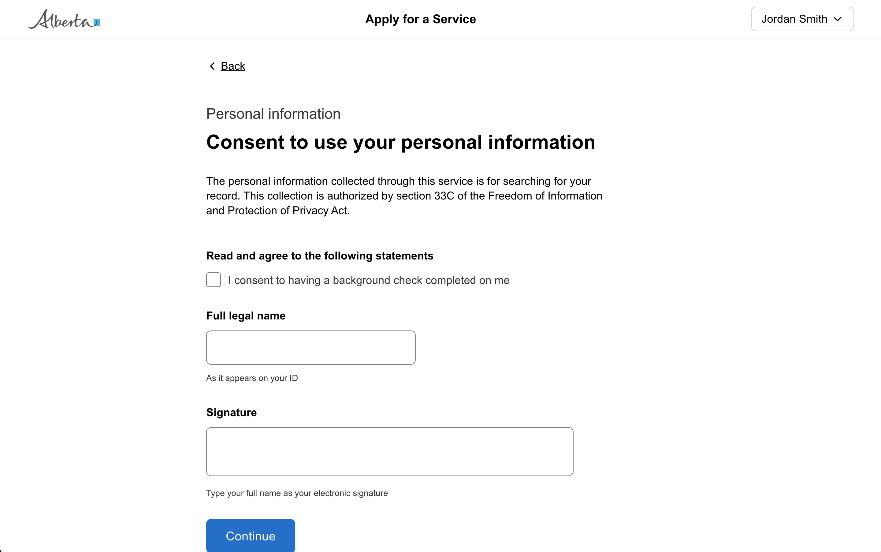
const [open, setOpen] = useState(false);<GoabButton onClick={() => setOpen(true)}>Open Basic Modal</GoabButton>
<GoabModal
heading="Are you sure you want to continue?"
open={open}
onClose={() => setOpen(false)}
actions={
<GoabButtonGroup alignment="end">
<GoabButton type="secondary" size="compact" onClick={() => setOpen(false)}>
Back
</GoabButton>
<GoabButton type="primary" size="compact" onClick={() => setOpen(false)}>
Continue
</GoabButton>
</GoabButtonGroup>
}
>
<p>You cannot return to this page.</p>
</GoabModal>import { Component } from "@angular/core";
open = false;
toggleModal(): void {
this.open = !this.open;
}<goab-button (onClick)="toggleModal()">Open Basic Modal</goab-button>
<goab-modal
[open]="open"
(onClose)="toggleModal()"
heading="Are you sure you want to continue?"
[actions]="actions"
>
<p>You cannot return to this page.</p>
<ng-template #actions>
<goab-button-group alignment="end">
<goab-button type="secondary" size="compact" (onClick)="toggleModal()"
>Back</goab-button
>
<goab-button type="primary" size="compact" (onClick)="toggleModal()"
>Continue</goab-button
>
</goab-button-group>
</ng-template>
</goab-modal>const modal = document.getElementById("confirmation-modal");
const openBtn = document.getElementById("open-modal-btn");
const backBtn = document.getElementById("back-btn");
const continueBtn = document.getElementById("continue-btn");
function openModal() {
modal.setAttribute("open", "true");
}
function closeModal() {
modal.removeAttribute("open");
}
openBtn.addEventListener("_click", openModal);
backBtn.addEventListener("_click", closeModal);
continueBtn.addEventListener("_click", closeModal);
modal.addEventListener("_close", closeModal);<goa-button version="2" id="open-modal-btn">Open Basic Modal</goa-button>
<goa-modal
version="2"
id="confirmation-modal"
heading="Are you sure you want to continue?"
>
<p>You cannot return to this page.</p>
<div slot="actions">
<goa-button-group alignment="end">
<goa-button version="2" id="back-btn" type="secondary" size="compact"
>Back</goa-button
>
<goa-button version="2" id="continue-btn" type="primary" size="compact"
>Continue</goa-button
>
</goa-button-group>
</div>
</goa-modal>const [date, setDate] = useState<Date | undefined>();
const setNewDate = (value: Date | undefined) => {
setDate(value);
};
function setValue() {
const d = new Date();
d.setDate(d.getDate() - 7);
setDate(d);
}
function clearValue() {
setDate(undefined);
}<GoabFormItem label="Date Picker">
<GoabDatePicker
name="item"
value={date}
onChange={(e) => setNewDate(e.value as Date)}
mb="xl"
/>
</GoabFormItem>
<GoabButtonGroup mt="xs" alignment="start">
<GoabButton onClick={setValue}>Set Value</GoabButton>
<GoabButton onClick={clearValue}>Clear Value</GoabButton>
</GoabButtonGroup>import { Component } from "@angular/core";
import type { GoabDatePickerOnChangeDetail } from "@abgov/ui-components-common";
item: Date | undefined = undefined;
onChange(event: GoabDatePickerOnChangeDetail): void {
this.item = event.valueStr ? new Date(event.valueStr) : undefined;
}
setValue(): void {
const d = new Date();
d.setDate(d.getDate() - 7);
this.item = d;
}
clearValue(): void {
this.item = undefined;
}<goab-form-item label="Date Picker">
<goab-date-picker (onChange)="onChange($event)" name="item" [value]="item">
</goab-date-picker>
</goab-form-item>
<goab-button-group alignment="start" mt="xs">
<goab-button (onClick)="setValue()">Set Value</goab-button>
<goab-button (onClick)="clearValue()">Clear Value</goab-button>
</goab-button-group>const datePicker = document.getElementById("date-picker");
const setValueBtn = document.getElementById("set-value-btn");
const clearValueBtn = document.getElementById("clear-value-btn");
datePicker.addEventListener("_change", (e) => {
console.log("Date changed:", e.detail.value);
});
setValueBtn.addEventListener("_click", () => {
const d = new Date();
d.setDate(d.getDate() - 7);
datePicker.setAttribute("value", d.toISOString());
});
clearValueBtn.addEventListener("_click", () => {
datePicker.removeAttribute("value");
});<goa-form-item version="2" label="Date Picker">
<goa-date-picker version="2" id="date-picker" name="item"></goa-date-picker>
</goa-form-item>
<goa-button-group alignment="start" mt="xs">
<goa-button version="2" id="set-value-btn">Set Value</goa-button>
<goa-button version="2" id="clear-value-btn">Clear Value</goa-button>
</goa-button-group><GoabGrid minChildWidth="315px">
<GoabContainer accent="thin" type="non-interactive">
<GoabText size="heading-m" mt="none" mb="m">
Appearance details
</GoabText>
<GoabGrid minChildWidth="200px" gap="m">
<GoabBlock direction="column" gap="xs">
<GoabText size="body-s" color="secondary" mt="none" mb="none">
Accused name
</GoabText>
<GoabText size="body-m" mt="none" mb="none">
Doe, John Scott
</GoabText>
</GoabBlock>
<GoabBlock direction="column" gap="xs">
<GoabText size="body-s" color="secondary" mt="none" mb="none">
Date of birth
</GoabText>
<GoabText size="body-m" mt="none" mb="none">
Mar 14, 2021
</GoabText>
</GoabBlock>
<GoabBlock direction="column" gap="xs">
<GoabText size="body-s" color="secondary" mt="none" mb="none">
Court location
</GoabText>
<GoabText size="body-m" mt="none" mb="none">
Calgary
</GoabText>
</GoabBlock>
<GoabBlock direction="column" gap="xs">
<GoabText size="body-s" color="secondary" mt="none" mb="none">
Upcoming appearance date{"(s)"}
</GoabText>
<GoabText size="body-m" mt="none" mb="none">
Sep 20, 2021
</GoabText>
</GoabBlock>
</GoabGrid>
<GoabText size="heading-xs" mt="l" mb="s">
Docket number{"(s)"} & charges
</GoabText>
<GoabContainer type="non-interactive" padding="compact">
<GoabText size="heading-xs" mt="none" mb="xs">
{"1) 12345678"}
</GoabText>
<GoabText size="body-m" mt="none" mb="none">
{"CC 334(1) - Theft under $5000"}
</GoabText>
<GoabText size="body-m" mt="none" mb="none">
{"CC 268(1) - Aggravated assault"}
</GoabText>
</GoabContainer>
<GoabContainer type="non-interactive" padding="compact">
<GoabText size="heading-xs" mt="none" mb="xs">
{"2) 12345678"}
</GoabText>
<GoabText size="body-m" mt="none" mb="none">
{"CC 334(1) - Theft under $5000"}
</GoabText>
<GoabText size="body-m" mt="none" mb="none">
{"CC 268(1) - Aggravated assault"}
</GoabText>
</GoabContainer>
</GoabContainer>
<GoabContainer accent="thin" width="content">
<form>
<GoabText size="heading-m" mt="none" mb="m">
Adjournment request
</GoabText>
<GoabText size="body-m" mt="none" mb="none">
Keep track of the individuals who are placed in lodges and may qualify for the
Lodge Assistance Program subsidy.
</GoabText>
<GoabFormItem label="Case history and new request" mt="l">
<GoabRadioGroup name="case" orientation="horizontal" onChange={() => {}}>
<GoabRadioItem value="grant" label="Grant" />
<GoabRadioItem value="deny" label="Deny" />
</GoabRadioGroup>
</GoabFormItem>
<GoabFormItem label="Reason to deny" mt="l">
<GoabDropdown name="reason" width="100%" onChange={() => {}}>
<GoabDropdownItem value="1" label="Incomplete Application" />
<GoabDropdownItem value="2" label="Eligibility Criteria Not Met" />
<GoabDropdownItem value="3" label="Documentation Verification Failure" />
</GoabDropdown>
</GoabFormItem>
<GoabFormItem label="Message" mt="l">
<GoabTextArea
name="message"
rows={5}
width="100%"
value=""
onChange={() => {}}
/>
</GoabFormItem>
<GoabButton mt="xl" onClick={() => {}}>
Confirm adjournment
</GoabButton>
</form>
</GoabContainer>
</GoabGrid>import { Component } from "@angular/core";
import { FormBuilder, FormGroup } from "@angular/forms";
form: FormGroup;
constructor(private fb: FormBuilder) {
this.form = this.fb.group({
case: [""],
reason: [""],
message: [""],
});
}
onClick(): void {
console.log("Confirm clicked!");
}<goab-grid minChildWidth="315px">
<goab-container accent="thin" type="non-interactive">
<goab-text size="heading-m" mt="none" mb="m">Appearance details</goab-text>
<goab-grid minChildWidth="200px" gap="m">
<goab-block direction="column" gap="xs">
<goab-text size="body-s" color="secondary" mt="none" mb="none"
>Accused name</goab-text
>
<goab-text size="body-m" mt="none" mb="none">Doe, John Scott</goab-text>
</goab-block>
<goab-block direction="column" gap="xs">
<goab-text size="body-s" color="secondary" mt="none" mb="none"
>Date of birth</goab-text
>
<goab-text size="body-m" mt="none" mb="none">Mar 14, 2021</goab-text>
</goab-block>
<goab-block direction="column" gap="xs">
<goab-text size="body-s" color="secondary" mt="none" mb="none"
>Court location</goab-text
>
<goab-text size="body-m" mt="none" mb="none">Calgary</goab-text>
</goab-block>
<goab-block direction="column" gap="xs">
<goab-text size="body-s" color="secondary" mt="none" mb="none"
>Upcoming appearance date(s)</goab-text
>
<goab-text size="body-m" mt="none" mb="none">Sep 20, 2021</goab-text>
</goab-block>
</goab-grid>
<goab-text size="heading-xs" mt="l" mb="s">Docket number(s) & charges</goab-text>
<goab-container type="non-interactive" padding="compact">
<goab-text size="heading-xs" mt="none" mb="xs">1) 12345678</goab-text>
<goab-text size="body-m" mt="none" mb="none"
>CC 334(1) - Theft under $5000</goab-text
>
<goab-text size="body-m" mt="none" mb="none"
>CC 268(1) - Aggravated assault</goab-text
>
</goab-container>
<goab-container type="non-interactive" padding="compact">
<goab-text size="heading-xs" mt="none" mb="xs">2) 12345678</goab-text>
<goab-text size="body-m" mt="none" mb="none"
>CC 334(1) - Theft under $5000</goab-text
>
<goab-text size="body-m" mt="none" mb="none"
>CC 268(1) - Aggravated assault</goab-text
>
</goab-container>
</goab-container>
<goab-container accent="thin" width="content">
<form [formGroup]="form">
<goab-text size="heading-m" mt="none" mb="m">Adjournment request</goab-text>
<goab-text size="body-m" mt="none" mb="none">
Keep track of the individuals who are placed in lodges and may qualify for the
Lodge Assistance Program subsidy.
</goab-text>
<goab-form-item label="Case history and new request" mt="l">
<goab-radio-group name="case" orientation="horizontal" formControlName="case">
<goab-radio-item value="grant" label="Grant"></goab-radio-item>
<goab-radio-item value="deny" label="Deny"></goab-radio-item>
</goab-radio-group>
</goab-form-item>
<goab-form-item label="Reason to deny" mt="l">
<goab-dropdown name="reason" width="100%" formControlName="reason">
<goab-dropdown-item
value="1"
label="Incomplete Application"
></goab-dropdown-item>
<goab-dropdown-item
value="2"
label="Eligibility Criteria Not Met"
></goab-dropdown-item>
<goab-dropdown-item
value="3"
label="Documentation Verification Failure"
></goab-dropdown-item>
</goab-dropdown>
</goab-form-item>
<goab-form-item label="Message" mt="l">
<goab-textarea
name="message"
[rows]="5"
width="100%"
formControlName="message"
></goab-textarea>
</goab-form-item>
<goab-button mt="xl" (onClick)="onClick()">Confirm adjournment</goab-button>
</form>
</goab-container>
</goab-grid>document.getElementById("confirm-btn").addEventListener("_click", () => {
console.log("Confirm clicked!");
});<goa-grid minchildwidth="315px">
<goa-container accent="thin" type="non-interactive">
<goa-text size="heading-m" mt="none" mb="m">Appearance details</goa-text>
<goa-grid minchildwidth="200px" gap="m">
<goa-block direction="column" gap="xs">
<goa-text size="body-s" color="secondary" mt="none" mb="none"
>Accused name</goa-text
>
<goa-text size="body-m" mt="none" mb="none">Doe, John Scott</goa-text>
</goa-block>
<goa-block direction="column" gap="xs">
<goa-text size="body-s" color="secondary" mt="none" mb="none"
>Date of birth</goa-text
>
<goa-text size="body-m" mt="none" mb="none">Mar 14, 2021</goa-text>
</goa-block>
<goa-block direction="column" gap="xs">
<goa-text size="body-s" color="secondary" mt="none" mb="none"
>Court location</goa-text
>
<goa-text size="body-m" mt="none" mb="none">Calgary</goa-text>
</goa-block>
<goa-block direction="column" gap="xs">
<goa-text size="body-s" color="secondary" mt="none" mb="none"
>Upcoming appearance date(s)</goa-text
>
<goa-text size="body-m" mt="none" mb="none">Sep 20, 2021</goa-text>
</goa-block>
</goa-grid>
<goa-text size="heading-xs" mt="l" mb="s">Docket number(s) & charges</goa-text>
<goa-container type="non-interactive" padding="compact">
<goa-text size="heading-xs" mt="none" mb="xs">1) 12345678</goa-text>
<goa-text size="body-m" mt="none" mb="none">CC 334(1) - Theft under $5000</goa-text>
<goa-text size="body-m" mt="none" mb="none"
>CC 268(1) - Aggravated assault</goa-text
>
</goa-container>
<goa-container type="non-interactive" padding="compact">
<goa-text size="heading-xs" mt="none" mb="xs">2) 12345678</goa-text>
<goa-text size="body-m" mt="none" mb="none">CC 334(1) - Theft under $5000</goa-text>
<goa-text size="body-m" mt="none" mb="none"
>CC 268(1) - Aggravated assault</goa-text
>
</goa-container>
</goa-container>
<goa-container accent="thin" width="content">
<form>
<goa-text size="heading-m" mt="none" mb="m">Adjournment request</goa-text>
<goa-text size="body-m" mt="none" mb="none">
Keep track of the individuals who are placed in lodges and may qualify for the
Lodge Assistance Program subsidy.
</goa-text>
<goa-form-item version="2" label="Case history and new request" mt="l">
<goa-radio-group version="2" name="case" orientation="horizontal">
<goa-radio-item value="grant" label="Grant"></goa-radio-item>
<goa-radio-item value="deny" label="Deny"></goa-radio-item>
</goa-radio-group>
</goa-form-item>
<goa-form-item version="2" label="Reason to deny" mt="l">
<goa-dropdown version="2" name="reason" width="100%">
<goa-dropdown-item value="1" label="Incomplete Application"></goa-dropdown-item>
<goa-dropdown-item
value="2"
label="Eligibility Criteria Not Met"
></goa-dropdown-item>
<goa-dropdown-item
value="3"
label="Documentation Verification Failure"
></goa-dropdown-item>
</goa-dropdown>
</goa-form-item>
<goa-form-item version="2" label="Message" mt="l">
<goa-textarea version="2" name="message" rows="5" width="100%"></goa-textarea>
</goa-form-item>
<goa-button version="2" id="confirm-btn" mt="xl">Confirm adjournment</goa-button>
</form>
</goa-container>
</goa-grid>const [search, setSearch] = useState("");
const onClick = () => {
console.log("search:", search);
};<form>
<GoabFormItem>
<GoabBlock gap="xs" direction="row">
<GoabInput
type="search"
name="search"
value={search}
onChange={(e) => setSearch(e.value)}
leadingIcon="search"
/>
<GoabButton type="primary" onClick={onClick}>
Search
</GoabButton>
</GoabBlock>
</GoabFormItem>
</form>import { Component } from "@angular/core";
import { FormBuilder, FormGroup } from "@angular/forms";
form: FormGroup;
constructor(private fb: FormBuilder) {
this.form = this.fb.group({
search: [""],
});
}
onClick(): void {
console.log("search:", this.form.controls["search"].value);
}<form [formGroup]="form">
<goab-form-item>
<goab-block gap="xs" direction="row">
<goab-input
type="search"
name="search"
formControlName="search"
leadingIcon="search"
>
</goab-input>
<goab-button type="primary" (onClick)="onClick()">Search</goab-button>
</goab-block>
</goab-form-item>
</form>const searchInput = document.getElementById("search-input");
const searchBtn = document.getElementById("search-btn");
let searchValue = "";
searchInput.addEventListener("_change", (e) => {
searchValue = e.detail.value;
});
searchBtn.addEventListener("_click", () => {
console.log("search:", searchValue);
});<form>
<goa-form-item version="2">
<goa-block gap="xs" direction="row">
<goa-input
version="2"
id="search-input"
type="search"
name="search"
leadingicon="search"
>
</goa-input>
<goa-button version="2" id="search-btn" type="primary">Search</goa-button>
</goa-block>
</goa-form-item>
</form>const review = [0, 1, 2, 3];
const complete = [0, 1];<GoabTabs initialTab={2}>
<GoabTab heading="All">
<GoabTable width="100%">
<thead>
<tr>
<th>Status</th>
<th>Text</th>
<th className="goa-table-number-header">Number</th>
<th style={{ width: "1%", whiteSpace: "nowrap" }}>Action</th>
</tr>
</thead>
<tbody>
{review.map((i) => (
<tr key={`review-${i}`}>
<td>
<GoabBadge type="important" content="Review pending" />
</td>
<td>Lorem Ipsum</td>
<td className="goa-table-number-column">1234567890</td>
<td>
<GoabButton type="tertiary" size="compact">
Action
</GoabButton>
</td>
</tr>
))}
{complete.map((i) => (
<tr key={`complete-${i}`}>
<td>
<GoabBadge type="information" content="Complete" />
</td>
<td>Lorem Ipsum</td>
<td className="goa-table-number-column">1234567890</td>
<td>
<GoabButton type="tertiary" size="compact">
Action
</GoabButton>
</td>
</tr>
))}
</tbody>
</GoabTable>
</GoabTab>
<GoabTab
heading={
Review pending
<GoabBadge type="important" content="4" icon={false} />
}
>
<GoabTable width="100%">
<thead>
<tr>
<th>Status</th>
<th>Text</th>
<th className="goa-table-number-header">Number</th>
<th style={{ width: "1%", whiteSpace: "nowrap" }}>Action</th>
</tr>
</thead>
<tbody>
{review.map((i) => (
<tr key={i}>
<td>
<GoabBadge type="important" content="Review pending" />
</td>
<td>Lorem Ipsum</td>
<td className="goa-table-number-column">1234567890</td>
<td>
<GoabButton type="tertiary" size="compact">
Action
</GoabButton>
</td>
</tr>
))}
</tbody>
</GoabTable>
</GoabTab>
<GoabTab
heading={
<>
Complete
<GoabBadge type="information" content="338" icon={false} />
</>
}
>
<GoabTable width="100%">
<thead>
<tr>
<th>Status</th>
<th>Text</th>
<th className="goa-table-number-header">Number</th>
<th style={{ width: "1%", whiteSpace: "nowrap" }}>Action</th>
</tr>
</thead>
<tbody>
{complete.map((i) => (
<tr key={i}>
<td>
<GoabBadge type="information" content="Complete" />
</td>
<td>Lorem Ipsum</td>
<td className="goa-table-number-column">1234567890</td>
<td>
<GoabButton type="tertiary" size="compact">
Action
</GoabButton>
</td>
</tr>
))}
</tbody>
</GoabTable>
</GoabTab>
</GoabTabs>import { Component } from "@angular/core";
review = [0, 1, 2, 3];
complete = [0, 1];<goab-tabs [initialTab]="2">
<goab-tab heading="All">
<goab-table width="100%">
<thead>
<tr>
<th>Status</th>
<th>Text</th>
<th class="goa-table-number-header">Number</th>
<th style="width: 1%; white-space: nowrap">Action</th>
</tr>
</thead>
<tbody>
@for (i of review; track $index) {
<tr>
<td>
<goab-badge type="important" content="Review pending"></goab-badge>
</td>
<td>Lorem Ipsum</td>
<td class="goa-table-number-column">1234567890</td>
<td>
<goab-button type="tertiary" size="compact">Action</goab-button>
</td>
</tr>
} @for (i of complete; track $index) {
<tr>
<td>
<goab-badge type="information" content="Complete"></goab-badge>
</td>
<td>Lorem Ipsum</td>
<td class="goa-table-number-column">1234567890</td>
<td>
<goab-button type="tertiary" size="compact">Action</goab-button>
</td>
</tr>
}
</tbody>
</goab-table>
</goab-tab>
<goab-tab [heading]="reviewPending">
<ng-template #reviewPending
>Review pending<goab-badge type="important" content="4" [icon]="false"></goab-badge
></ng-template>
<goab-table width="100%">
<thead>
<tr>
<th>Status</th>
<th>Text</th>
<th class="goa-table-number-header">Number</th>
<th style="width: 1%; white-space: nowrap">Action</th>
</tr>
</thead>
<tbody>
@for (i of review; track $index) {
<tr>
<td>
<goab-badge type="important" content="Review pending"></goab-badge>
</td>
<td>Lorem Ipsum</td>
<td class="goa-table-number-column">1234567890</td>
<td>
<goab-button type="tertiary" size="compact">Action</goab-button>
</td>
</tr>
}
</tbody>
</goab-table>
</goab-tab>
<goab-tab [heading]="completeTemplate">
<ng-template #completeTemplate
>Complete<goab-badge type="information" content="338" [icon]="false"></goab-badge
></ng-template>
<goab-table width="100%">
<thead>
<tr>
<th>Status</th>
<th>Text</th>
<th class="goa-table-number-header">Number</th>
<th style="width: 1%; white-space: nowrap">Action</th>
</tr>
</thead>
<tbody>
@for (i of complete; track $index) {
<tr>
<td>
<goab-badge type="information" content="Complete"></goab-badge>
</td>
<td>Lorem Ipsum</td>
<td class="goa-table-number-column">1234567890</td>
<td>
<goab-button type="tertiary" size="compact">Action</goab-button>
</td>
</tr>
}
</tbody>
</goab-table>
</goab-tab>
</goab-tabs><goa-tabs version="2" initialtab="2">
<goa-tab>
<div slot="heading">All</div>
<goa-table version="2" width="100%">
<table width="100%">
<thead>
<tr>
<th>Status</th>
<th>Text</th>
<th class="goa-table-number-header">Number</th>
<th style="width: 1%; white-space: nowrap">Action</th>
</tr>
</thead>
<tbody>
<tr>
<td>
<goa-badge
version="2"
type="important"
content="Review pending"
></goa-badge>
</td>
<td>Lorem Ipsum</td>
<td class="goa-table-number-column">1234567890</td>
<td>
<goa-button version="2" type="tertiary" size="compact">Action</goa-button>
</td>
</tr>
<tr>
<td>
<goa-badge
version="2"
type="important"
content="Review pending"
></goa-badge>
</td>
<td>Lorem Ipsum</td>
<td class="goa-table-number-column">1234567890</td>
<td>
<goa-button version="2" type="tertiary" size="compact">Action</goa-button>
</td>
</tr>
<tr>
<td>
<goa-badge version="2" type="information" content="Complete"></goa-badge>
</td>
<td>Lorem Ipsum</td>
<td class="goa-table-number-column">1234567890</td>
<td>
<goa-button version="2" type="tertiary" size="compact">Action</goa-button>
</td>
</tr>
</tbody>
</table>
</goa-table>
</goa-tab>
<goa-tab>
<div slot="heading">
Review pending<goa-badge
version="2"
type="important"
content="4"
icon="false"
></goa-badge>
</div>
<goa-table version="2" width="100%">
<table width="100%">
<thead>
<tr>
<th>Status</th>
<th>Text</th>
<th class="goa-table-number-header">Number</th>
<th style="width: 1%; white-space: nowrap">Action</th>
</tr>
</thead>
<tbody>
<tr>
<td>
<goa-badge
version="2"
type="important"
content="Review pending"
></goa-badge>
</td>
<td>Lorem Ipsum</td>
<td class="goa-table-number-column">1234567890</td>
<td>
<goa-button version="2" type="tertiary" size="compact">Action</goa-button>
</td>
</tr>
<tr>
<td>
<goa-badge
version="2"
type="important"
content="Review pending"
></goa-badge>
</td>
<td>Lorem Ipsum</td>
<td class="goa-table-number-column">1234567890</td>
<td>
<goa-button version="2" type="tertiary" size="compact">Action</goa-button>
</td>
</tr>
</tbody>
</table>
</goa-table>
</goa-tab>
<goa-tab>
<div slot="heading">
Complete<goa-badge
version="2"
type="information"
content="338"
icon="false"
></goa-badge>
</div>
<goa-table version="2" width="100%">
<table width="100%">
<thead>
<tr>
<th>Status</th>
<th>Text</th>
<th class="goa-table-number-header">Number</th>
<th style="width: 1%; white-space: nowrap">Action</th>
</tr>
</thead>
<tbody>
<tr>
<td>
<goa-badge version="2" type="information" content="Complete"></goa-badge>
</td>
<td>Lorem Ipsum</td>
<td class="goa-table-number-column">1234567890</td>
<td>
<goa-button version="2" type="tertiary" size="compact">Action</goa-button>
</td>
</tr>
<tr>
<td>
<goa-badge version="2" type="information" content="Complete"></goa-badge>
</td>
<td>Lorem Ipsum</td>
<td class="goa-table-number-column">1234567890</td>
<td>
<goa-button version="2" type="tertiary" size="compact">Action</goa-button>
</td>
</tr>
</tbody>
</table>
</goa-table>
</goa-tab>
</goa-tabs>const save = async () => {
// await api.save();
TemporaryNotification.show("Your application has been saved.", {
type: "success",
});
};<GoabTemporaryNotificationCtrl />
<GoabButton type="secondary" onClick={save}>
Save
</GoabButton>import { Component } from "@angular/core";
import { TemporaryNotification } from "@abgov/ui-components-common";
async save(): Promise<void> {
// await this.api.save();
TemporaryNotification.show("Your application has been saved.", {
type: "success",
});
}<goab-temporary-notification-ctrl></goab-temporary-notification-ctrl>
<goab-button type="secondary" (onClick)="save()">Save</goab-button>document.getElementById("save-btn").addEventListener("_click", () => {
// await api.save();
document.body.dispatchEvent(
new CustomEvent("msg", {
composed: true,
bubbles: true,
detail: {
action: "goa:temp-notification",
data: {
message: "Your application has been saved.",
type: "success",
uuid: crypto.randomUUID(),
duration: "short",
},
},
}),
);
});<goa-temp-notification-ctrl></goa-temp-notification-ctrl>
<goa-button version="2" id="save-btn" type="secondary">Save</goa-button>const comment = () => {
const uuid = TemporaryNotification.show(
"Edna Mode commented on your assigned case.",
{
actionText: "View",
action: () => {
TemporaryNotification.dismiss(uuid);
},
},
);
};<GoabTemporaryNotificationCtrl />
<GoabButton onClick={comment}>Comment</GoabButton>import { Component } from "@angular/core";
import { TemporaryNotification } from "@abgov/ui-components-common";
comment(): void {
const uuid = TemporaryNotification.show(
"Edna Mode commented on your assigned case.",
{
actionText: "View",
action: () => {
TemporaryNotification.dismiss(uuid);
},
},
);
}<goab-temporary-notification-ctrl></goab-temporary-notification-ctrl>
<goab-button (onClick)="comment()">Comment</goab-button>const commentBtn = document.getElementById("comment-btn");
let currentUuid = null;
function showNotification(message, opts = {}) {
const uuid = crypto.randomUUID();
document.body.dispatchEvent(
new CustomEvent("msg", {
composed: true,
bubbles: true,
detail: {
action: "goa:temp-notification",
data: { message, uuid, type: "basic", duration: "short", ...opts },
},
}),
);
return uuid;
}
function dismissNotification(uuid) {
document.body.dispatchEvent(
new CustomEvent("msg", {
composed: true,
bubbles: true,
detail: {
action: "goa:temp-notification:dismiss",
data: uuid,
},
}),
);
}
commentBtn.addEventListener("_click", () => {
currentUuid = showNotification("Edna Mode commented on your assigned case.", {
actionText: "View",
action: () => {
dismissNotification(currentUuid);
},
});
});<goa-temp-notification-ctrl></goa-temp-notification-ctrl>
<goa-button version="2" id="comment-btn">Comment</goa-button>const sendApi = (
progressCallback: (progress: number) => void,
isCancelledRef: { current: boolean },
) => {
return new Promise((resolve, reject) => {
let progress = 0;
const interval = setInterval(() => {
if (isCancelledRef.current) {
clearInterval(interval);
reject("cancelled");
return;
}
progress += 5;
progressCallback(progress);
if (progress >= 100) {
clearInterval(interval);
resolve("success");
}
}, 200);
});
};
const downloadReport = () => {
const isCancelledRef = { current: false };
const uuid = TemporaryNotification.show("Downloading report D-23459", {
type: "progress",
actionText: "Cancel",
action: () => {
isCancelledRef.current = true;
TemporaryNotification.dismiss(uuid);
console.log("Download cancelled");
},
});
TemporaryNotification.setProgress(uuid, 0);
const updateProgress = (progress: number) => {
TemporaryNotification.setProgress(uuid, progress);
if (progress >= 100) {
setTimeout(() => {
TemporaryNotification.show("Report downloaded", {
type: "success",
duration: "medium",
actionText: "View",
action: () => {
console.log("View report clicked!");
},
cancelUUID: uuid,
});
}, 300);
}
};
sendApi(updateProgress, isCancelledRef).catch((error) => {
if (error !== "cancelled") {
TemporaryNotification.dismiss(uuid);
}
});
};<GoabTemporaryNotificationCtrl />
<GoabButton type="tertiary" leadingIcon="download" onClick={downloadReport}>
Download report
</GoabButton>import { Component } from "@angular/core";
import { TemporaryNotification } from "@abgov/ui-components-common";
async downloadReportAPI(notificationUuid: string): Promise<Error | undefined> {
// Perform your API call here with progress tracking
// Update progress as download progresses (0-100)
TemporaryNotification.setProgress(notificationUuid, 25);
// ... continue API work ...
TemporaryNotification.setProgress(notificationUuid, 50);
// ... continue API work ...
TemporaryNotification.setProgress(notificationUuid, 75);
// ... complete API work ...
TemporaryNotification.setProgress(notificationUuid, 100);
return undefined;
}
async downloadReport(): Promise<void> {
const uuid = TemporaryNotification.show("Downloading report D-23459", {
type: "progress",
actionText: "Cancel",
action: () => {
TemporaryNotification.dismiss(uuid);
},
});
const err = await this.downloadReportAPI(uuid);
if (err) {
TemporaryNotification.show("Download failed", {
type: "error",
duration: "medium",
cancelUUID: uuid,
});
} else {
TemporaryNotification.show("Report downloaded", {
type: "success",
duration: "medium",
actionText: "View",
action: () => {
console.log("View report clicked!");
},
cancelUUID: uuid,
});
}
}<goab-temporary-notification-ctrl></goab-temporary-notification-ctrl>
<goab-button type="tertiary" leadingIcon="download" (onClick)="downloadReport()">
Download report
</goab-button>const downloadBtn = document.getElementById("download-btn");
let currentUuid = null;
function showNotification(message, opts = {}) {
const uuid = crypto.randomUUID();
document.body.dispatchEvent(
new CustomEvent("msg", {
composed: true,
bubbles: true,
detail: {
action: "goa:temp-notification",
data: { message, uuid, type: "basic", ...opts },
},
}),
);
return uuid;
}
function dismissNotification(uuid) {
document.body.dispatchEvent(
new CustomEvent("msg", {
composed: true,
bubbles: true,
detail: {
action: "goa:temp-notification:dismiss",
data: uuid,
},
}),
);
}
function setProgress(uuid, progress) {
document.body.dispatchEvent(
new CustomEvent("msg", {
composed: true,
bubbles: true,
detail: {
action: "goa:temp-notification:progress",
data: { uuid, progress },
},
}),
);
}
async function downloadReportAPI(notificationUuid) {
setProgress(notificationUuid, 25);
await new Promise((resolve) => setTimeout(resolve, 500));
setProgress(notificationUuid, 50);
await new Promise((resolve) => setTimeout(resolve, 500));
setProgress(notificationUuid, 75);
await new Promise((resolve) => setTimeout(resolve, 500));
setProgress(notificationUuid, 100);
}
async function downloadReport() {
currentUuid = showNotification("Downloading report D-23459", {
type: "progress",
actionText: "Cancel",
action: () => {
dismissNotification(currentUuid);
},
});
try {
await downloadReportAPI(currentUuid);
showNotification("Report downloaded", {
type: "success",
duration: "medium",
actionText: "View",
action: () => {
console.log("View report clicked!");
},
cancelUUID: currentUuid,
});
} catch (err) {
showNotification("Download failed", {
type: "failure",
duration: "medium",
cancelUUID: currentUuid,
});
}
}
downloadBtn.addEventListener("_click", downloadReport);<goa-temp-notification-ctrl></goa-temp-notification-ctrl>
<goa-button version="2" id="download-btn" type="tertiary" leadingicon="download">
Download report
</goa-button>const searchCMS = async (): Promise<Error | undefined> => {
// Perform your API call here
await new Promise((resolve) => setTimeout(resolve, 3000));
return undefined;
};
const search = async () => {
const uuid = TemporaryNotification.show("Searching case management system...", {
type: "indeterminate",
actionText: "Cancel",
action: () => {
TemporaryNotification.dismiss(uuid);
},
});
const err = await searchCMS();
if (err) {
TemporaryNotification.show("Could not connect to case history", {
type: "failure",
duration: "medium",
cancelUUID: uuid,
});
} else {
TemporaryNotification.show("Search complete - 47 records found", {
type: "success",
duration: "medium",
actionText: "View",
action: () => {
console.log("View search results clicked!");
},
cancelUUID: uuid,
});
}
};<GoabTemporaryNotificationCtrl />
<GoabButton type="secondary" leadingIcon="search" onClick={search}>
Search case history
</GoabButton>import { Component } from "@angular/core";
import { TemporaryNotification } from "@abgov/ui-components-common";
async searchCMS(): Promise<Error | undefined> {
// Perform your API call here
await new Promise((resolve) => setTimeout(resolve, 3000));
return undefined;
}
async search(): Promise<void> {
const uuid = TemporaryNotification.show("Searching case management system...", {
type: "indeterminate",
actionText: "Cancel",
action: () => {
TemporaryNotification.dismiss(uuid);
},
});
const err = await this.searchCMS();
if (err) {
TemporaryNotification.show("Could not connect to case history", {
type: "failure",
duration: "medium",
cancelUUID: uuid,
});
} else {
TemporaryNotification.show("Search complete - 47 records found", {
type: "success",
duration: "medium",
actionText: "View",
action: () => {
console.log("View search results clicked!");
},
cancelUUID: uuid,
});
}
}<goab-temporary-notification-ctrl></goab-temporary-notification-ctrl>
<goab-button type="secondary" leadingIcon="search" (onClick)="search()">
Search case history
</goab-button>const searchBtn = document.getElementById("search-btn");
let currentUuid = null;
function showNotification(message, opts = {}) {
const uuid = crypto.randomUUID();
document.body.dispatchEvent(
new CustomEvent("msg", {
composed: true,
bubbles: true,
detail: {
action: "goa:temp-notification",
data: { message, uuid, type: "basic", ...opts },
},
}),
);
return uuid;
}
function dismissNotification(uuid) {
document.body.dispatchEvent(
new CustomEvent("msg", {
composed: true,
bubbles: true,
detail: {
action: "goa:temp-notification:dismiss",
data: uuid,
},
}),
);
}
async function searchCMS() {
await new Promise((resolve) => setTimeout(resolve, 3000));
}
async function search() {
currentUuid = showNotification("Searching case management system...", {
type: "indeterminate",
actionText: "Cancel",
action: () => {
dismissNotification(currentUuid);
},
});
try {
await searchCMS();
showNotification("Search complete - 47 records found", {
type: "success",
duration: "medium",
actionText: "View",
action: () => {
console.log("View search results clicked!");
},
cancelUUID: currentUuid,
});
} catch (err) {
showNotification("Could not connect to case history", {
type: "failure",
duration: "medium",
cancelUUID: currentUuid,
});
}
}
searchBtn.addEventListener("_click", search);<goa-temp-notification-ctrl></goa-temp-notification-ctrl>
<goa-button version="2" id="search-btn" type="secondary" leadingicon="search">
Search case history
</goa-button>const review = [0, 1, 2, 3];
const complete = [0, 1];<GoabTabs initialTab={1}>
<GoabTab heading="All">
<GoabTable width="100%">
<thead>
<tr>
<th>Status</th>
<th>Text</th>
<th className="goa-table-number-header">Number</th>
<th style={{ width: "1%", whiteSpace: "nowrap" }}>Action</th>
</tr>
</thead>
<tbody>
{review.map((i) => (
<tr key={`review-${i}`}>
<td>
<GoabBadge type="important" content="Review pending" />
</td>
<td>Lorem Ipsum</td>
<td className="goa-table-number-column">1234567890</td>
<td>
<GoabButton type="tertiary" size="compact">
Action
</GoabButton>
</td>
</tr>
))}
{complete.map((i) => (
<tr key={`complete-${i}`}>
<td>
<GoabBadge type="information" content="Complete" />
</td>
<td>Lorem Ipsum</td>
<td className="goa-table-number-column">1234567890</td>
<td>
<GoabButton type="tertiary" size="compact">
Action
</GoabButton>
</td>
</tr>
))}
</tbody>
</GoabTable>
</GoabTab>
<GoabTab
heading={
Review pending
<GoabBadge type="important" content="4" icon={false} />
}
>
<GoabTable width="100%">
<thead>
<tr>
<th>Status</th>
<th>Text</th>
<th className="goa-table-number-header">Number</th>
<th style={{ width: "1%", whiteSpace: "nowrap" }}>Action</th>
</tr>
</thead>
<tbody>
{review.map((i) => (
<tr key={i}>
<td>
<GoabBadge type="important" content="Review pending" />
</td>
<td>Lorem Ipsum</td>
<td className="goa-table-number-column">1234567890</td>
<td>
<GoabButton type="tertiary" size="compact">
Action
</GoabButton>
</td>
</tr>
))}
</tbody>
</GoabTable>
</GoabTab>
<GoabTab
heading={
<>
Complete
<GoabBadge type="information" content="338" icon={false} />
</>
}
>
<GoabTable width="100%">
<thead>
<tr>
<th>Status</th>
<th>Text</th>
<th className="goa-table-number-header">Number</th>
<th style={{ width: "1%", whiteSpace: "nowrap" }}>Action</th>
</tr>
</thead>
<tbody>
{complete.map((i) => (
<tr key={i}>
<td>
<GoabBadge type="information" content="Complete" />
</td>
<td>Lorem Ipsum</td>
<td className="goa-table-number-column">1234567890</td>
<td>
<GoabButton type="tertiary" size="compact">
Action
</GoabButton>
</td>
</tr>
))}
</tbody>
</GoabTable>
</GoabTab>
</GoabTabs>import { Component } from "@angular/core";
reviewItems = [0, 1, 2, 3];
completeItems = [0, 1];<goab-tabs>
<goab-tab heading="All">
<goab-table width="100%">
<thead>
<tr>
<th>Status</th>
<th>Text</th>
<th class="goa-table-number-header">Number</th>
<th style="width: 1%; white-space: nowrap">Action</th>
</tr>
</thead>
<tbody>
@for (i of reviewItems; track $index) {
<tr>
<td><goab-badge type="important" content="Review pending"></goab-badge></td>
<td>Lorem ipsum</td>
<td class="goa-table-number-column">1234567890</td>
<td><goab-button type="tertiary" size="compact">Action</goab-button></td>
</tr>
} @for (i of completeItems; track $index) {
<tr>
<td><goab-badge type="information" content="Complete"></goab-badge></td>
<td>Lorem Ipsum</td>
<td class="goa-table-number-column">1234567890</td>
<td><goab-button type="tertiary" size="compact">Action</goab-button></td>
</tr>
}
</tbody>
</goab-table>
</goab-tab>
<goab-tab [heading]="reviewPending">
<ng-template #reviewPending
>Review pending<goab-badge type="important" content="4" [icon]="false"></goab-badge
></ng-template>
<goab-table width="100%">
<thead>
<tr>
<th>Status</th>
<th>Text</th>
<th class="goa-table-number-header">Number</th>
<th style="width: 1%; white-space: nowrap">Action</th>
</tr>
</thead>
<tbody>
@for (i of reviewItems; track $index) {
<tr>
<td><goab-badge type="important" content="Review pending"></goab-badge></td>
<td>Lorem ipsum</td>
<td class="goa-table-number-column">1234567890</td>
<td><goab-button type="tertiary" size="compact">Action</goab-button></td>
</tr>
}
</tbody>
</goab-table>
</goab-tab>
<goab-tab [heading]="completeTab">
<ng-template #completeTab
>Complete<goab-badge type="information" content="338" [icon]="false"></goab-badge
></ng-template>
<goab-table width="100%">
<thead>
<tr>
<th>Status</th>
<th>Text</th>
<th class="goa-table-number-header">Number</th>
<th style="width: 1%; white-space: nowrap">Action</th>
</tr>
</thead>
<tbody>
@for (i of completeItems; track $index) {
<tr>
<td><goab-badge type="information" content="Complete"></goab-badge></td>
<td>Lorem Ipsum</td>
<td class="goa-table-number-column">1234567890</td>
<td><goab-button type="tertiary" size="compact">Action</goab-button></td>
</tr>
}
</tbody>
</goab-table>
</goab-tab>
</goab-tabs><goa-tabs version="2">
<goa-tab>
<div slot="heading">All</div>
<goa-table version="2" width="100%">
<table width="100%">
<thead>
<tr>
<th>Status</th>
<th>Text</th>
<th class="goa-table-number-header">Number</th>
<th style="width: 1%; white-space: nowrap">Action</th>
</tr>
</thead>
<tbody>
<tr>
<td>
<goa-badge
version="2"
type="important"
content="Review pending"
></goa-badge>
</td>
<td>Lorem ipsum</td>
<td class="goa-table-number-column">1234567890</td>
<td>
<goa-button version="2" type="tertiary" size="compact">Action</goa-button>
</td>
</tr>
<tr>
<td>
<goa-badge
version="2"
type="important"
content="Review pending"
></goa-badge>
</td>
<td>Lorem ipsum</td>
<td class="goa-table-number-column">1234567890</td>
<td>
<goa-button version="2" type="tertiary" size="compact">Action</goa-button>
</td>
</tr>
<tr>
<td>
<goa-badge version="2" type="information" content="Complete"></goa-badge>
</td>
<td>Lorem Ipsum</td>
<td class="goa-table-number-column">1234567890</td>
<td>
<goa-button version="2" type="tertiary" size="compact">Action</goa-button>
</td>
</tr>
</tbody>
</table>
</goa-table>
</goa-tab>
<goa-tab>
<div slot="heading">
Review pending<goa-badge
version="2"
type="important"
content="4"
icon="false"
></goa-badge>
</div>
<goa-table version="2" width="100%">
<table width="100%">
<thead>
<tr>
<th>Status</th>
<th>Text</th>
<th class="goa-table-number-header">Number</th>
<th style="width: 1%; white-space: nowrap">Action</th>
</tr>
</thead>
<tbody>
<tr>
<td>
<goa-badge
version="2"
type="important"
content="Review pending"
></goa-badge>
</td>
<td>Lorem ipsum</td>
<td class="goa-table-number-column">1234567890</td>
<td>
<goa-button version="2" type="tertiary" size="compact">Action</goa-button>
</td>
</tr>
<tr>
<td>
<goa-badge
version="2"
type="important"
content="Review pending"
></goa-badge>
</td>
<td>Lorem ipsum</td>
<td class="goa-table-number-column">1234567890</td>
<td>
<goa-button version="2" type="tertiary" size="compact">Action</goa-button>
</td>
</tr>
</tbody>
</table>
</goa-table>
</goa-tab>
<goa-tab>
<div slot="heading">
Complete<goa-badge
version="2"
type="information"
content="338"
icon="false"
></goa-badge>
</div>
<goa-table version="2" width="100%">
<table width="100%">
<thead>
<tr>
<th>Status</th>
<th>Text</th>
<th class="goa-table-number-header">Number</th>
<th style="width: 1%; white-space: nowrap">Action</th>
</tr>
</thead>
<tbody>
<tr>
<td>
<goa-badge version="2" type="information" content="Complete"></goa-badge>
</td>
<td>Lorem Ipsum</td>
<td class="goa-table-number-column">1234567890</td>
<td>
<goa-button version="2" type="tertiary" size="compact">Action</goa-button>
</td>
</tr>
</tbody>
</table>
</goa-table>
</goa-tab>
</goa-tabs>interface BadgeValue {
key: number;
type: GoabBadgeType;
content: string;
}
const badgeValues: BadgeValue[] = [
{ key: 1, type: "important", content: "Pending" },
{ key: 2, type: "emergency", content: "Failed" },
{ key: 3, type: "success", content: "Complete" },
{ key: 4, type: "information", content: "In progress" },
{ key: 5, type: "default", content: "Closed" },
{ key: 6, type: "success", content: "Complete" },
];
const handleClick = () => {
console.log("clicked");
};<GoabTable width="100%">
<thead>
<tr>
<th>Status</th>
<th>Name</th>
<th className="goa-table-number-header">File number</th>
<th style={{ width: "1%", whiteSpace: "nowrap" }}></th>
</tr>
</thead>
<tbody>
{badgeValues.map((badge) => (
<tr key={badge.key}>
<td>
<GoabBadge type={badge.type} content={badge.content} icon={false} />
</td>
<td>Lorem ipsum dolor sit amet consectetur</td>
<td className="goa-table-number-column">1234567890</td>
<td>
<GoabButton size="compact" type="tertiary" onClick={handleClick}>
Assign
</GoabButton>
</td>
</tr>
))}
</tbody>
</GoabTable>import { Component } from "@angular/core";
import type { GoabBadgeType } from "@abgov/ui-components-common";
badgeValues: BadgeValue[] = [
{ type: "important", content: "Pending" },
{ type: "emergency", content: "Failed" },
{ type: "success", content: "Complete" },
{ type: "information", content: "In progress" },
{ type: "default", content: "Closed" },
{ type: "success", content: "Complete" },
];
onClick(): void {
console.log("clicked");
}<goab-table width="100%">
<thead>
<tr>
<th>Status</th>
<th>Name</th>
<th class="goa-table-number-header">File number</th>
<th style="width: 1%; white-space: nowrap"></th>
</tr>
</thead>
<tbody>
@for (badge of badgeValues; track $index) {
<tr>
<td>
<goab-badge
[type]="badge.type"
[content]="badge.content"
[icon]="false"
></goab-badge>
</td>
<td>Lorem ipsum dolor sit amet consectetur.</td>
<td class="goa-table-number-column">1234567890</td>
<td>
<goab-button size="compact" type="tertiary" (onClick)="onClick()"
>Assign</goab-button
>
</td>
</tr>
}
</tbody>
</goab-table>const badgeValues = [
{ type: "important", content: "Pending" },
{ type: "emergency", content: "Failed" },
{ type: "success", content: "Complete" },
{ type: "information", content: "In progress" },
{ type: "default", content: "Closed" },
{ type: "success", content: "Complete" },
];
const tbody = document.getElementById("table-body");
badgeValues.forEach((badge) => {
const row = document.createElement("tr");
row.innerHTML = `
<td><goa-badge version="2" type="${badge.type}" content="${badge.content}" icon="false"></goa-badge></td>
<td>Lorem ipsum dolor sit amet consectetur</td>
<td class="goa-table-number-column">1234567890</td>
<td><goa-button version="2" size="compact" type="tertiary">Assign</goa-button></td>
`;
const button = row.querySelector("goa-button");
button.addEventListener("_click", () => console.log("clicked"));
tbody.appendChild(row);
});<goa-table version="2" width="100%" id="status-table">
<table width="100%">
<thead>
<tr>
<th>Status</th>
<th>Name</th>
<th class="goa-table-number-header">File number</th>
<th style="width: 1%; white-space: nowrap"></th>
</tr>
</thead>
<tbody id="table-body"></tbody>
</table>
</goa-table>const [open, setOpen] = useState(false); <GoabButton type="secondary" onClick={() => setOpen(true)}>
Save for later
</GoabButton>
<GoabModal
heading="Complete submission prior to 1PM"
calloutVariant="important"
open={open}
onClose={() => setOpen(false)}
actions={
<GoabButtonGroup alignment="end">
<GoabButton type="primary" onClick={() => setOpen(false)}>
I understand
</GoabButton>
</GoabButtonGroup>
}
>
<p>
You've selected to adjourn a matter that is required to appear today. This
Calgary court location does not accept adjournment requests past 1PM MST. Please
submit your adjournment request as soon as possible.
</p>
</GoabModal>
);
}import { Component } from "@angular/core";
open = false;
toggleModal(): void {
this.open = !this.open;
}<goab-button type="secondary" (onClick)="toggleModal()">Save for later</goab-button>
<goab-modal
[open]="open"
calloutVariant="important"
(onClose)="toggleModal()"
heading="Complete submission prior to 1PM"
[actions]="actions"
>
<p>
You've selected to adjourn a matter that is required to appear today. This Calgary
court location does not accept adjournment requests past 1PM MST. Please submit your
adjournment request as soon as possible.
</p>
<ng-template #actions>
<goab-button-group alignment="end">
<goab-button type="primary" (onClick)="toggleModal()">I understand</goab-button>
</goab-button-group>
</ng-template>
</goab-modal>const modal = document.getElementById("deadline-modal");
const openBtn = document.getElementById("open-modal-btn");
const understandBtn = document.getElementById("understand-btn");
openBtn.addEventListener("_click", () => {
modal.setAttribute("open", "true");
});
understandBtn.addEventListener("_click", () => {
modal.removeAttribute("open");
});
modal.addEventListener("_close", () => {
modal.removeAttribute("open");
});<goa-button version="2" type="secondary" id="open-modal-btn">Save for later</goa-button>
<goa-modal
version="2"
id="deadline-modal"
calloutvariant="important"
heading="Complete submission prior to 1PM"
>
You've selected to adjourn a matter that is required to appear today. This Calgary court
location does not accept adjournment requests past 1PM MST. Please submit your
adjournment request as soon as possible.
<div slot="actions">
<goa-button-group alignment="end">
<goa-button version="2" type="primary" size="compact" id="understand-btn"
>I understand</goa-button
>
</goa-button-group>
</div>
</goa-modal>Only use disabled buttons if research shows it makes the user interface easier to understand.
Consider removing options that are unavailable or not applicable. Show actions that are only relevant and useful to the user at a given time.
Instead of disabling a submit button, keep it enabled and provide clear feedback about any missed fields or input errors when the user tries to submit the form.
When you must disable a button or input:
This distinction matters for screen reader users who expect different behaviors, keyboard navigation patterns, and browser history.
For icon buttons with both a label and icon, hide the icon from the screen reader so it announces “Button, add row” not “Button, cross icon, add row”.
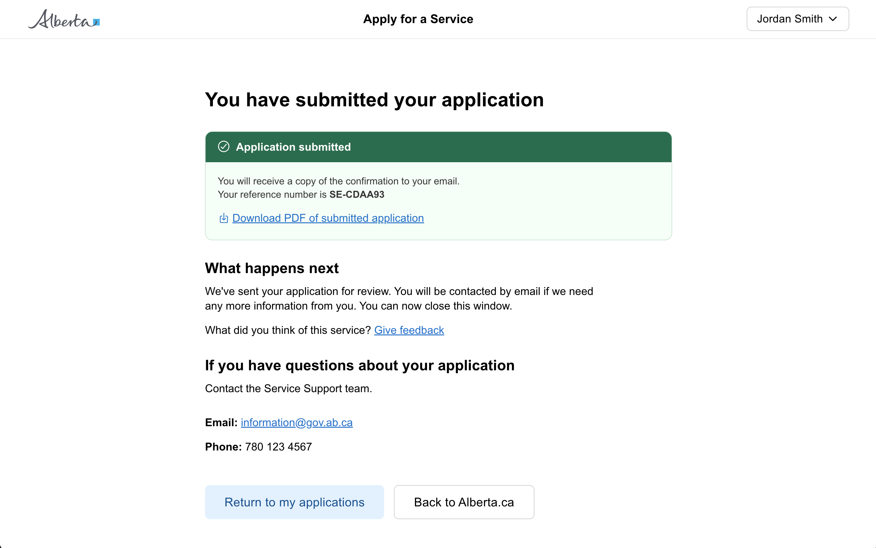
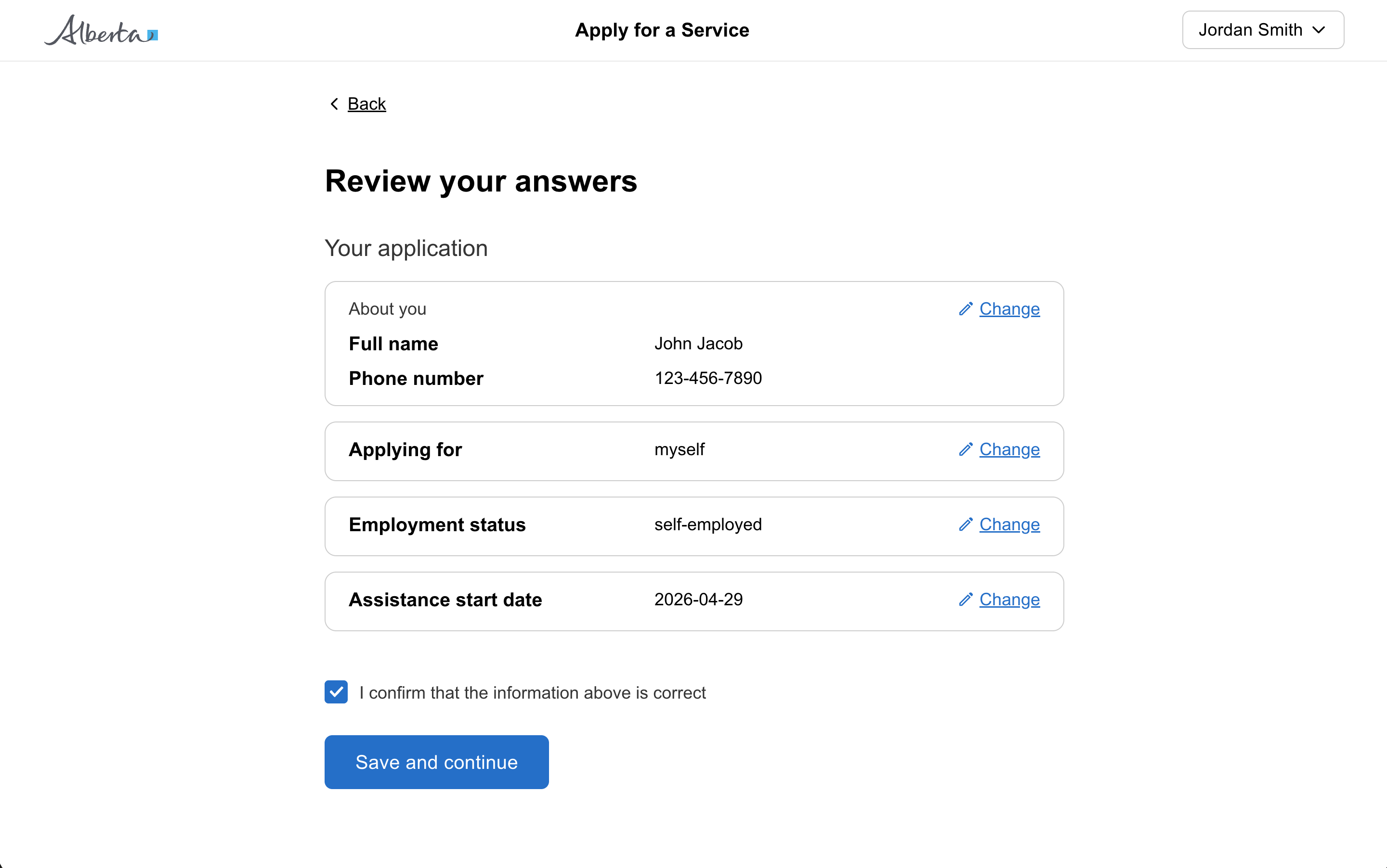
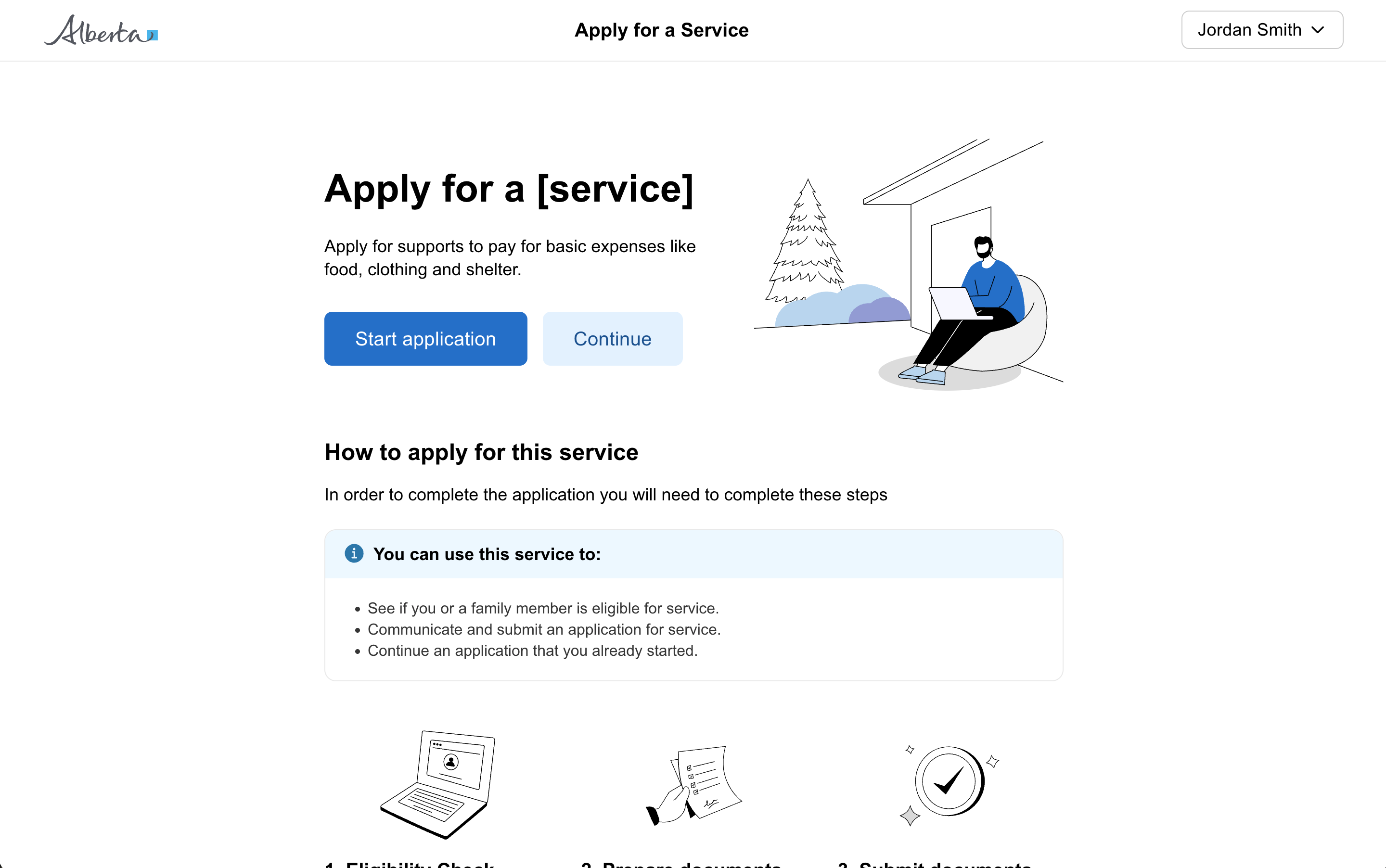
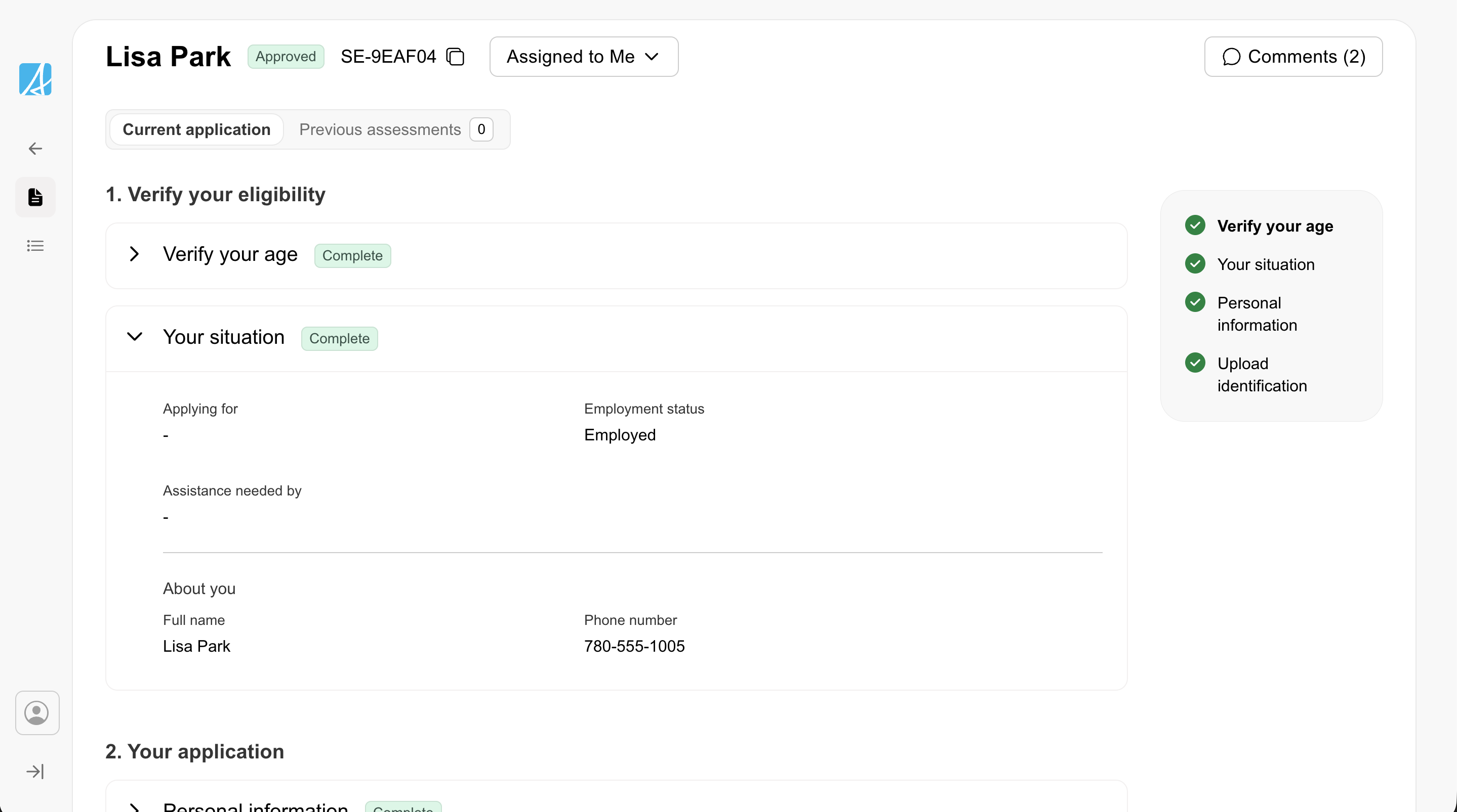
