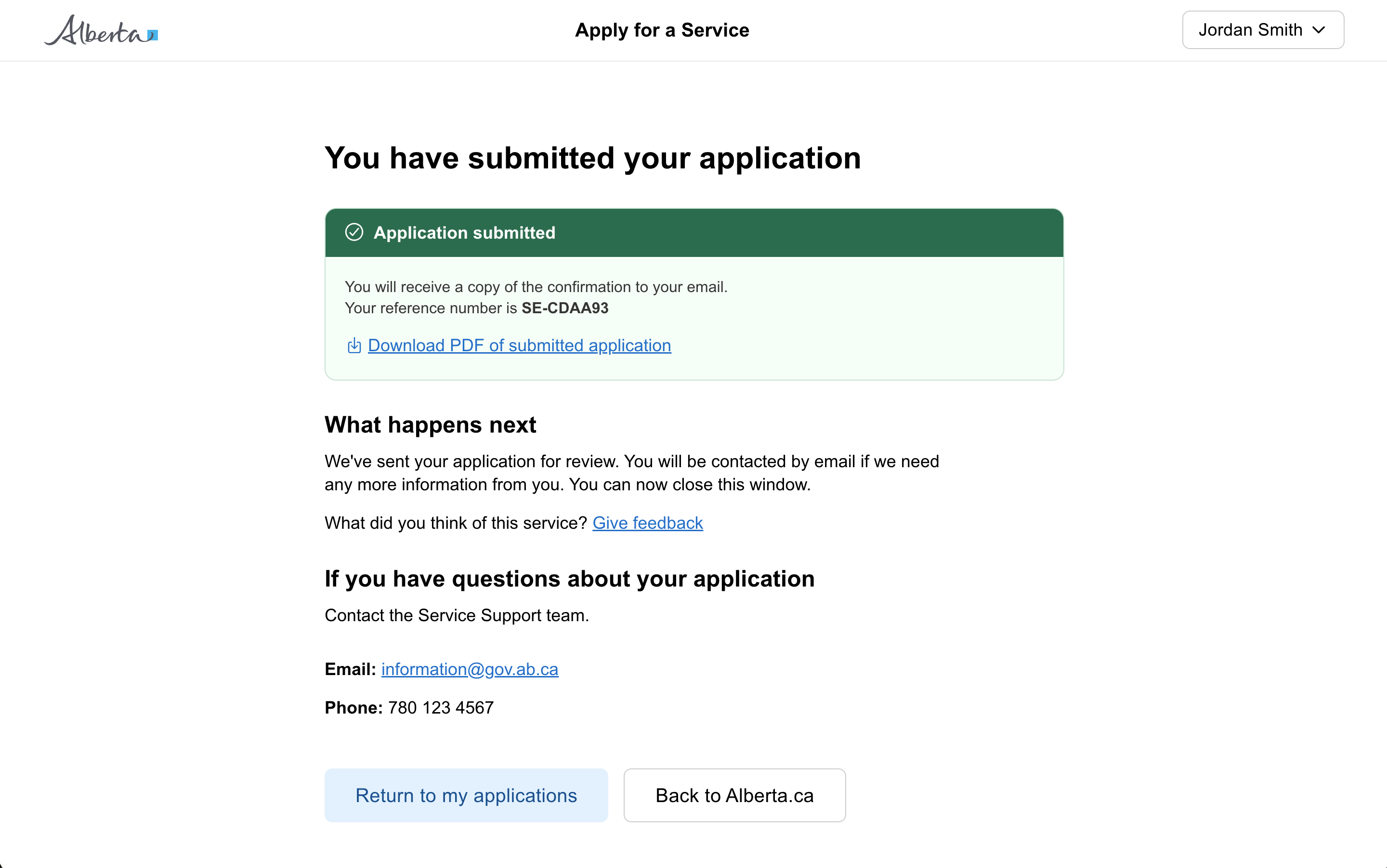
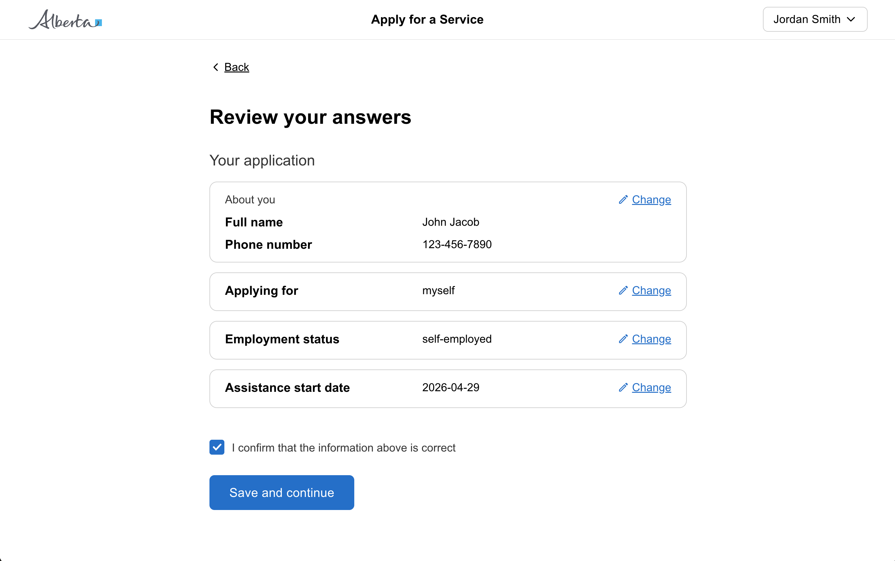
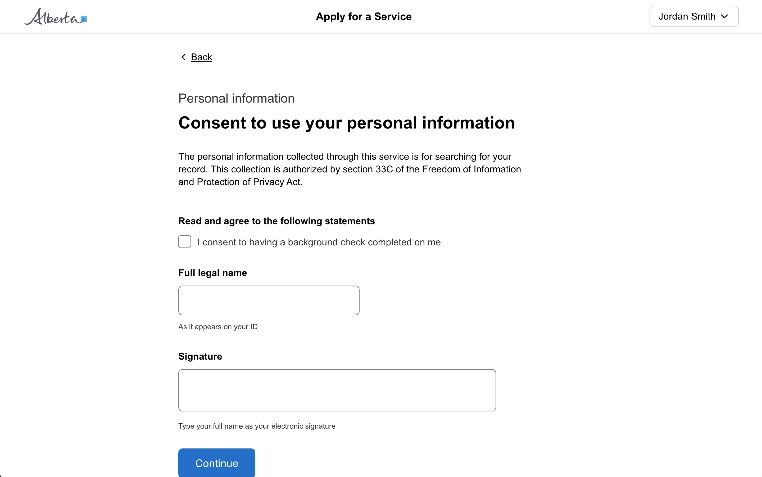
Question page
Display multiple related actions stacked or in a horizontal row to help with arrangement and spacing.
relaxed.
const [open, setOpen] = useState(false);<GoabButton leadingIcon="add" onClick={() => setOpen(true)}>
Add Record
</GoabButton>
<GoabDrawer
maxSize="492px"
open={open}
heading="Add Record"
position="right"
onClose={() => setOpen(false)}
actions={
<GoabButtonGroup alignment="start">
<GoabButton type="primary" size="compact" onClick={() => setOpen(false)}>
Add record
</GoabButton>
<GoabButton type="tertiary" size="compact" onClick={() => setOpen(false)}>
Cancel
</GoabButton>
</GoabButtonGroup>
}
>
<GoabFormItem label="Level of education">
<GoabDropdown onChange={() => {}} name="education" value="university">
<GoabDropdownItem value="high-school" label="High School Diploma" />
<GoabDropdownItem value="college" label="College Diploma" />
<GoabDropdownItem value="university" label="University Degree" />
<GoabDropdownItem value="masters" label="Master's Degree" />
<GoabDropdownItem value="doctorate" label="Doctorate" />
</GoabDropdown>
</GoabFormItem>
<GoabFormItem label="Educational institution" mt="l">
<GoabInput name="education" type="text" onChange={() => {}} />
</GoabFormItem>
<GoabFormItem label="Field of study" requirement="optional" mt="l">
<GoabInput name="fieldOfStudy" type="text" onChange={() => {}} />
</GoabFormItem>
<GoabFormItem label="Is the person currently attending?" mt="l">
<GoabRadioGroup
name="attendTraining"
orientation="horizontal"
onChange={() => {}}
>
<GoabRadioItem value="yes" label="Yes" />
<GoabRadioItem value="no" label="No" />
</GoabRadioGroup>
</GoabFormItem>
<GoabFormItem label="Start date" mt="l">
<GoabDatePicker onChange={() => {}} value={new Date("2022-09-01")} />
<GoabCheckbox
name="startDateApproximate"
text="Approximate date"
value="y"
mt="s"
/>
</GoabFormItem>
<GoabFormItem label="Credential received?" mt="l">
<GoabRadioGroup
name="credentialReceived"
orientation="horizontal"
onChange={() => {}}
>
<GoabRadioItem value="yes" label="Yes" />
<GoabRadioItem value="no" label="No" />
</GoabRadioGroup>
</GoabFormItem>
</GoabDrawer>import { Component } from "@angular/core";
open = false;
onClick() {
this.open = true;
}
onClose() {
this.open = false;
}
dropdownOnChange(event: any) {
console.log(event);
}
inputOnChange(event: any) {
console.log(event);
}
radioOnChange(event: any) {
console.log(event);
}
dateOnChange(event: any) {
console.log(event);
}
closeDrawer() {
this.open = false;
}<goab-button leadingIcon="add" (onClick)="onClick()">Add Record</goab-button>
<goab-drawer
maxSize="492px"
[open]="open"
heading="Add Record"
position="right"
(onClose)="onClose()"
[actions]="actions"
>
<goab-form-item label="Level of education">
<goab-dropdown
(onChange)="dropdownOnChange($event)"
name="education"
value="university"
>
<goab-dropdown-item
value="high-school"
label="High School Diploma"
></goab-dropdown-item>
<goab-dropdown-item value="college" label="College Diploma"></goab-dropdown-item>
<goab-dropdown-item
value="university"
label="University Degree"
></goab-dropdown-item>
<goab-dropdown-item value="masters" label="Master's Degree"></goab-dropdown-item>
<goab-dropdown-item value="doctorate" label="Doctorate"></goab-dropdown-item>
</goab-dropdown>
</goab-form-item>
<goab-form-item label="Educational institution" mt="l">
<goab-input
name="education"
type="text"
(onChange)="inputOnChange($event)"
></goab-input>
</goab-form-item>
<goab-form-item label="Field of study" requirement="optional" mt="l">
<goab-input
name="fieldOfStudy"
type="text"
(onChange)="inputOnChange($event)"
></goab-input>
</goab-form-item>
<goab-form-item label="Is the person currently attending?" mt="l">
<goab-radio-group
name="attendTraining"
orientation="horizontal"
(onChange)="radioOnChange($event)"
>
<goab-radio-item value="yes" label="Yes"></goab-radio-item>
<goab-radio-item value="no" label="No"></goab-radio-item>
</goab-radio-group>
</goab-form-item>
<goab-form-item label="Start date" mt="l">
<goab-date-picker (onChange)="dateOnChange($event)"></goab-date-picker>
<goab-checkbox
name="startDateApproximate"
text="Approximate date"
value="y"
mt="s"
></goab-checkbox>
</goab-form-item>
<goab-form-item label="Credential received?" mt="l">
<goab-radio-group
name="credentialReceived"
orientation="horizontal"
(onChange)="radioOnChange($event)"
>
<goab-radio-item value="yes" label="Yes"></goab-radio-item>
<goab-radio-item value="no" label="No"></goab-radio-item>
</goab-radio-group>
</goab-form-item>
<ng-template #actions>
<goab-button-group alignment="start">
<goab-button type="primary" size="compact" (onClick)="closeDrawer()"
>Add record</goab-button
>
<goab-button type="tertiary" size="compact" (onClick)="closeDrawer()"
>Cancel</goab-button
>
</goab-button-group>
</ng-template>
</goab-drawer>const drawer = document.getElementById("record-drawer");
const openBtn = document.getElementById("open-drawer-btn");
const addBtn = document.getElementById("add-record-btn");
const cancelBtn = document.getElementById("cancel-btn");
openBtn.addEventListener("_click", () => {
drawer.setAttribute("open", "true");
});
drawer.addEventListener("_close", () => {
drawer.removeAttribute("open");
});
addBtn.addEventListener("_click", () => {
drawer.removeAttribute("open");
});
cancelBtn.addEventListener("_click", () => {
drawer.removeAttribute("open");
});<goa-button version="2" id="open-drawer-btn" leadingicon="add">Add Record</goa-button>
<goa-drawer
version="2"
id="record-drawer"
max-size="492px"
heading="Add Record"
position="right"
>
<goa-form-item version="2" label="Level of education">
<goa-dropdown version="2" name="education" value="university">
<goa-dropdown-item
value="high-school"
label="High School Diploma"
></goa-dropdown-item>
<goa-dropdown-item value="college" label="College Diploma"></goa-dropdown-item>
<goa-dropdown-item value="university" label="University Degree"></goa-dropdown-item>
<goa-dropdown-item value="masters" label="Master's Degree"></goa-dropdown-item>
<goa-dropdown-item value="doctorate" label="Doctorate"></goa-dropdown-item>
</goa-dropdown>
</goa-form-item>
<goa-form-item version="2" label="Educational institution" mt="l">
<goa-input version="2" name="education" type="text"></goa-input>
</goa-form-item>
<goa-form-item version="2" label="Field of study" requirement="optional" mt="l">
<goa-input version="2" name="fieldOfStudy" type="text"></goa-input>
</goa-form-item>
<goa-form-item version="2" label="Is the person currently attending?" mt="l">
<goa-radio-group version="2" name="attendTraining" orientation="horizontal">
<goa-radio-item value="yes" label="Yes"></goa-radio-item>
<goa-radio-item value="no" label="No"></goa-radio-item>
</goa-radio-group>
</goa-form-item>
<goa-form-item version="2" label="Start date" mt="l">
<goa-date-picker version="2"></goa-date-picker>
<goa-checkbox
version="2"
name="startDateApproximate"
text="Approximate date"
value="y"
mt="s"
></goa-checkbox>
</goa-form-item>
<goa-form-item version="2" label="Credential received?" mt="l">
<goa-radio-group version="2" name="credentialReceived" orientation="horizontal">
<goa-radio-item value="yes" label="Yes"></goa-radio-item>
<goa-radio-item value="no" label="No"></goa-radio-item>
</goa-radio-group>
</goa-form-item>
<div slot="actions">
<goa-button-group alignment="start">
<goa-button version="2" id="add-record-btn" type="primary" size="compact"
>Add record</goa-button
>
<goa-button version="2" id="cancel-btn" type="tertiary" size="compact"
>Cancel</goa-button
>
</goa-button-group>
</div>
</goa-drawer>const [open, setOpen] = useState(false);<GoabButton onClick={() => setOpen(true)}>Filters</GoabButton>
<GoabDrawer
heading="Filters"
open={open}
onClose={() => setOpen(false)}
position="right"
actions={
<GoabButtonGroup alignment="start">
<GoabButton type="primary" size="compact" onClick={() => setOpen(false)}>
Apply filters
</GoabButton>
<GoabButton type="tertiary" size="compact" onClick={() => setOpen(false)}>
Cancel
</GoabButton>
</GoabButtonGroup>
}
>
<GoabFormItem label="Entry status">
<GoabCheckboxList name="entryStatus" onChange={() => {}}>
<GoabCheckbox name="draft" text="Draft" value="draft" />
<GoabCheckbox name="published" text="Published" value="published" />
</GoabCheckboxList>
</GoabFormItem>
<GoabFormItem label="Assigned to - Region" mt="l">
<GoabCheckboxList name="region" onChange={() => {}}>
<GoabCheckbox name="calgary" text="Calgary" value="calgary" />
<GoabCheckbox name="central" text="Central" value="central" />
<GoabCheckbox name="edmonton" text="Edmonton" value="edmonton" />
<GoabCheckbox name="north" text="North" value="north" />
<GoabCheckbox name="south" text="South" value="south" />
</GoabCheckboxList>
</GoabFormItem>
<GoabFormItem label="Assigned to" mt="l">
<GoabDropdown name="assignedTo" onChange={() => {}}>
<GoabDropdownItem value="1" label="Person 1" />
<GoabDropdownItem value="2" label="Person 2" />
</GoabDropdown>
</GoabFormItem>
<GoabFormItem label="Date taken" mt="l">
<GoabRadioGroup name="dateTaken" onChange={() => {}}>
<GoabRadioItem value="24" label="Last 24 hours" />
<GoabRadioItem value="72" label="Last 72 hours" />
</GoabRadioGroup>
</GoabFormItem>
</GoabDrawer>import { Component } from "@angular/core";
open = false;
assignedTo = "";
takenBy = "";
onClick() {
this.open = true;
}
onClose() {
this.open = false;
}
radioOnChange(event: any) {
console.log(event);
}
onChangeAssignedTo(e: any) {
this.assignedTo = e.value as string;
}
closeDrawer() {
this.open = false;
}<goab-button (onClick)="onClick()">Filters</goab-button>
<goab-drawer
heading="Filters"
[open]="open"
(onClose)="onClose()"
position="right"
[actions]="actions"
>
<goab-form-item label="Entry status">
<goab-checkbox-list name="entryStatus" (onChange)="onCheckboxChange($event)">
<goab-checkbox name="draft" text="Draft" value="draft"></goab-checkbox>
<goab-checkbox name="published" text="Published" value="published"></goab-checkbox>
</goab-checkbox-list>
</goab-form-item>
<goab-form-item label="Assigned to - Region" mt="l">
<goab-checkbox-list name="region" (onChange)="onCheckboxChange($event)">
<goab-checkbox name="calgary" text="Calgary" value="calgary"></goab-checkbox>
<goab-checkbox name="central" text="Central" value="central"></goab-checkbox>
<goab-checkbox name="edmonton" text="Edmonton" value="edmonton"></goab-checkbox>
<goab-checkbox name="north" text="North" value="north"></goab-checkbox>
<goab-checkbox name="south" text="South" value="south"></goab-checkbox>
</goab-checkbox-list>
</goab-form-item>
<goab-form-item label="Assigned to" mt="l">
<goab-dropdown
[value]="assignedTo"
name="assignedToData"
(onChange)="onChangeAssignedTo($event)"
>
<goab-dropdown-item value="1" label="Person 1"></goab-dropdown-item>
<goab-dropdown-item value="2" label="Person 2"></goab-dropdown-item>
</goab-dropdown>
</goab-form-item>
<goab-form-item label="Date taken" mt="l">
<goab-radio-group name="dateTaken" (onChange)="radioOnChange($event)">
<goab-radio-item value="24" label="Last 24 hours"></goab-radio-item>
<goab-radio-item value="72" label="Last 72 hours"></goab-radio-item>
</goab-radio-group>
</goab-form-item>
<ng-template #actions>
<goab-button-group alignment="start">
<goab-button type="primary" size="compact" (onClick)="closeDrawer()"
>Apply filters</goab-button
>
<goab-button type="tertiary" size="compact" (onClick)="closeDrawer()"
>Cancel</goab-button
>
</goab-button-group>
</ng-template>
</goab-drawer>const drawer = document.getElementById("filters-drawer");
const openBtn = document.getElementById("open-filters-btn");
const applyBtn = document.getElementById("apply-filters-btn");
const cancelBtn = document.getElementById("cancel-btn");
openBtn.addEventListener("_click", () => {
drawer.setAttribute("open", "true");
});
drawer.addEventListener("_close", () => {
drawer.removeAttribute("open");
});
applyBtn.addEventListener("_click", () => {
drawer.removeAttribute("open");
});
cancelBtn.addEventListener("_click", () => {
drawer.removeAttribute("open");
});<goa-button version="2" id="open-filters-btn">Filters</goa-button>
<goa-drawer version="2" id="filters-drawer" heading="Filters" position="right">
<goa-form-item version="2" label="Entry status">
<goa-checkbox-list name="entryStatus">
<goa-checkbox version="2" name="draft" text="Draft" value="draft"></goa-checkbox>
<goa-checkbox
version="2"
name="published"
text="Published"
value="published"
></goa-checkbox>
</goa-checkbox-list>
</goa-form-item>
<goa-form-item version="2" label="Assigned to - Region" mt="l">
<goa-checkbox-list name="region">
<goa-checkbox
version="2"
name="calgary"
text="Calgary"
value="calgary"
></goa-checkbox>
<goa-checkbox
version="2"
name="central"
text="Central"
value="central"
></goa-checkbox>
<goa-checkbox
version="2"
name="edmonton"
text="Edmonton"
value="edmonton"
></goa-checkbox>
<goa-checkbox version="2" name="north" text="North" value="north"></goa-checkbox>
<goa-checkbox version="2" name="south" text="South" value="south"></goa-checkbox>
</goa-checkbox-list>
</goa-form-item>
<goa-form-item version="2" label="Assigned to" mt="l">
<goa-dropdown version="2" name="assignedTo">
<goa-dropdown-item value="1" label="Person 1"></goa-dropdown-item>
<goa-dropdown-item value="2" label="Person 2"></goa-dropdown-item>
</goa-dropdown>
</goa-form-item>
<goa-form-item version="2" label="Date taken" mt="l">
<goa-radio-group version="2" name="dateTaken">
<goa-radio-item value="24" label="Last 24 hours"></goa-radio-item>
<goa-radio-item value="72" label="Last 72 hours"></goa-radio-item>
</goa-radio-group>
</goa-form-item>
<div slot="actions">
<goa-button-group alignment="start">
<goa-button version="2" id="apply-filters-btn" type="primary" size="compact"
>Apply filters</goa-button
>
<goa-button version="2" id="cancel-btn" type="tertiary" size="compact"
>Cancel</goa-button
>
</goa-button-group>
</div>
</goa-drawer>const [open, setOpen] = useState(false);
const [type, setType] = useState<string>();
const [name, setName] = useState<string>();
const [description, setDescription] = useState<string>();<GoabButton type="tertiary" leadingIcon="add" onClick={() => setOpen(true)}>
Add another item
</GoabButton>
<GoabModal
heading="Add a new item"
open={open}
actions={
<GoabButtonGroup alignment="end">
<GoabButton type="tertiary" size="compact" onClick={() => setOpen(false)}>
Cancel
</GoabButton>
<GoabButton type="primary" size="compact" onClick={() => setOpen(false)}>
Save new item
</GoabButton>
</GoabButtonGroup>
}
>
<p>Fill in the information to create a new item</p>
<GoabFormItem label="Type" mt="l">
<GoabDropdown onChange={(e) => setType(e.value)} value={type}>
<GoabDropdownItem value="1" label="Option 1" />
<GoabDropdownItem value="2" label="Option 2" />
</GoabDropdown>
</GoabFormItem>
<GoabFormItem label="Name" mt="l">
<GoabInput
onChange={(e) => setName(e.value)}
value={name}
name="name"
width="100%"
/>
</GoabFormItem>
<GoabFormItem label="Description" mt="l">
<GoabTextArea
name="description"
rows={3}
width="100%"
onChange={(e) => setDescription(e.value)}
value={description}
/>
</GoabFormItem>
</GoabModal>import { Component } from "@angular/core";
open = false;
type: string | undefined = "";
name = "";
description = "";
toggleModal() {
this.open = !this.open;
}
updateType(event: any) {
this.type = event.value;
}
updateName(event: any) {
this.name = event.value;
}
updateDescription(event: any) {
this.description = event.value;
}<goab-button type="tertiary" leadingIcon="add" (onClick)="toggleModal()"
>Add another item</goab-button
>
<goab-modal
[open]="open"
(onClose)="toggleModal()"
heading="Add a new item"
[actions]="actions"
>
<p>Fill in the information to create a new item</p>
<goab-form-item label="Type" mt="l">
<goab-dropdown (onChange)="updateType($event)" [value]="type">
<goab-dropdown-item value="1" label="Option 1"></goab-dropdown-item>
<goab-dropdown-item value="2" label="Option 2"></goab-dropdown-item>
</goab-dropdown>
</goab-form-item>
<goab-form-item label="Name" mt="l">
<goab-input
name="name"
width="100%"
(onChange)="updateName($event)"
[value]="name"
></goab-input>
</goab-form-item>
<goab-form-item label="Description" mt="l">
<goab-textarea
name="description"
width="100%"
[rows]="3"
(onChange)="updateDescription($event)"
[value]="description"
></goab-textarea>
</goab-form-item>
<ng-template #actions>
<goab-button-group alignment="end">
<goab-button type="tertiary" size="compact" (onClick)="toggleModal()"
>Cancel</goab-button
>
<goab-button type="primary" size="compact" (onClick)="toggleModal()"
>Save new item</goab-button
>
</goab-button-group>
</ng-template>
</goab-modal>const modal = document.getElementById("add-item-modal");
const openBtn = document.getElementById("open-modal-btn");
const cancelBtn = document.getElementById("cancel-btn");
const saveBtn = document.getElementById("save-btn");
openBtn.addEventListener("_click", () => {
modal.setAttribute("open", "true");
});
modal.addEventListener("_close", () => {
modal.removeAttribute("open");
});
cancelBtn.addEventListener("_click", () => {
modal.removeAttribute("open");
});
saveBtn.addEventListener("_click", () => {
modal.removeAttribute("open");
});<goa-button version="2" id="open-modal-btn" type="tertiary" leadingicon="add"
>Add another item</goa-button
>
<goa-modal version="2" id="add-item-modal" heading="Add a new item">
<p>Fill in the information to create a new item</p>
<goa-form-item version="2" label="Type" mt="l">
<goa-dropdown version="2" id="type-dropdown">
<goa-dropdown-item value="1" label="Option 1"></goa-dropdown-item>
<goa-dropdown-item value="2" label="Option 2"></goa-dropdown-item>
</goa-dropdown>
</goa-form-item>
<goa-form-item version="2" label="Name" mt="l">
<goa-input version="2" name="name" width="100%" id="name-input"></goa-input>
</goa-form-item>
<goa-form-item version="2" label="Description" mt="l">
<goa-textarea
version="2"
name="description"
width="100%"
rows="3"
id="description-textarea"
></goa-textarea>
</goa-form-item>
<div slot="actions">
<goa-button-group alignment="end">
<goa-button version="2" id="cancel-btn" type="tertiary" size="compact"
>Cancel</goa-button
>
<goa-button version="2" id="save-btn" type="primary" size="compact"
>Save new item</goa-button
>
</goa-button-group>
</div>
</goa-modal>const [address, setAddress] = useState("");
const [suite, setSuite] = useState("");
const [city, setCity] = useState("");
const [province, setProvince] = useState("");
const [postalCode, setPostalCode] = useState("");<GoabText size="heading-l" mt="none" mb="xl">
What is your address?
</GoabText>
<GoabFormItem label="Street Address">
<GoabInput
name="address"
type="text"
value={address}
onChange={(e) => setAddress(e.value)}
width="100%"
/>
</GoabFormItem>
<GoabFormItem label="Suite or unit #" mt="l">
<GoabInput
name="suite"
type="text"
value={suite}
onChange={(e) => setSuite(e.value)}
width="100%"
/>
</GoabFormItem>
<GoabFormItem label="City or town" mt="l">
<GoabInput
name="city"
type="text"
value={city}
onChange={(e) => setCity(e.value)}
width="100%"
/>
</GoabFormItem>
<GoabBlock direction="row" gap="l" mt="l">
<GoabFormItem label="Province or territory">
<GoabDropdown
onChange={(e) => setProvince(e.value ?? "")}
name="province"
value={province}
width="100%"
>
<GoabDropdownItem label="Alberta" value="AB" />
<GoabDropdownItem label="British Columbia" value="BC" />
<GoabDropdownItem label="Manitoba" value="MB" />
<GoabDropdownItem label="New Brunswick" value="NB" />
<GoabDropdownItem label="Newfoundland and Labrador" value="NL" />
<GoabDropdownItem label="Northwest Territories" value="NT" />
<GoabDropdownItem label="Nova Scotia" value="NS" />
<GoabDropdownItem label="Nunavut" value="NU" />
<GoabDropdownItem label="Ontario" value="ON" />
<GoabDropdownItem label="Prince Edward Island" value="PE" />
<GoabDropdownItem label="Quebec" value="QC" />
<GoabDropdownItem label="Saskatchewan" value="SK" />
<GoabDropdownItem label="Yukon" value="YT" />
</GoabDropdown>
</GoabFormItem>
<GoabFormItem label="Postal Code">
<GoabInput
name="postalCode"
type="text"
value={postalCode}
onChange={(e) => setPostalCode(e.value)}
width="7ch"
/>
</GoabFormItem>
</GoabBlock>
<GoabButtonGroup alignment="start" mt="2xl">
<GoabButton type="primary" onClick={() => {}}>
Save and continue
</GoabButton>
<GoabButton type="secondary" onClick={() => {}}>
Cancel
</GoabButton>
</GoabButtonGroup>import { Component } from "@angular/core";
import { FormBuilder, FormGroup } from "@angular/forms";
form!: FormGroup;
constructor(private fb: FormBuilder) {
this.form = this.fb.group({
address: [""],
suite: [""],
city: [""],
province: [""],
postalCode: [""],
});
}
onClick() {
// Handle form submission
}<goab-text size="heading-l" mt="none" mb="xl">What is your address?</goab-text>
<goab-form-item label="Street Address">
<goab-input
name="address"
type="text"
[formControl]="form.controls.address"
width="100%"
></goab-input>
</goab-form-item>
<goab-form-item label="Suite or unit #" mt="l">
<goab-input
name="suite"
type="text"
[formControl]="form.controls.suite"
width="100%"
></goab-input>
</goab-form-item>
<goab-form-item label="City or town" mt="l">
<goab-input
name="city"
type="text"
[formControl]="form.controls.city"
width="100%"
></goab-input>
</goab-form-item>
<goab-block direction="row" gap="l" mt="l">
<goab-form-item label="Province or territory">
<goab-dropdown name="province" [formControl]="form.controls.province" width="100%">
<goab-dropdown-item label="Alberta" value="AB"></goab-dropdown-item>
<goab-dropdown-item label="British Columbia" value="BC"></goab-dropdown-item>
<goab-dropdown-item label="Manitoba" value="MB"></goab-dropdown-item>
<goab-dropdown-item label="New Brunswick" value="NB"></goab-dropdown-item>
<goab-dropdown-item
label="Newfoundland and Labrador"
value="NL"
></goab-dropdown-item>
<goab-dropdown-item label="Northwest Territories" value="NT"></goab-dropdown-item>
<goab-dropdown-item label="Nova Scotia" value="NS"></goab-dropdown-item>
<goab-dropdown-item label="Nunavut" value="NU"></goab-dropdown-item>
<goab-dropdown-item label="Ontario" value="ON"></goab-dropdown-item>
<goab-dropdown-item label="Prince Edward Island" value="PE"></goab-dropdown-item>
<goab-dropdown-item label="Quebec" value="QC"></goab-dropdown-item>
<goab-dropdown-item label="Saskatchewan" value="SK"></goab-dropdown-item>
<goab-dropdown-item label="Yukon" value="YT"></goab-dropdown-item>
</goab-dropdown>
</goab-form-item>
<goab-form-item label="Postal Code">
<goab-input
name="postalCode"
type="text"
[formControl]="form.controls.postalCode"
width="7ch"
></goab-input>
</goab-form-item>
</goab-block>
<goab-button-group alignment="start" mt="2xl">
<goab-button type="primary" (onClick)="onClick()">Save and continue</goab-button>
<goab-button type="secondary" (onClick)="onClick()">Cancel</goab-button>
</goab-button-group>document.getElementById("save-btn")?.addEventListener("_click", () => {
console.log("Form submitted");
});<goa-text size="heading-l" mt="none" mb="xl">What is your address?</goa-text>
<goa-form-item version="2" label="Street Address">
<goa-input
version="2"
name="address"
type="text"
width="100%"
id="address-input"
></goa-input>
</goa-form-item>
<goa-form-item version="2" label="Suite or unit #" mt="l">
<goa-input
version="2"
name="suite"
type="text"
width="100%"
id="suite-input"
></goa-input>
</goa-form-item>
<goa-form-item version="2" label="City or town" mt="l">
<goa-input version="2" name="city" type="text" width="100%" id="city-input"></goa-input>
</goa-form-item>
<goa-block direction="row" gap="l" mt="l">
<goa-form-item version="2" label="Province or territory">
<goa-dropdown version="2" name="province" id="province-dropdown" width="100%">
<goa-dropdown-item label="Alberta" value="AB"></goa-dropdown-item>
<goa-dropdown-item label="British Columbia" value="BC"></goa-dropdown-item>
<goa-dropdown-item label="Manitoba" value="MB"></goa-dropdown-item>
<goa-dropdown-item label="New Brunswick" value="NB"></goa-dropdown-item>
<goa-dropdown-item label="Newfoundland and Labrador" value="NL"></goa-dropdown-item>
<goa-dropdown-item label="Northwest Territories" value="NT"></goa-dropdown-item>
<goa-dropdown-item label="Nova Scotia" value="NS"></goa-dropdown-item>
<goa-dropdown-item label="Nunavut" value="NU"></goa-dropdown-item>
<goa-dropdown-item label="Ontario" value="ON"></goa-dropdown-item>
<goa-dropdown-item label="Prince Edward Island" value="PE"></goa-dropdown-item>
<goa-dropdown-item label="Quebec" value="QC"></goa-dropdown-item>
<goa-dropdown-item label="Saskatchewan" value="SK"></goa-dropdown-item>
<goa-dropdown-item label="Yukon" value="YT"></goa-dropdown-item>
</goa-dropdown>
</goa-form-item>
<goa-form-item version="2" label="Postal Code">
<goa-input
version="2"
name="postalCode"
type="text"
width="7ch"
id="postal-input"
></goa-input>
</goa-form-item>
</goa-block>
<goa-button-group alignment="start" mt="2xl">
<goa-button version="2" type="primary" id="save-btn">Save and continue</goa-button>
<goa-button version="2" type="secondary" id="cancel-btn">Cancel</goa-button>
</goa-button-group><GoabButtonGroup alignment="start">
<GoabButton leadingIcon="arrow-back">Go back</GoabButton>
<GoabButton trailingIcon="arrow-forward">Continue</GoabButton>
<GoabButton type="secondary" leadingIcon="add">
Add item
</GoabButton>
</GoabButtonGroup><goab-button-group alignment="start">
<goab-button leadingIcon="arrow-back">Go back</goab-button>
<goab-button trailingIcon="arrow-forward">Continue</goab-button>
<goab-button type="secondary" leadingIcon="add">Add item</goab-button>
</goab-button-group><goa-button-group alignment="start">
<goa-button version="2" leadingicon="arrow-back">Go back</goa-button>
<goa-button version="2" trailingicon="arrow-forward">Continue</goa-button>
<goa-button version="2" type="secondary" leadingicon="add">Add item</goa-button>
</goa-button-group>const [open, setOpen] = useState(false);
const [effectiveDate, setEffectiveDate] = useState<Date | undefined>(new Date());
const onChangeEffectiveDate = (detail: GoabDatePickerOnChangeDetail) => {
setEffectiveDate(detail.value as Date);
};<GoabButton onClick={() => setOpen(true)}>Save and continue</GoabButton>
<GoabModal
heading="Address has changed"
open={open}
onClose={() => setOpen(false)}
actions={
<GoabButtonGroup alignment="end">
<GoabButton type="secondary" size="compact" onClick={() => setOpen(false)}>
Undo address change
</GoabButton>
<GoabButton type="primary" size="compact" onClick={() => setOpen(false)}>
Confirm
</GoabButton>
</GoabButtonGroup>
}
>
<GoabContainer
type="non-interactive"
accent="filled"
padding="compact"
width="full"
>
<GoabText tag="h4" mt="none" mb="s">
Before
</GoabText>
<GoabText mt="none">123456 78 Ave NW, Edmonton, Alberta</GoabText>
<GoabText tag="h4" mt="none" mb="s">
After
</GoabText>
<GoabText mt="none" mb="none">
881 12 Ave NW, Edmonton, Alberta
</GoabText>
</GoabContainer>
<GoabFormItem label="Effective date" mt="l">
<GoabDatePicker
onChange={onChangeEffectiveDate}
name="effectiveDate"
value={effectiveDate}
/>
</GoabFormItem>
</GoabModal>import { Component } from "@angular/core";
import { GoabDatePickerOnChangeDetail } from "@abgov/ui-components-common";
open = false;
effectiveDate = new Date();
toggleModal(): void {
this.open = !this.open;
}
onChangeEffectiveDate(event: GoabDatePickerOnChangeDetail): void {
this.effectiveDate = event.value as Date;
}<goab-button (onClick)="toggleModal()">Save and continue</goab-button>
<goab-modal
[open]="open"
(onClose)="toggleModal()"
heading="Address has changed"
[actions]="actions"
>
<goab-container type="non-interactive" accent="filled" padding="compact" width="full">
<goab-text tag="h4" mt="none" mb="s">Before</goab-text>
<goab-text mt="none">123456 78 Ave NW, Edmonton, Alberta</goab-text>
<goab-text tag="h4" mt="none" mb="s">After</goab-text>
<goab-text mt="none" mb="none">881 12 Ave NW, Edmonton, Alberta</goab-text>
</goab-container>
<goab-form-item label="Effective date" mt="l">
<goab-date-picker
(onChange)="onChangeEffectiveDate($event)"
name="effectiveDate"
[value]="effectiveDate"
></goab-date-picker>
</goab-form-item>
<ng-template #actions>
<goab-button-group alignment="end">
<goab-button type="secondary" size="compact" (onClick)="toggleModal()">
Undo address change
</goab-button>
<goab-button type="primary" size="compact" (onClick)="toggleModal()">
Confirm
</goab-button>
</goab-button-group>
</ng-template>
</goab-modal>const modal = document.getElementById("change-modal");
const openBtn = document.getElementById("open-modal-btn");
const undoBtn = document.getElementById("undo-btn");
const confirmBtn = document.getElementById("confirm-btn");
const datePicker = document.getElementById("effective-date");
let effectiveDate = new Date();
datePicker.setAttribute("value", effectiveDate.toISOString());
openBtn.addEventListener("_click", () => {
modal.setAttribute("open", "true");
});
undoBtn.addEventListener("_click", () => {
modal.removeAttribute("open");
});
confirmBtn.addEventListener("_click", () => {
modal.removeAttribute("open");
});
modal.addEventListener("_close", () => {
modal.removeAttribute("open");
});
datePicker.addEventListener("_change", (e) => {
effectiveDate = e.detail.value;
});<goa-button version="2" id="open-modal-btn">Save and continue</goa-button>
<goa-modal version="2" id="change-modal" heading="Address has changed">
<goa-container type="non-interactive" accent="filled" padding="compact" width="full">
<goa-text as="h4" mt="none" mb="s">Before</goa-text>
<goa-text mt="none">123456 78 Ave NW, Edmonton, Alberta</goa-text>
<goa-text as="h4" mt="none" mb="s">After</goa-text>
<goa-text mt="none" mb="none">881 12 Ave NW, Edmonton, Alberta</goa-text>
</goa-container>
<goa-form-item version="2" label="Effective date" mt="l">
<goa-date-picker
version="2"
id="effective-date"
name="effectiveDate"
></goa-date-picker>
</goa-form-item>
<div slot="actions">
<goa-button-group alignment="end">
<goa-button version="2" type="secondary" size="compact" id="undo-btn">
Undo address change
</goa-button>
<goa-button version="2" type="primary" size="compact" id="confirm-btn">
Confirm
</goa-button>
</goa-button-group>
</div>
</goa-modal>const [open, setOpen] = useState(false);<GoabButton type="tertiary" leadingIcon="trash" onClick={() => setOpen(true)}>
Delete record
</GoabButton>
<GoabModal
heading="Are you sure you want to delete this record?"
open={open}
onClose={() => setOpen(false)}
actions={
<GoabButtonGroup alignment="end">
<GoabButton type="tertiary" size="compact" onClick={() => setOpen(false)}>
Cancel
</GoabButton>
<GoabButton
type="primary"
variant="destructive"
size="compact"
onClick={() => setOpen(false)}
>
Delete record
</GoabButton>
</GoabButtonGroup>
}
>
<p>This action cannot be undone.</p>
</GoabModal>import { Component } from "@angular/core";
open = false;
toggleModal(): void {
this.open = !this.open;
}<goab-button type="tertiary" leadingIcon="trash" (onClick)="toggleModal()"
>Delete record</goab-button
>
<goab-modal
[open]="open"
(onClose)="toggleModal()"
heading="Are you sure you want to delete this record?"
[actions]="actions"
>
<p>This action cannot be undone.</p>
<ng-template #actions>
<goab-button-group alignment="end">
<goab-button type="tertiary" size="compact" (onClick)="toggleModal()"
>Cancel</goab-button
>
<goab-button
type="primary"
variant="destructive"
size="compact"
(onClick)="toggleModal()"
>Delete record</goab-button
>
</goab-button-group>
</ng-template>
</goab-modal>const modal = document.getElementById("delete-modal");
const deleteBtn = document.getElementById("delete-btn");
const cancelBtn = document.getElementById("cancel-btn");
const confirmDeleteBtn = document.getElementById("confirm-delete-btn");
deleteBtn.addEventListener("_click", () => {
modal.setAttribute("open", "true");
});
cancelBtn.addEventListener("_click", () => {
modal.removeAttribute("open");
});
confirmDeleteBtn.addEventListener("_click", () => {
modal.removeAttribute("open");
});
modal.addEventListener("_close", () => {
modal.removeAttribute("open");
});<goa-button version="2" type="tertiary" leadingicon="trash" id="delete-btn"
>Delete record</goa-button
>
<goa-modal
version="2"
id="delete-modal"
heading="Are you sure you want to delete this record?"
>
<p>This action cannot be undone.</p>
<div slot="actions">
<goa-button-group alignment="end">
<goa-button version="2" type="tertiary" size="compact" id="cancel-btn"
>Cancel</goa-button
>
<goa-button
version="2"
type="primary"
variant="destructive"
size="compact"
id="confirm-delete-btn"
>Delete record</goa-button
>
</goa-button-group>
</div>
</goa-modal>const [open, setOpen] = useState(false);
const handleChangeRoute = () => {
setOpen(false);
// In a real app, you would use your router's navigate function
// setTimeout(() => navigate("/some-path"), 300);
console.log("Navigating to new route...");
};<GoabButton onClick={() => setOpen(true)}>Open</GoabButton>
<GoabModal
heading="Are you sure you want to change route?"
open={open}
onClose={() => setOpen(false)}
actions={
<GoabButtonGroup alignment="end">
<GoabButton type="secondary" size="compact" onClick={() => setOpen(false)}>
Cancel
</GoabButton>
<GoabButton type="primary" size="compact" onClick={handleChangeRoute}>
Change route
</GoabButton>
</GoabButtonGroup>
}
/>import { Component } from "@angular/core";
import { Router } from "@angular/router";
open = false;
constructor(private router: Router) {}
onOpen(): void {
this.open = true;
}
onClose(): void {
this.open = false;
}
onChangeRoute(): void {
this.open = false;
// setTimeout will allow any modal transitions to be run
setTimeout(() => this.router.navigate(["/components"]), 0);
}<goab-button (onClick)="onOpen()">Open</goab-button>
<goab-modal
[open]="open"
heading="Are you sure you want to change route?"
[actions]="actions"
>
<ng-template #actions>
<goab-button-group alignment="end">
<goab-button type="secondary" size="compact" (onClick)="onClose()"
>Cancel</goab-button
>
<goab-button type="primary" size="compact" (onClick)="onChangeRoute()"
>Change route</goab-button
>
</goab-button-group>
</ng-template>
</goab-modal>const modal = document.getElementById("route-modal");
const openBtn = document.getElementById("open-btn");
const cancelBtn = document.getElementById("cancel-btn");
const changeRouteBtn = document.getElementById("change-route-btn");
openBtn.addEventListener("_click", () => {
modal.setAttribute("open", "true");
});
cancelBtn.addEventListener("_click", () => {
modal.removeAttribute("open");
});
changeRouteBtn.addEventListener("_click", () => {
modal.removeAttribute("open");
// setTimeout will allow any modal transitions to be run
setTimeout(() => {
window.location.href = "/components";
}, 300);
});
modal.addEventListener("_close", () => {
modal.removeAttribute("open");
});<goa-button version="2" id="open-btn">Open</goa-button>
<goa-modal version="2" id="route-modal" heading="Are you sure you want to change route?">
<div slot="actions">
<goa-button-group alignment="end">
<goa-button version="2" type="secondary" size="compact" id="cancel-btn"
>Cancel</goa-button
>
<goa-button version="2" type="primary" size="compact" id="change-route-btn"
>Change route</goa-button
>
</goa-button-group>
</div>
</goa-modal>const [inputValue, setInputValue] = useState("");
const handleInputChange = (detail: GoabInputOnChangeDetail) => {
setInputValue(detail.value);
};
const handleConfirm = () => {
// Handle form submission
console.log("Form submitted with:", inputValue);
};
const handleCancel = () => {
// Handle cancellation
setInputValue("");
};<form>
<GoabFormItem label="Name" requirement="required">
<GoabInput
name="input"
type="text"
onChange={handleInputChange}
value={inputValue}
width="100%"
/>
</GoabFormItem>
<GoabButtonGroup alignment="start" mt="xl">
<GoabButton disabled={inputValue.trim() === ""} onClick={handleConfirm}>
Confirm
</GoabButton>
<GoabButton type="secondary" onClick={handleCancel}>
Cancel
</GoabButton>
</GoabButtonGroup>
</form>import { Component } from "@angular/core";
import { GoabInputOnChangeDetail } from "@abgov/ui-components-common";
inputValue = "";
onInputChange(detail: GoabInputOnChangeDetail): void {
this.inputValue = detail.value;
}
onConfirm(): void {
// Handle form submission
console.log("Form submitted with:", this.inputValue);
}
onCancel(): void {
// Handle cancellation
this.inputValue = "";
}
get isDisabled(): boolean {
return this.inputValue.trim() === "";
}<form>
<goab-form-item label="Name" requirement="required">
<goab-input
name="input"
type="text"
(onChange)="onInputChange($event)"
[value]="inputValue"
width="100%"
>
</goab-input>
</goab-form-item>
<goab-button-group alignment="start" mt="xl">
<goab-button [disabled]="isDisabled" (onClick)="onConfirm()"> Confirm </goab-button>
<goab-button type="secondary" (onClick)="onCancel()"> Cancel </goab-button>
</goab-button-group>
</form>const nameInput = document.getElementById("name-input");
const confirmBtn = document.getElementById("confirm-btn");
const cancelBtn = document.getElementById("cancel-btn");
nameInput.addEventListener("_change", (e) => {
const value = e.detail.value.trim();
if (value === "") {
confirmBtn.setAttribute("disabled", "true");
} else {
confirmBtn.removeAttribute("disabled");
}
});
confirmBtn.addEventListener("_click", () => {
console.log("Form submitted with:", nameInput.value);
});
cancelBtn.addEventListener("_click", () => {
nameInput.value = "";
confirmBtn.setAttribute("disabled", "true");
});<form id="required-field-form">
<goa-form-item version="2" label="Name" requirement="required">
<goa-input
version="2"
id="name-input"
name="input"
type="text"
width="100%"
></goa-input>
</goa-form-item>
<goa-button-group alignment="start" mt="xl">
<goa-button version="2" id="confirm-btn" disabled="true">Confirm</goa-button>
<goa-button version="2" id="cancel-btn" type="secondary">Cancel</goa-button>
</goa-button-group>
</form>const [open, setOpen] = useState(false);<GoabButton onClick={() => setOpen(true)}>Open Basic Modal</GoabButton>
<GoabModal
heading="Are you sure you want to continue?"
open={open}
onClose={() => setOpen(false)}
actions={
<GoabButtonGroup alignment="end">
<GoabButton type="secondary" size="compact" onClick={() => setOpen(false)}>
Back
</GoabButton>
<GoabButton type="primary" size="compact" onClick={() => setOpen(false)}>
Continue
</GoabButton>
</GoabButtonGroup>
}
>
<p>You cannot return to this page.</p>
</GoabModal>import { Component } from "@angular/core";
open = false;
toggleModal(): void {
this.open = !this.open;
}<goab-button (onClick)="toggleModal()">Open Basic Modal</goab-button>
<goab-modal
[open]="open"
(onClose)="toggleModal()"
heading="Are you sure you want to continue?"
[actions]="actions"
>
<p>You cannot return to this page.</p>
<ng-template #actions>
<goab-button-group alignment="end">
<goab-button type="secondary" size="compact" (onClick)="toggleModal()"
>Back</goab-button
>
<goab-button type="primary" size="compact" (onClick)="toggleModal()"
>Continue</goab-button
>
</goab-button-group>
</ng-template>
</goab-modal>const modal = document.getElementById("confirmation-modal");
const openBtn = document.getElementById("open-modal-btn");
const backBtn = document.getElementById("back-btn");
const continueBtn = document.getElementById("continue-btn");
function openModal() {
modal.setAttribute("open", "true");
}
function closeModal() {
modal.removeAttribute("open");
}
openBtn.addEventListener("_click", openModal);
backBtn.addEventListener("_click", closeModal);
continueBtn.addEventListener("_click", closeModal);
modal.addEventListener("_close", closeModal);<goa-button version="2" id="open-modal-btn">Open Basic Modal</goa-button>
<goa-modal
version="2"
id="confirmation-modal"
heading="Are you sure you want to continue?"
>
<p>You cannot return to this page.</p>
<div slot="actions">
<goa-button-group alignment="end">
<goa-button version="2" id="back-btn" type="secondary" size="compact"
>Back</goa-button
>
<goa-button version="2" id="continue-btn" type="primary" size="compact"
>Continue</goa-button
>
</goa-button-group>
</div>
</goa-modal>const [date, setDate] = useState<Date | undefined>();
const setNewDate = (value: Date | undefined) => {
setDate(value);
};
function setValue() {
const d = new Date();
d.setDate(d.getDate() - 7);
setDate(d);
}
function clearValue() {
setDate(undefined);
}<GoabFormItem label="Date Picker">
<GoabDatePicker
name="item"
value={date}
onChange={(e) => setNewDate(e.value as Date)}
mb="xl"
/>
</GoabFormItem>
<GoabButtonGroup mt="xs" alignment="start">
<GoabButton onClick={setValue}>Set Value</GoabButton>
<GoabButton onClick={clearValue}>Clear Value</GoabButton>
</GoabButtonGroup>import { Component } from "@angular/core";
import type { GoabDatePickerOnChangeDetail } from "@abgov/ui-components-common";
item: Date | undefined = undefined;
onChange(event: GoabDatePickerOnChangeDetail): void {
this.item = event.valueStr ? new Date(event.valueStr) : undefined;
}
setValue(): void {
const d = new Date();
d.setDate(d.getDate() - 7);
this.item = d;
}
clearValue(): void {
this.item = undefined;
}<goab-form-item label="Date Picker">
<goab-date-picker (onChange)="onChange($event)" name="item" [value]="item">
</goab-date-picker>
</goab-form-item>
<goab-button-group alignment="start" mt="xs">
<goab-button (onClick)="setValue()">Set Value</goab-button>
<goab-button (onClick)="clearValue()">Clear Value</goab-button>
</goab-button-group>const datePicker = document.getElementById("date-picker");
const setValueBtn = document.getElementById("set-value-btn");
const clearValueBtn = document.getElementById("clear-value-btn");
datePicker.addEventListener("_change", (e) => {
console.log("Date changed:", e.detail.value);
});
setValueBtn.addEventListener("_click", () => {
const d = new Date();
d.setDate(d.getDate() - 7);
datePicker.setAttribute("value", d.toISOString());
});
clearValueBtn.addEventListener("_click", () => {
datePicker.removeAttribute("value");
});<goa-form-item version="2" label="Date Picker">
<goa-date-picker version="2" id="date-picker" name="item"></goa-date-picker>
</goa-form-item>
<goa-button-group alignment="start" mt="xs">
<goa-button version="2" id="set-value-btn">Set Value</goa-button>
<goa-button version="2" id="clear-value-btn">Clear Value</goa-button>
</goa-button-group><GoabButtonGroup alignment="start">
<GoabTooltip content="Edit">
<GoabIconButton icon="pencil" ariaLabel="Edit" />
</GoabTooltip>
<GoabTooltip content="Alerts">
<GoabIconButton icon="notifications" ariaLabel="Alerts" />
</GoabTooltip>
<GoabTooltip content="Settings">
<GoabIconButton icon="settings" ariaLabel="Settings" />
</GoabTooltip>
</GoabButtonGroup><goab-button-group alignment="start">
<goab-tooltip content="Edit">
<goab-icon-button icon="pencil" ariaLabel="Edit"></goab-icon-button>
</goab-tooltip>
<goab-tooltip content="Alerts">
<goab-icon-button icon="notifications" ariaLabel="Alerts"></goab-icon-button>
</goab-tooltip>
<goab-tooltip content="Settings">
<goab-icon-button icon="settings" ariaLabel="Settings"></goab-icon-button>
</goab-tooltip>
</goab-button-group><goa-button-group alignment="start">
<goa-tooltip content="Edit">
<goa-icon-button icon="pencil" aria-label="Edit"></goa-icon-button>
</goa-tooltip>
<goa-tooltip content="Alerts">
<goa-icon-button icon="notifications" aria-label="Alerts"></goa-icon-button>
</goa-tooltip>
<goa-tooltip content="Settings">
<goa-icon-button icon="settings" aria-label="Settings"></goa-icon-button>
</goa-tooltip>
</goa-button-group>const [open, setOpen] = useState(false); <GoabButton type="secondary" onClick={() => setOpen(true)}>
Save for later
</GoabButton>
<GoabModal
heading="Complete submission prior to 1PM"
calloutVariant="important"
open={open}
onClose={() => setOpen(false)}
actions={
<GoabButtonGroup alignment="end">
<GoabButton type="primary" onClick={() => setOpen(false)}>
I understand
</GoabButton>
</GoabButtonGroup>
}
>
<p>
You've selected to adjourn a matter that is required to appear today. This
Calgary court location does not accept adjournment requests past 1PM MST. Please
submit your adjournment request as soon as possible.
</p>
</GoabModal>
);
}import { Component } from "@angular/core";
open = false;
toggleModal(): void {
this.open = !this.open;
}<goab-button type="secondary" (onClick)="toggleModal()">Save for later</goab-button>
<goab-modal
[open]="open"
calloutVariant="important"
(onClose)="toggleModal()"
heading="Complete submission prior to 1PM"
[actions]="actions"
>
<p>
You've selected to adjourn a matter that is required to appear today. This Calgary
court location does not accept adjournment requests past 1PM MST. Please submit your
adjournment request as soon as possible.
</p>
<ng-template #actions>
<goab-button-group alignment="end">
<goab-button type="primary" (onClick)="toggleModal()">I understand</goab-button>
</goab-button-group>
</ng-template>
</goab-modal>const modal = document.getElementById("deadline-modal");
const openBtn = document.getElementById("open-modal-btn");
const understandBtn = document.getElementById("understand-btn");
openBtn.addEventListener("_click", () => {
modal.setAttribute("open", "true");
});
understandBtn.addEventListener("_click", () => {
modal.removeAttribute("open");
});
modal.addEventListener("_close", () => {
modal.removeAttribute("open");
});<goa-button version="2" type="secondary" id="open-modal-btn">Save for later</goa-button>
<goa-modal
version="2"
id="deadline-modal"
calloutvariant="important"
heading="Complete submission prior to 1PM"
>
You've selected to adjourn a matter that is required to appear today. This Calgary court
location does not accept adjournment requests past 1PM MST. Please submit your
adjournment request as soon as possible.
<div slot="actions">
<goa-button-group alignment="end">
<goa-button version="2" type="primary" size="compact" id="understand-btn"
>I understand</goa-button
>
</goa-button-group>
</div>
</goa-modal>