Workspace Layout
A full-page layout for workspace-style applications that wraps your content responsively.
Props
Events
ReactNode
Layout
The workspace layout fills the full height of the viewport and manages its own scrolling inside the content area. Place it directly in your router outlet or page root. If you nest it inside another element that scrolls, the sticky header and footer will not stay in place as expected.
Interaction
The layout tracks how far the content has scrolled (at the top, in the middle, or at the bottom) and lets you read that to respond. Common uses are collapsing a tall header as people scroll down, showing a back to top button, or recording an analytics event when someone reaches the bottom of a long list.
Read it with the useGoabWorkspaceLayoutScrollState hook in React, or the GoabWorkspaceLayoutScrollStateService in Angular. In web components, listen for the _scrollStateChange event. See the Properties tab for the full event payload.
Usage
Reach for the workspace layout when you are building a tool people use to get work done, such as case management, internal dashboards, or back-office apps. It suits pages that share a side menu and where people scroll through long content while the header and footer actions stay in reach.
It is built for these worker applications, not public citizen-facing pages.
The workspace layout is the shell for workspace-style applications such as case management tools, internal dashboards, and back-office apps. It gives you a side menu, a sticky header and footer, a scrollable content area, and an optional push drawer, all wired together and responsive out of the box.
Anatomy
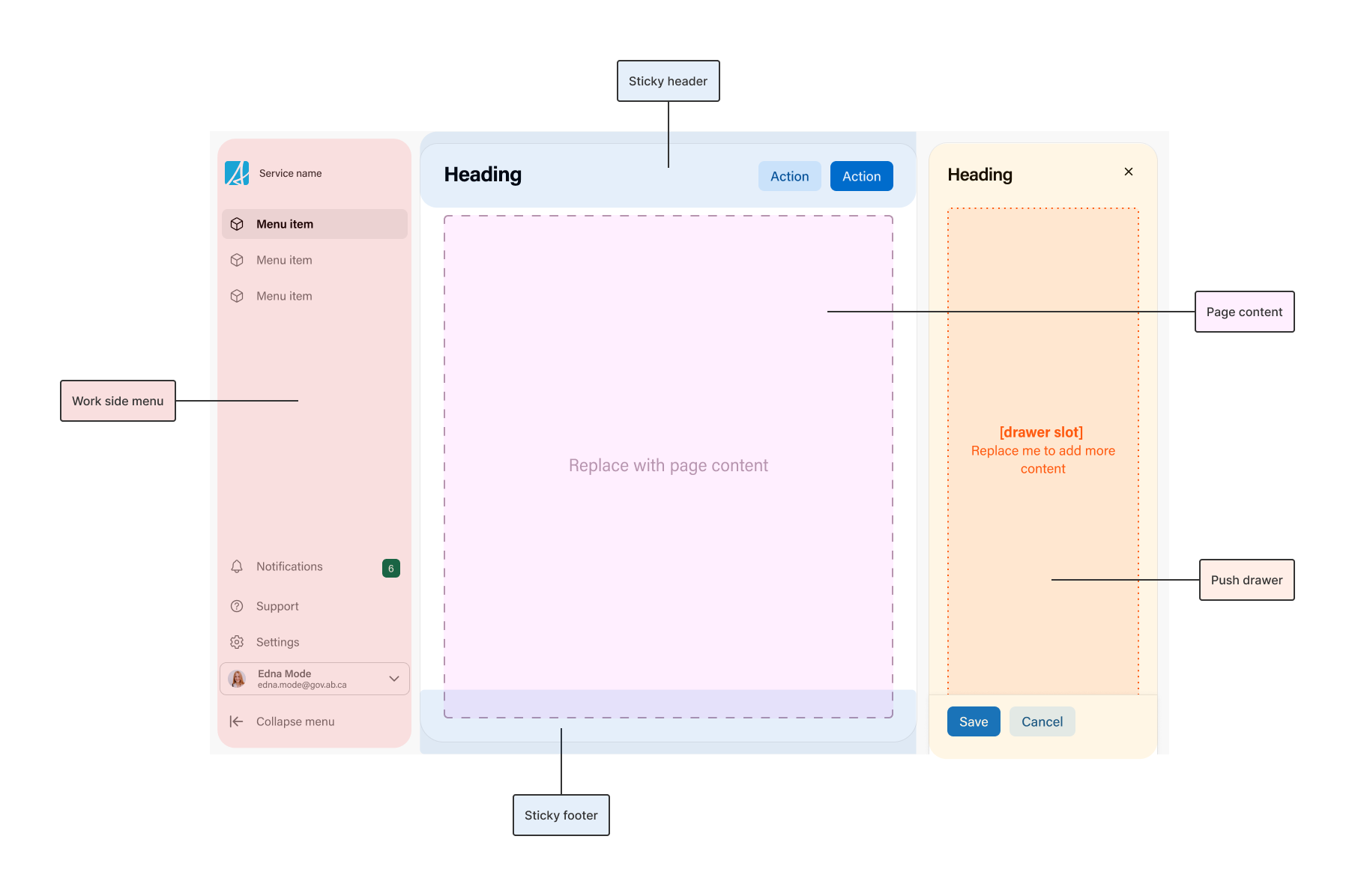
Work side menu
The main navigation for the workspace, built with a work side menu. It stays in place while the content scrolls. On narrow screens it hides and opens from the mobile hamburger menu.
Sticky header
A header pinned to the top while the content scrolls. Use it for the page title, key actions, or a toolbar. A soft shadow appears under it once content scrolls past, so people can tell there is more above. It can also collapse as people scroll down.
Page content
Your page content. The layout wraps it in a scrollable card and handles the spacing, so the header and footer stay in place while this area scrolls.
Sticky footer
A footer pinned to the bottom while the content scrolls. Use it for a summary or contextual actions that should stay reachable, such as a bulk action bar that appears once rows are selected.
Push drawer
An optional drawer that opens beside the page content instead of over it. Unlike a modal drawer, it narrows the content rather than covering it, so people can still interact with the main page content while the drawer is open.
Mobile hamburger menu
At narrow screen widths the side menu hides to save space, and the layout adds a hamburger button that opens it. This comes with the layout, you do not wire it up yourself.


