Tab

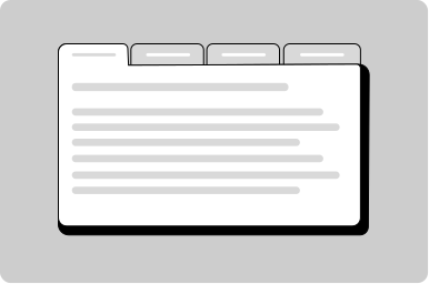
Individual tab within a tabs component.

Props

disabled
boolean
When true, disables the tab so it cannot be selected.
heading
string | React.ReactNode
The text label for this tab. Can also pass React nodes for custom heading content.
slug
string
URL-friendly identifier for the tab, used for hash-based navigation.
disabled
boolean
When true, disables the tab.
heading
string | TemplateRef<any>
The text label for this tab. Can also use the heading slot for custom content.
slug
string
Sets the URL slug for the tab.
disabled
boolean true | false
Defaults to false.
heading
string
The text label for this tab. Can also use the heading slot for custom content.
open
boolean true | false
Whether this tab is currently selected/active.
Defaults to false.
slug
string

ReactNode

heading
ReactNode
The text label for this tab. Can also pass React nodes for custom heading content.
heading
TemplateRef
The text label for this tab. Can also pass React nodes for custom heading content.
heading
slot
The text label for this tab. Can also pass React nodes for custom heading content.
Examples

Activate a specific tab with a button

Set a specific tab to be active

Show different views of data in a table

No usage guidelines have been documented for this component yet.

All GoA Design System components are built to meet WCAG 2.2 AA standards. The following guidelines provide additional context for accessible implementation.

No accessibility-specific guidelines have been documented for this component yet.

View old component docs